Visual identification
Project of logotype Prepration of corporate design and stationery book
Key Visual
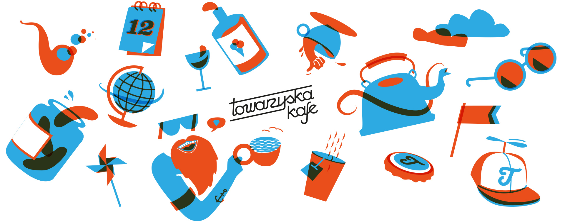
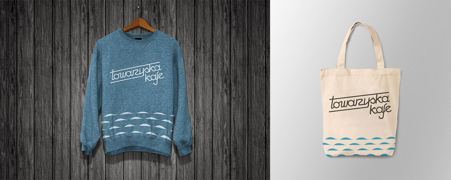
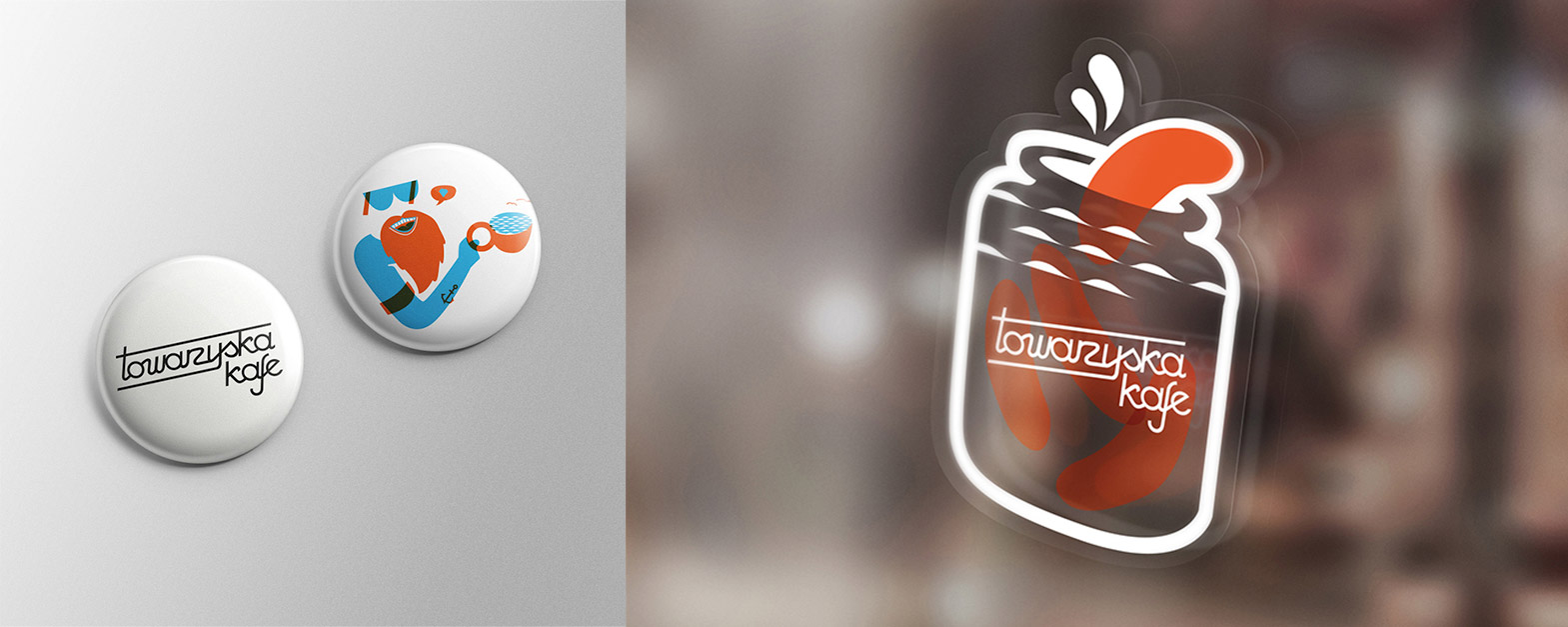
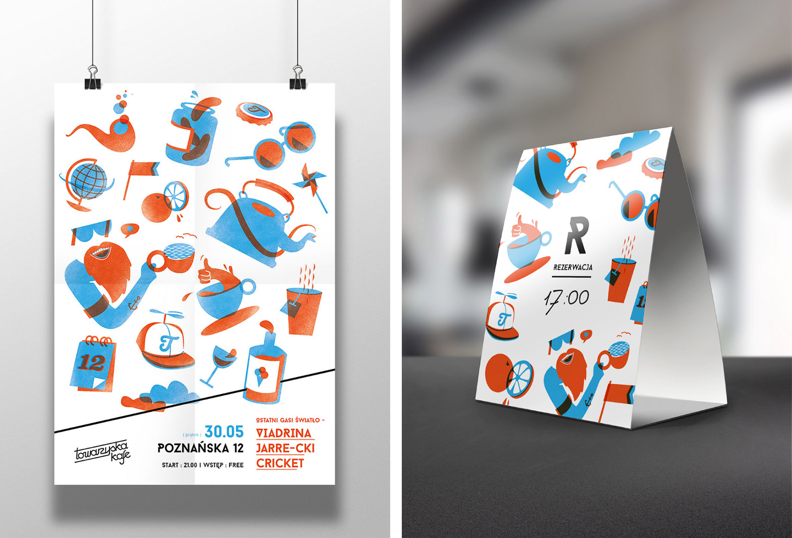
Visual identification was based on the following colours: black, blue, and orange. Wave graphic motif corresponds to the nearby river and the whole is topped-up with illustrations presenting fun.
Key Visual
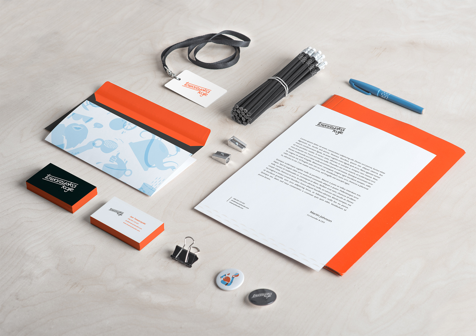
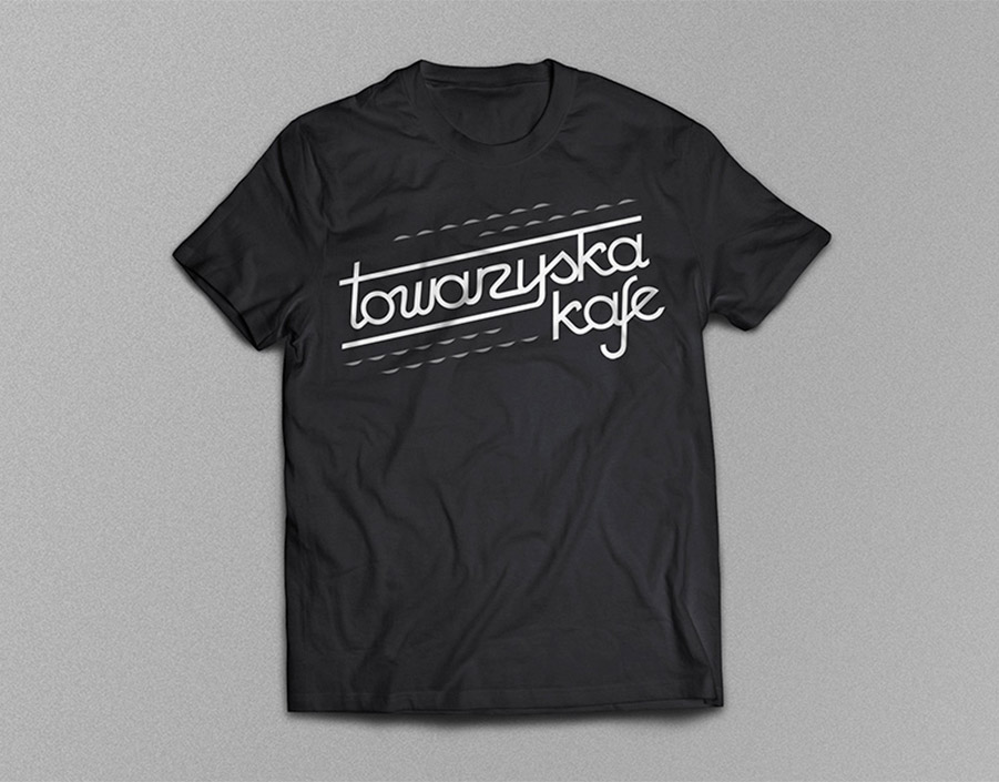
The identification elements were put on various materials useful in food and beverage business e.g. tickets, posters, id cards, but also company’s letterhead, folders and pens.
Premises
Business profile
Towarzyska Cafe runs an entertainment operation targeted at demanding clients who crave for something new. The yard with its own climate and spacious interior gather people who look for fun or a moment of rest in fresh air. Visual identification of this place was positively accepted. It is recognised everywhere, and can be seen in the photos, on wobblers, taps etc.


