Seta Disco

Seta Disco Identity, branding

The preparation of the brand identification and basic promotional materials.

Seta Disco

The idea behind this place originates from popular shot bars. Unlike the others, Seta Disco was to be expanded by the dance floor and presented in a more modern and courageous way. The investor did not want to wallpaper the place with newspapers to create vintage style. He gave into our hands the decision about colours and initial concepts of decor. The beginning of our work was creation of a logotype which would be presented in the form of neon in front of the premises. This is how the idea was born… The letters were to be shaped out of gas-filled tubes.

Elements of identification

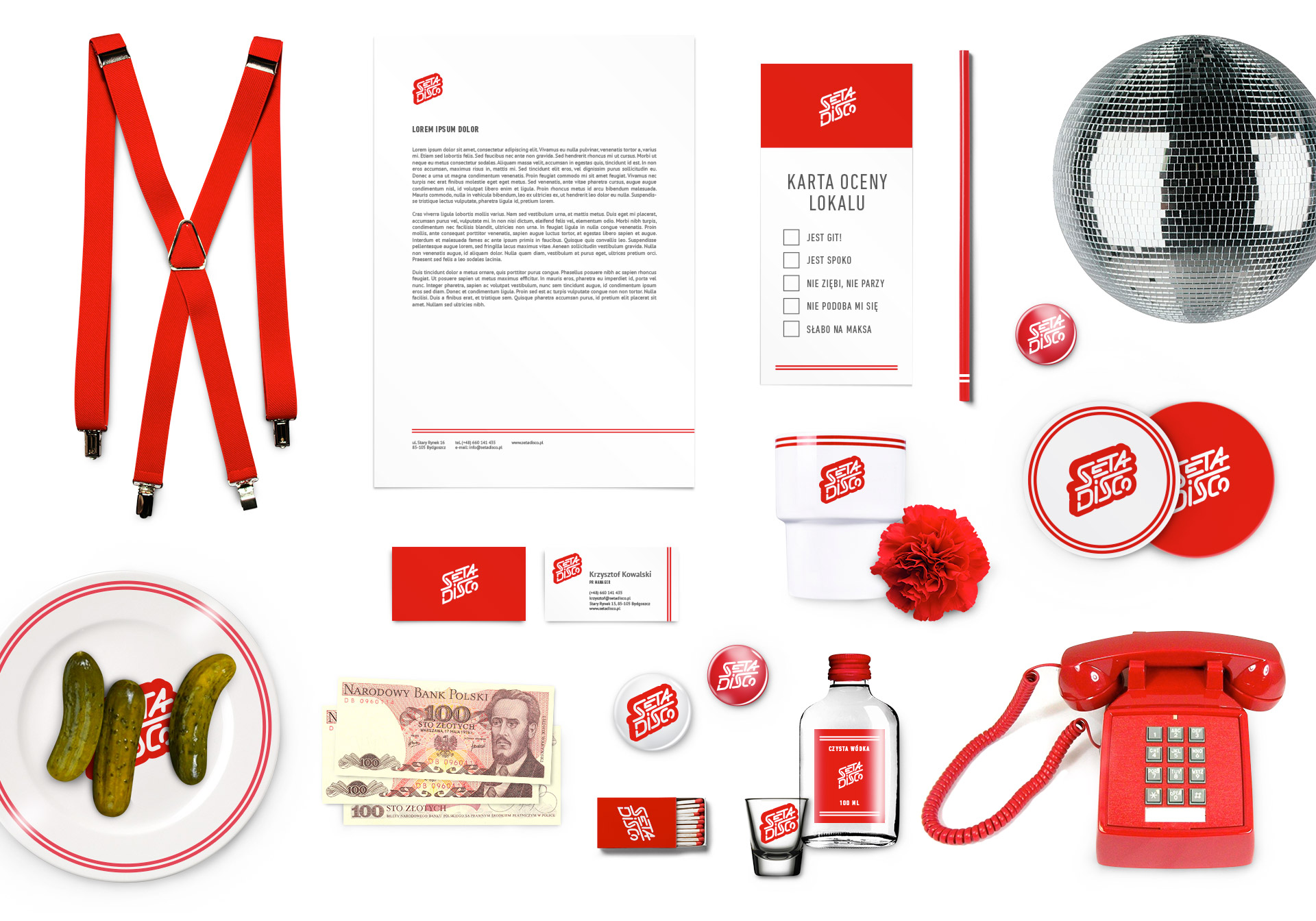
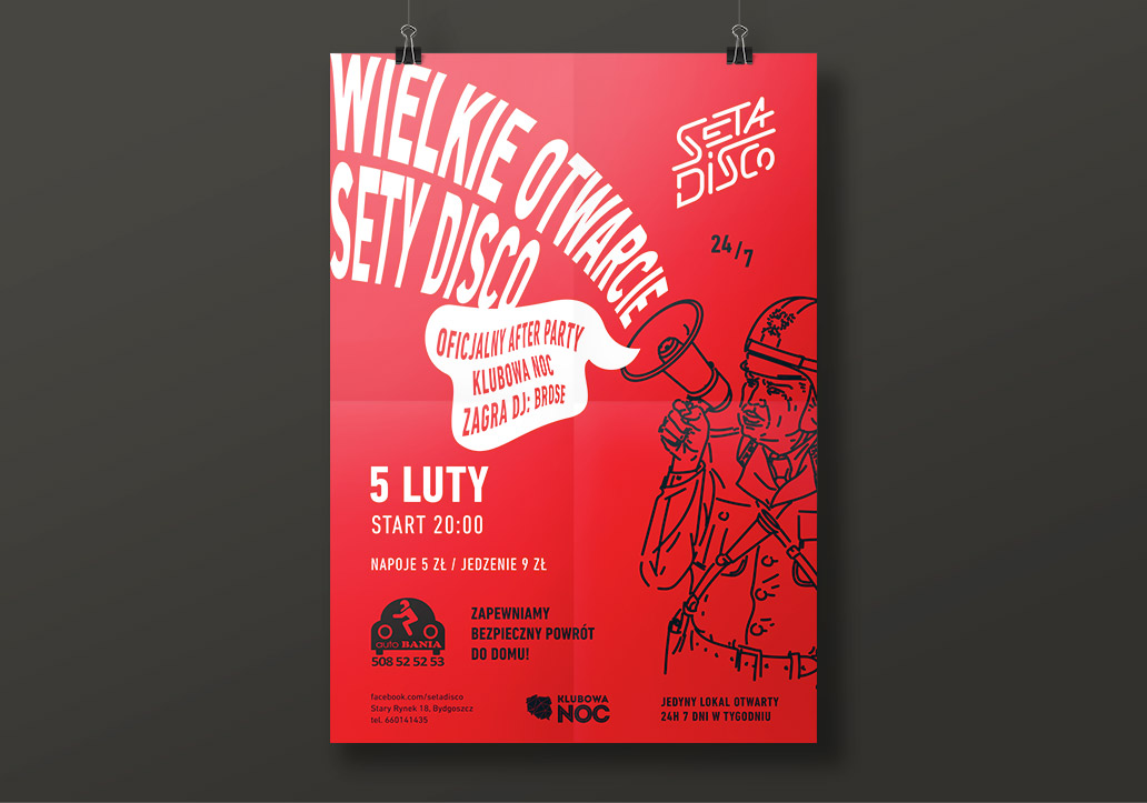
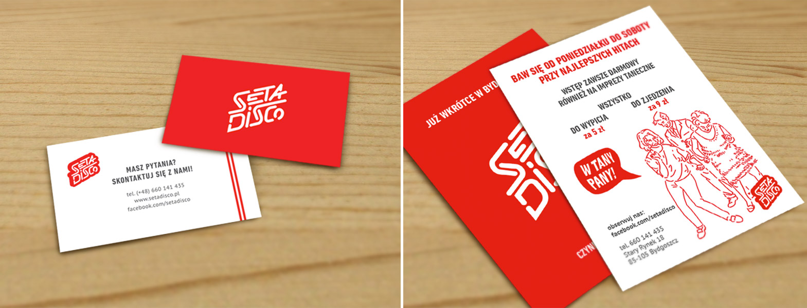
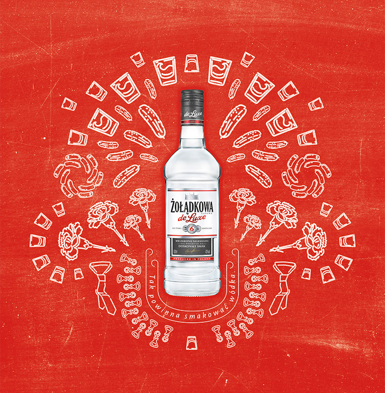
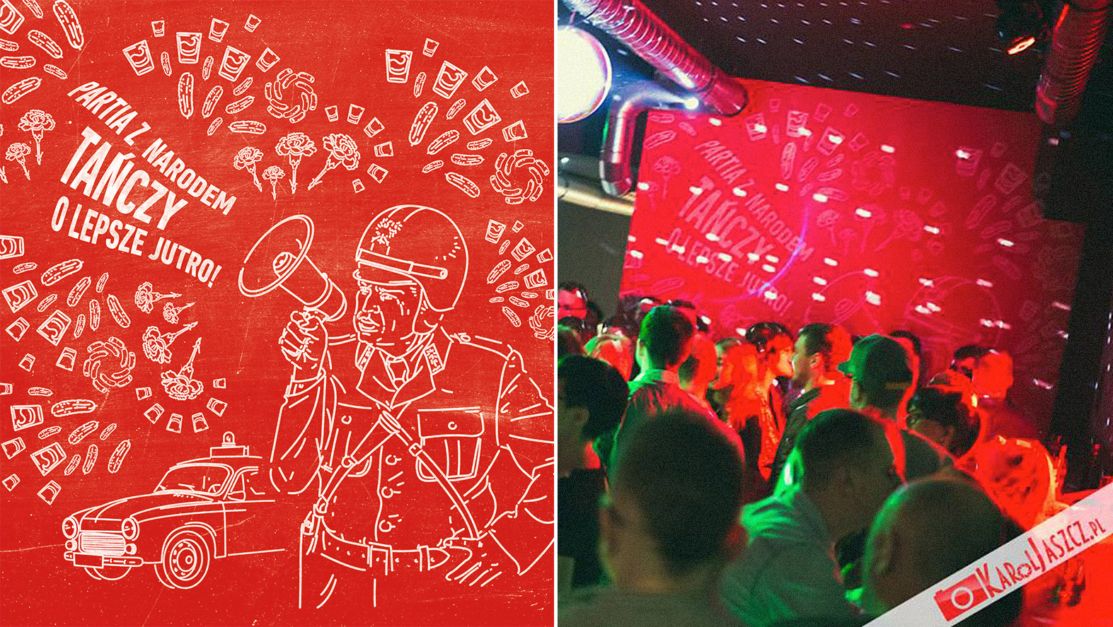
The ID of Seta Disco is built on dominant red colour, strong logo, and stripes. The PRL styled illustrations and readable, slightly condensed font make a supplement to the whole.

Attire and decor

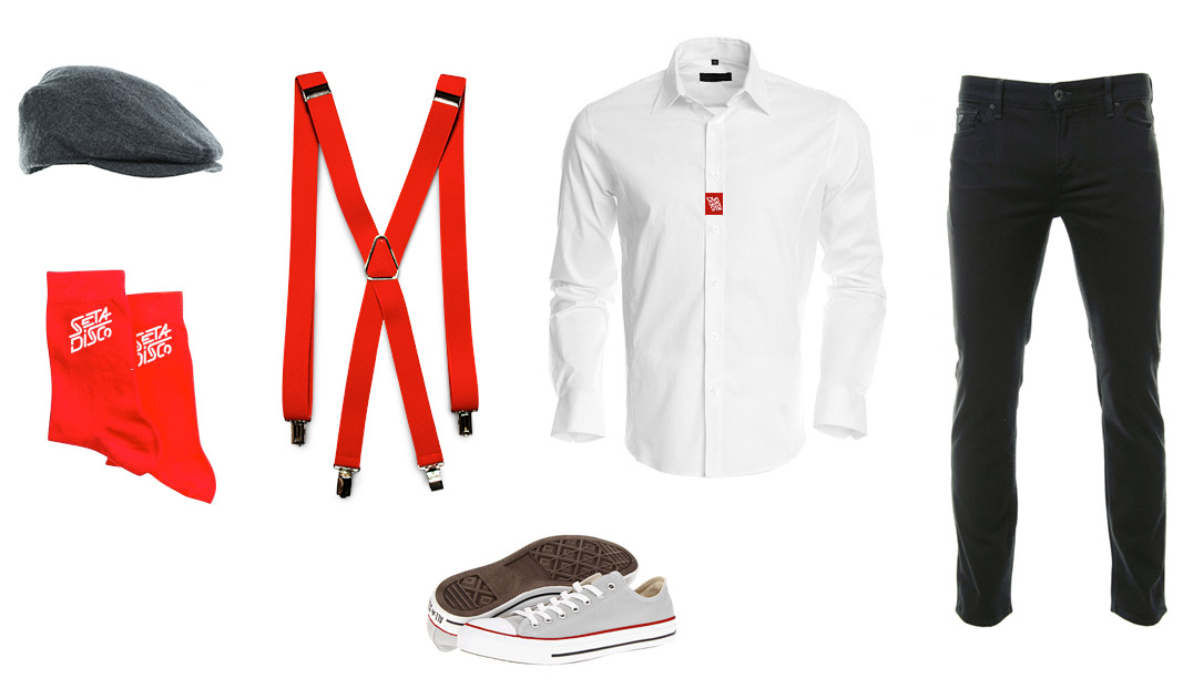
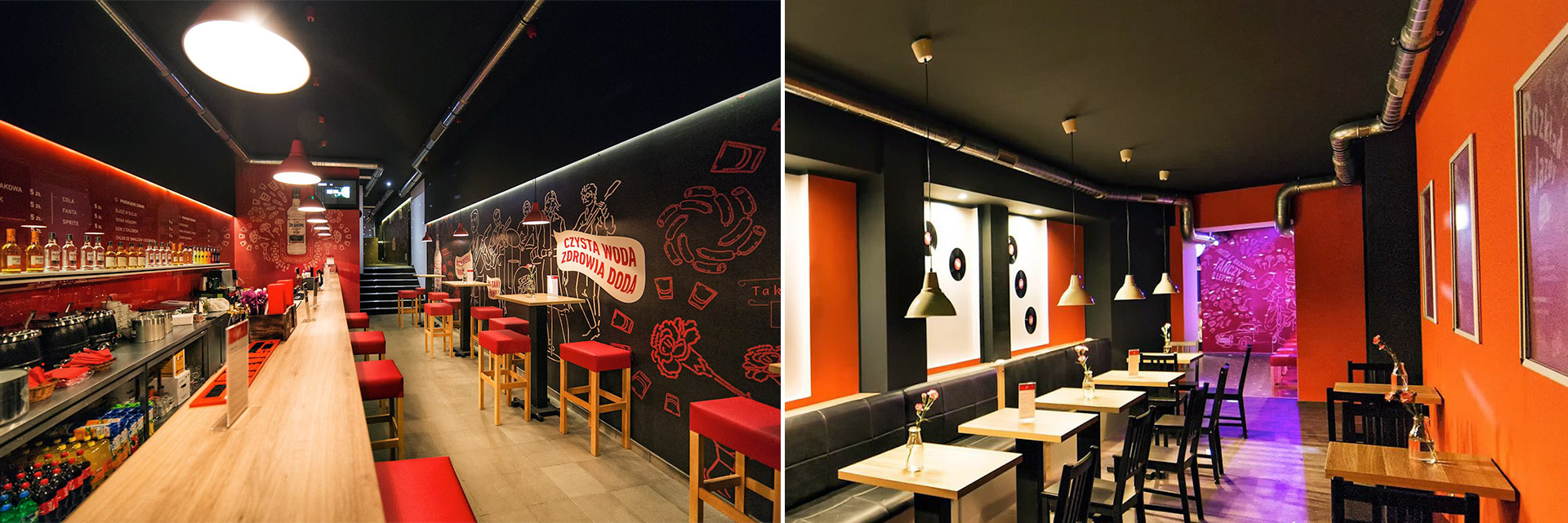
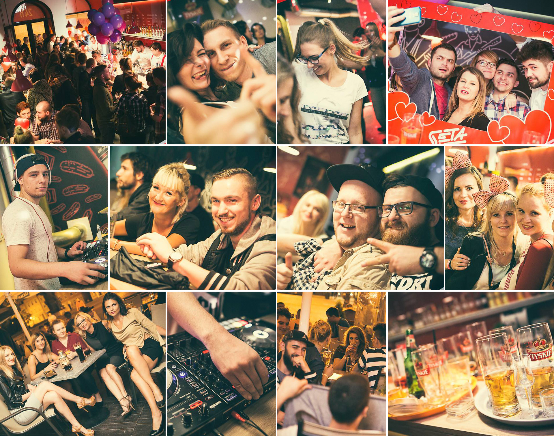
The interior means two colours – black and big apla red. Details are wood and glass on the walls. The service in order to stand out in such environment has been equipped in white shirts with embroidered logotype, red braces, and black trousers.

The interior of Seta Disco

The premises were established in an old town house in the city’s main square. High interior was lowered by painting the walls and ceiling black. Simple white menu was glued on a red lacobel. We had designed illustrations presenting stories from the PRL and prepared them in the form of large format wallpapers.

Seta Bistro

The popularity of the place made the owners to decide about expansion of the formula and creating younger sister of Seta Disco – Seta Bistro. The premises are kept in the same style, however, there is no dance floor there. The advantage, on the other hand, is great cuisine for great fun.

Do you like the project? Do you need help?
Write to us

Contact

Write or call us
to discuss your next project

(+48) 533 908 052

office@052b.com

Privacy policy