Identification
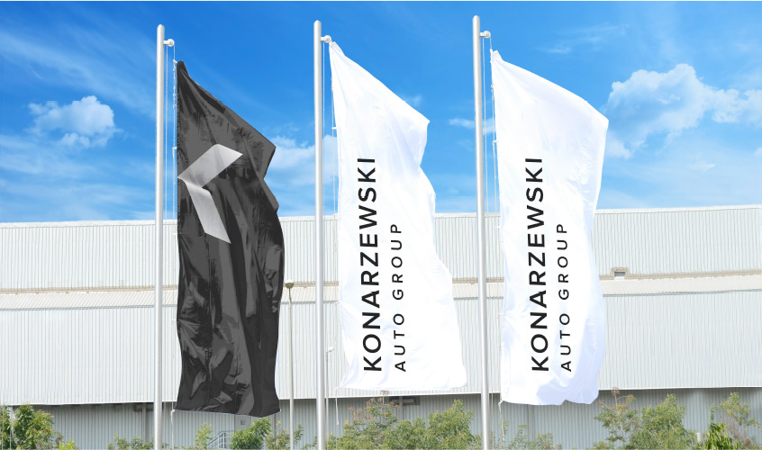
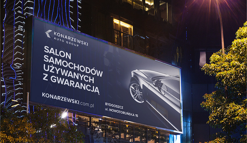
Brand identification was narrowed to its simplest form. Only elements necessary for correct message were kept. The very logotype in this case became main element of the KV.
Preparation of a website and basic promotional materials.
The task meant integration of the image of a seller who had been associated until that time with three car brands. What is more, his previous offer was broadened by premium class used car, which could result in undesirable image effect. The solution for that problem was a design of new logo for Konarzewski brand as an independent image thanks to new identification. Dynamic graphic element (being the initial at the same time) fits well into automotive profile of the seller, and chiaroscuro of the sign with light of typography gives it premium character.

Brand identification was narrowed to its simplest form. Only elements necessary for correct message were kept. The very logotype in this case became main element of the KV.
Strong contrasts between sections give certain dynamics and keep website’s arrangement in order. Please notice how monochrome colouring of the website allows to enhance other colouristic accents (cars, construction elements), and put them in front front of the viewer’s eye. The website is synchronized with promotional materials delivered by manufacturers.


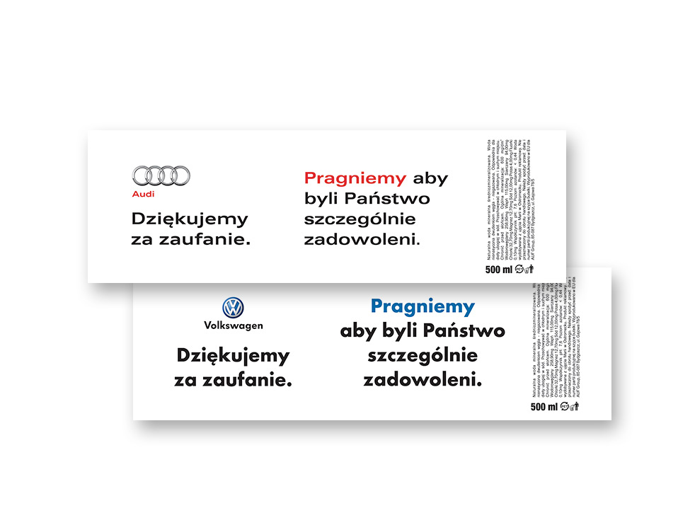
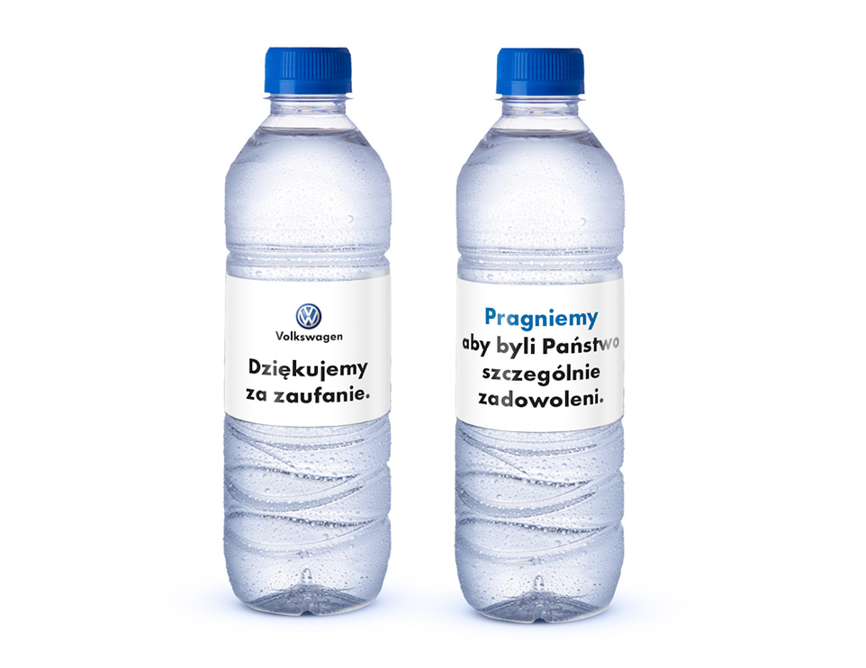
The seller also runs authorized service station within
scope of his operation. This is the reason for which there
were prepared special labels for bottles of water
for waiting clients.
