New identification of the AoM - focus on young people
Project of identification and the website of the Academy.

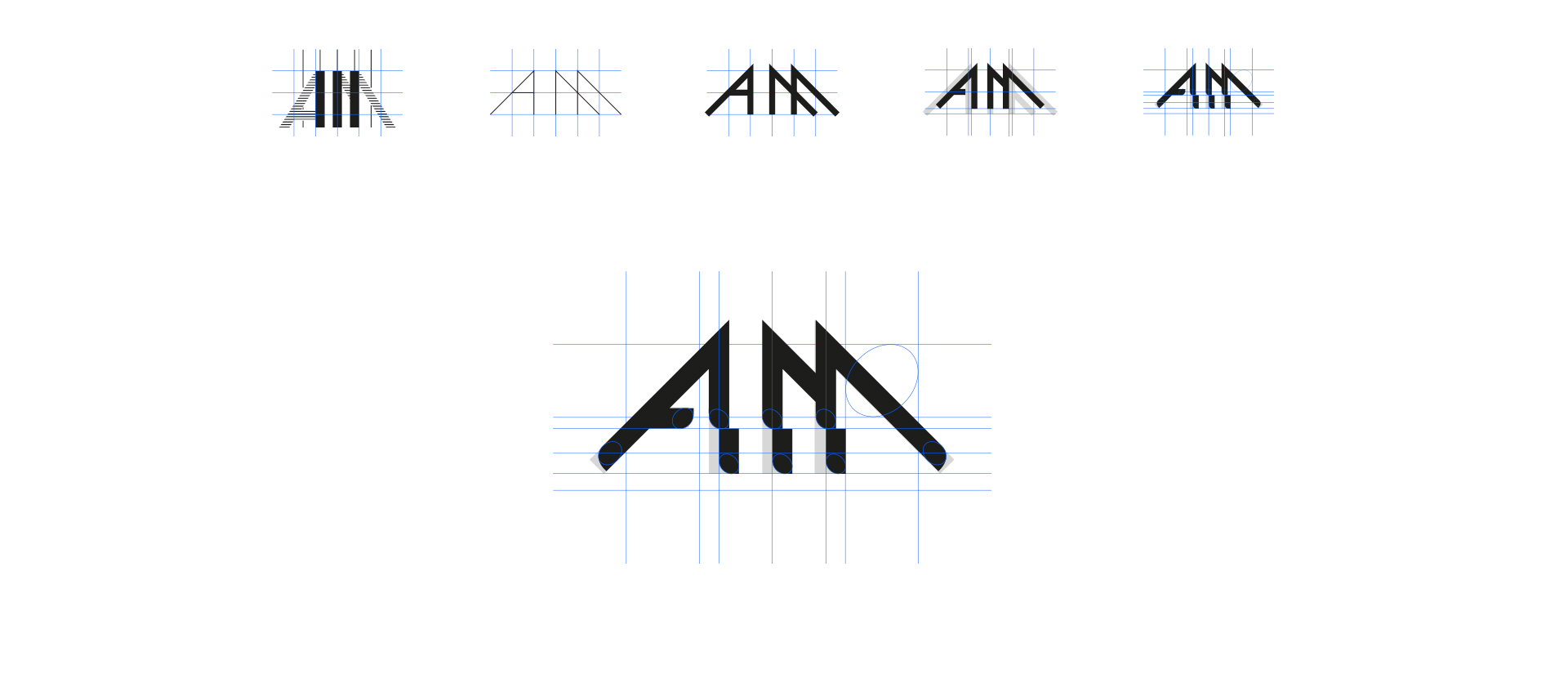
The creation of unified image of the brand requires from a designer to become familiar with the institution’s history, its achievements until now, character and method of teaching, current trends prevailing within given subject, and even architecture of the Academy. Thanks to such knowledge the designer can accurately define the aesthetics in which he or she will move while creating this new identification. New image called for re-designing of the logotype so it would match modern standards of graphic design, and selecting leading colour which would distinguish the school of Bydgoszcz from other schools in Poland. The next step was to determine full key visual of the brand by applying it on the basic printed materials and the website.
Colour


KV
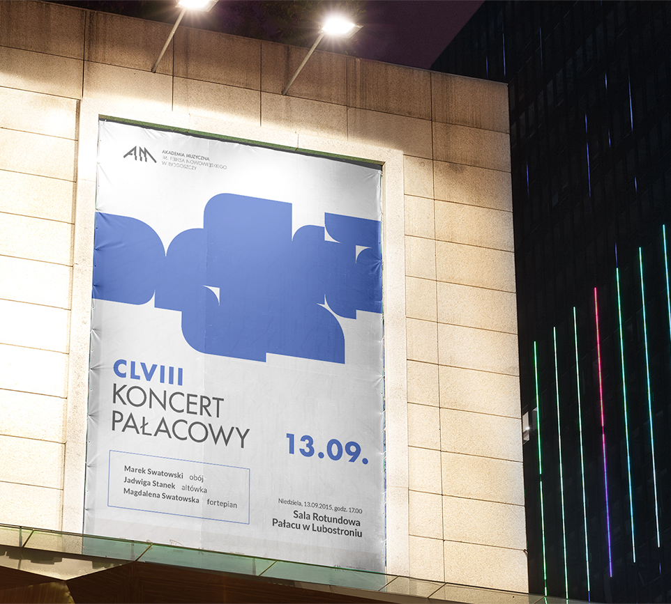
Taking into consideration the character of the Academy’s notion, which is sound, its image in a visual form should not dominate but only identify it in the international arena. A lot of “light” gives the composition a breath of air and lightness despite strong contrasts which, on the other hand, affect clarity so important in this project.
Architecture
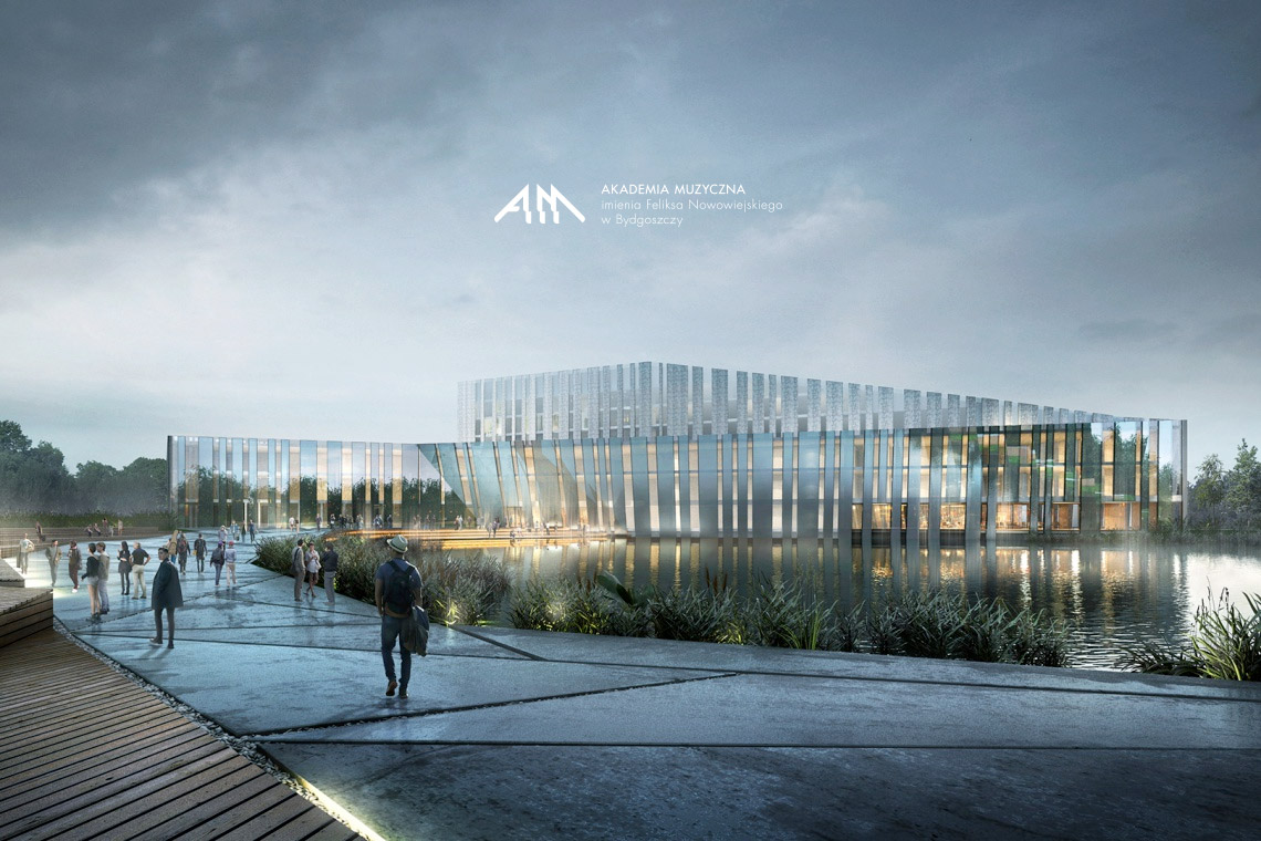
Academy’s new visual indentification makes no reference to current architectural assumptions of it’s buildings, because it was some kind of a nostalgic procedure. It’s role is to direct the image with a sense of perspective, considering development plans in 2020.


Integrity


