Design a logo that will ensure the success of your company

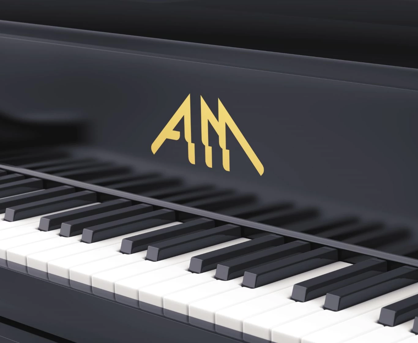
Not everyone can design the perfect logo. Although the final design often appears simple, the concept is in fact based on detailed and well-thought-out principles.
At first glance, designing a logo might seem straightforward. Take the Samsung or FedEx logos, for example – they’re very simple. However, you should be aware that behind a clear and recognisable logo there is usually a carefully thought-out, precise design. How do you design a good logo?
The knowledge required for design
I suppose knowledge of the subject matters in every field. Pushing boundaries or breaking the rules when creating unconventional projects isn’t a bad thing, but you need to know how to go about it. Taking a look at well-known and widely recognised projects helps you find your own path. First, familiarise yourself with what has already been created, so that you can then try to think outside the box and surprise people!
The simplicity of the logo
Think of any logo you like. Which brands spring to mind?
Consumers are surrounded by dozens, or even hundreds, of logos in their homes. Mobile phone brands, breakfast cereals, coffee, milk. The human brain takes in huge amounts of information every day! Simple logos are easier to remember.
Let’s now take a closer look at the logo of one of Bydgoszcz’s restaurants, which turns into a café-club in the evenings – XOXO. The name of the venue leaves room for interpretation and different pronunciations. The minimalist yet distinctive graphic motif emphasises the character of the place. The logo is not only memorable but also easy to use on POS materials (stickers, menus).
Find out more about the project for the XOXO club.
This straightforward solution ensures versatility and means you can use the logo in many different ways. And surely you want your customers to recognise your brand?
Accuracy
We’ve already touched on this a little whilst analysing the XOXO project. A logo must reflect the character of your business. For example, sports brands will evoke dynamism, competition and victory. The world-famous footwear brand Nike references the Greek goddess of victory in its logo. To be more precise, it references one of her wings – it is a simplified representation of it.
The reference to your field of work does not have to be direct. Getting to know your client is a key part of designing a logo. Conducting research will help you reach your target audience. This will enable you to create a message that will not only stick in your audience’s memory, but also set you apart from your competitors.
How do you design a timeless logo?
Logos are a bit like fashion. Trends come and go with the seasons. It’s not worth focusing 100 per cent on passing fads, because once they’re gone, you’ll be left with an outdated design. It’s better to opt for timeless, classic designs that can be refreshed as time goes by. The logo of a giant such as Coca-Cola has changed over the years, yet the brand’s core identity has remained unchanged. The Chanel logo is regarded as the epitome of a timeless classic. It is a symbol unique in the world of fashion, consisting of two Cs. It has remained virtually unchanged over the years. It appears on all the brand’s products. It symbolises class and prestige.
Źródło: http://www.kimono.pl/Magia-loga-POZNAJ-HISTORIE-SLYNNYCH-ZNACZKOW-g1227-12879
Recognisability
Remember: a logo should be consistent with the character of the brand it represents and easy to remember.
A good logo will be recognisable on a busy street or whilst travelling on a bus. When customers can easily recognise your company’s logo – you’ve made a success of it! You can use the tips above when designing your own logo. And if you’re looking for inspiration, do have a look at our portfolio.
Sources: D. Airey, *Logo Design Love: Design a Brilliant Logo!*, HELION, Gliwice 2010. P. Kliś, “A Brief History of the Birth of the Chanel Symbol”, http://intopassion.pl/krotka-historia-narodzin-symbolu-chanel; K. Wasilewski, “Where Did the Nike Logo Come From?”, http://mit.redblog.wspolczesna.pl/2009/12/30/skad-sie-wzielo-logo-nike/