New digital platform
for the Oko Never Sleeps Festival

Project summary:
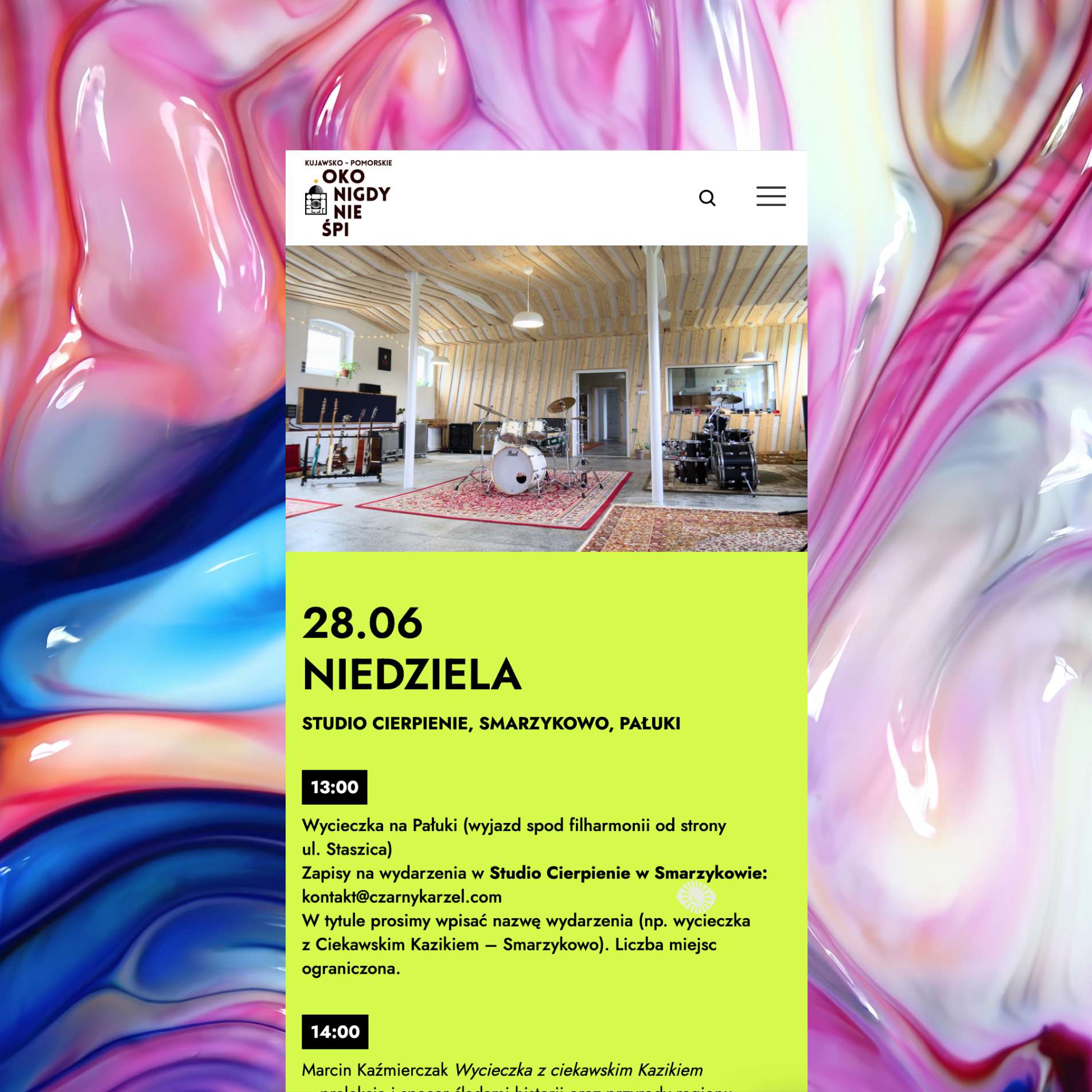
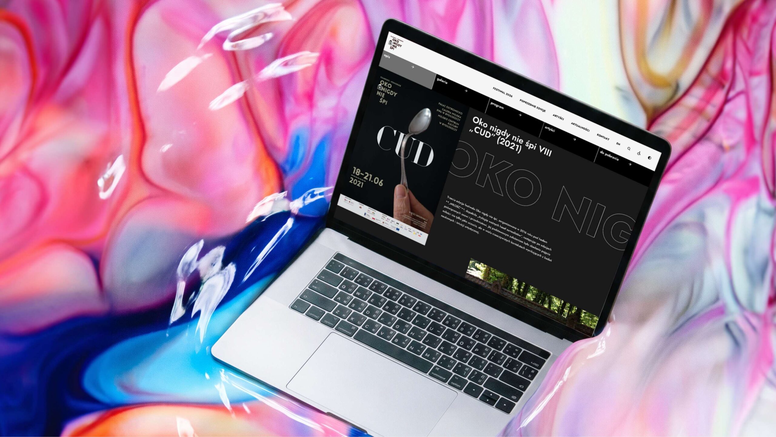
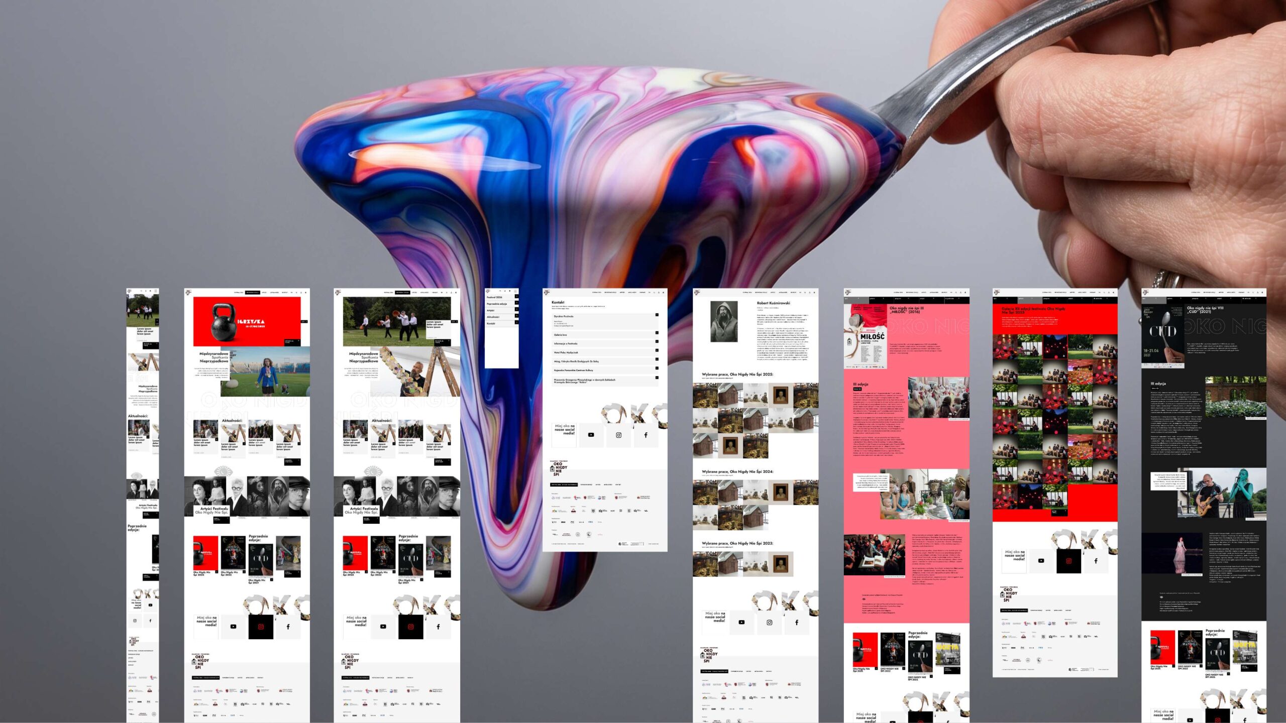
We designed a multi-purpose structure – rather than a single conversion path, we integrated brand building, education, documentation and community engagement into a cohesive website architecture.
We have integrated the archive with mobile functionality – we have created a permanent, well-organised archive of the festival’s editions, as well as a fully responsive website that automatically optimises new content for mobile devices.
We have implemented a flexible CMS – we have made it possible to change the colour scheme, typography and section layout for each edition of the festival, and we have also automated the import and assignment of artists to individual editions.
We took the festival’s non-commercial nature into account – when designing the website, we focused on promoting its educational reach and audience engagement rather than sales figures.
The challenge
Designing websites for cultural and artistic organisations involves a number of specific challenges. It is necessary to balance many equally important objectives – brand building, education, documenting achievements and community building – without a single, dominant conversion path that would simplify the design of the site’s structure.
Strategy and UX
An important aspect of the UX strategy for the ONNS Festival website is the need to combine up-to-date news with permanent archives – such as exhibition catalogues, biographies and event documentation – which must remain organised and accessible for years to come, making the site more akin to a digital library than a promotional website.
Project
Aesthetics often serve as a message in their own right, which encourages experimentation with typography, layout and animation, even at the expense of some standard usability; at the same time, the content is often narrative and extensive, making it harder to condense than sales messages.
Technology
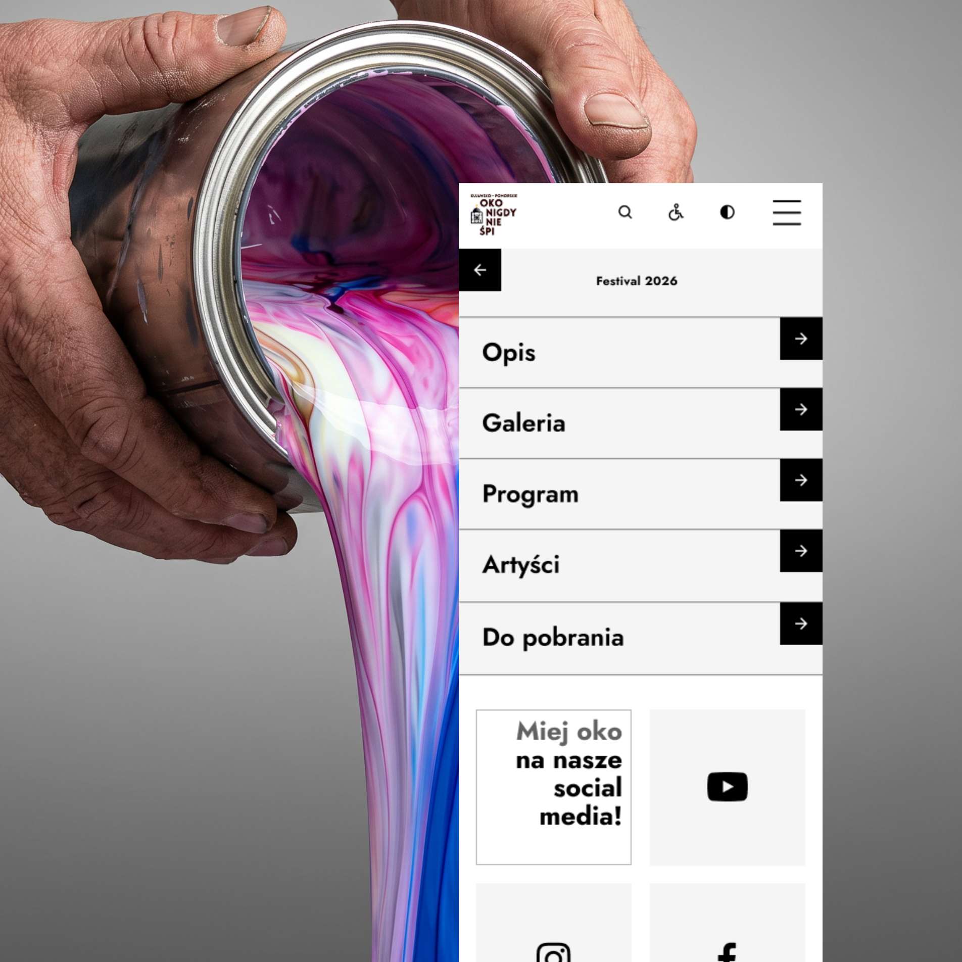
Given the nature of the festival taking place in many places within the city and outside the city and within the city and outside the city and within the city and outside the city and within the city and outside the city and within the city and outside the city and within the city and outside the city and within within the city limits and as well as outside the city, visitors must have constant access to information whilst travelling around. A very important for this reason optimisation for mobile devices has become a priority. All newly added content will be automatically optimised for various devices, so that over time the website works just as quickly.

Implementation
Populating the website with the data from the materials received required the use of appropriate tools to automate the import of artists and assign them to specific editions of the festival.
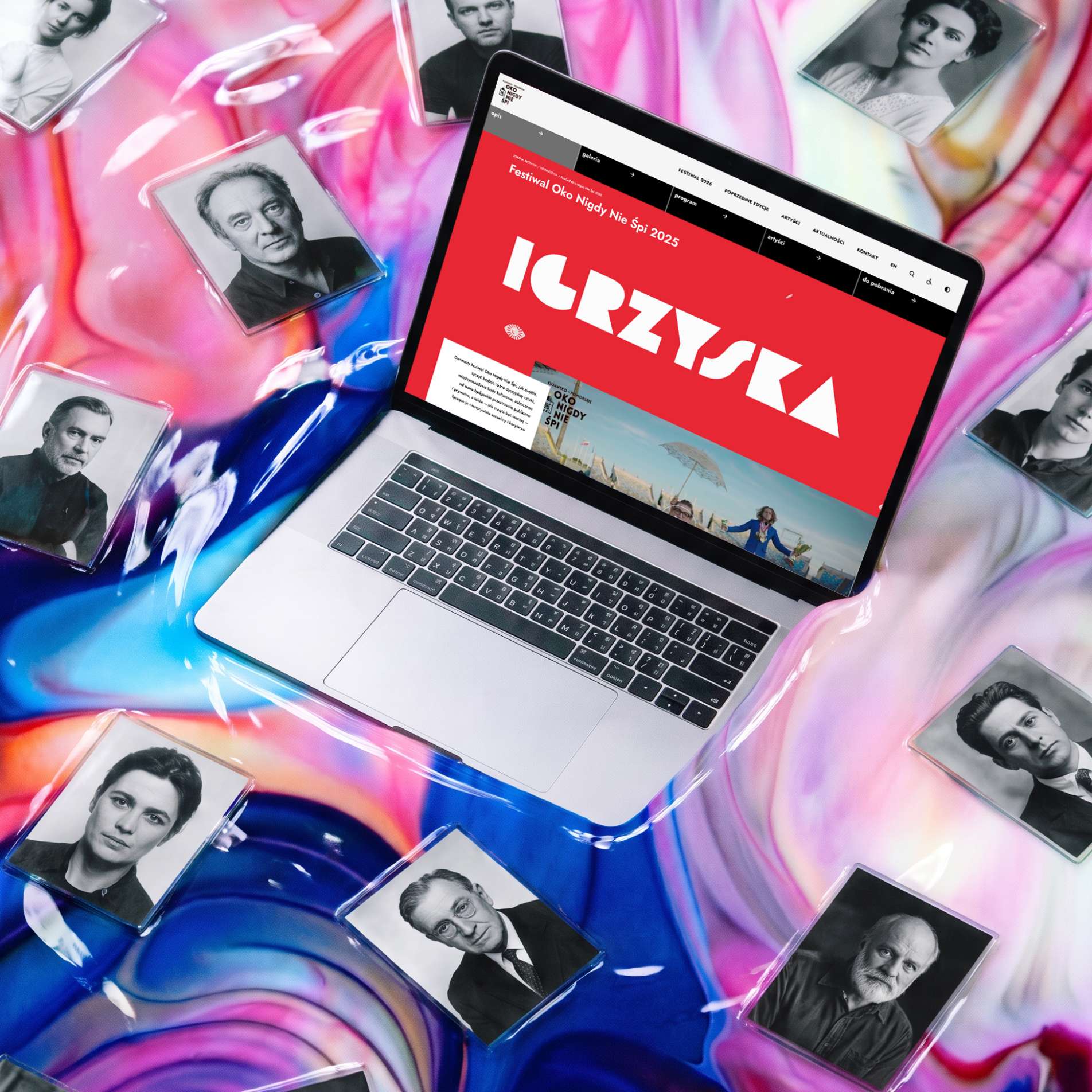
Each successive edition of the festival differs from the others in terms of its visual identity, and for this reason it became necessary to implement a CMS editor that allows changes to be made to the appearance of the subpages for the annual events. These options include changing the colour scheme, font, structure and the layout of the sections themselves.