


An eye-catching logo and visual identity that captures the audience’s attention


Project summary:
Preparation of a visual identity project.
Design of a logo and brand identity guide.
Designing patterns for commercial print materials.
Project objectives
Our task was to develop a comprehensive andvisual identity for Skillfy – a mobile app of the marketplace type, which enables users develop their knowledge and skills in soft skills across various fields.
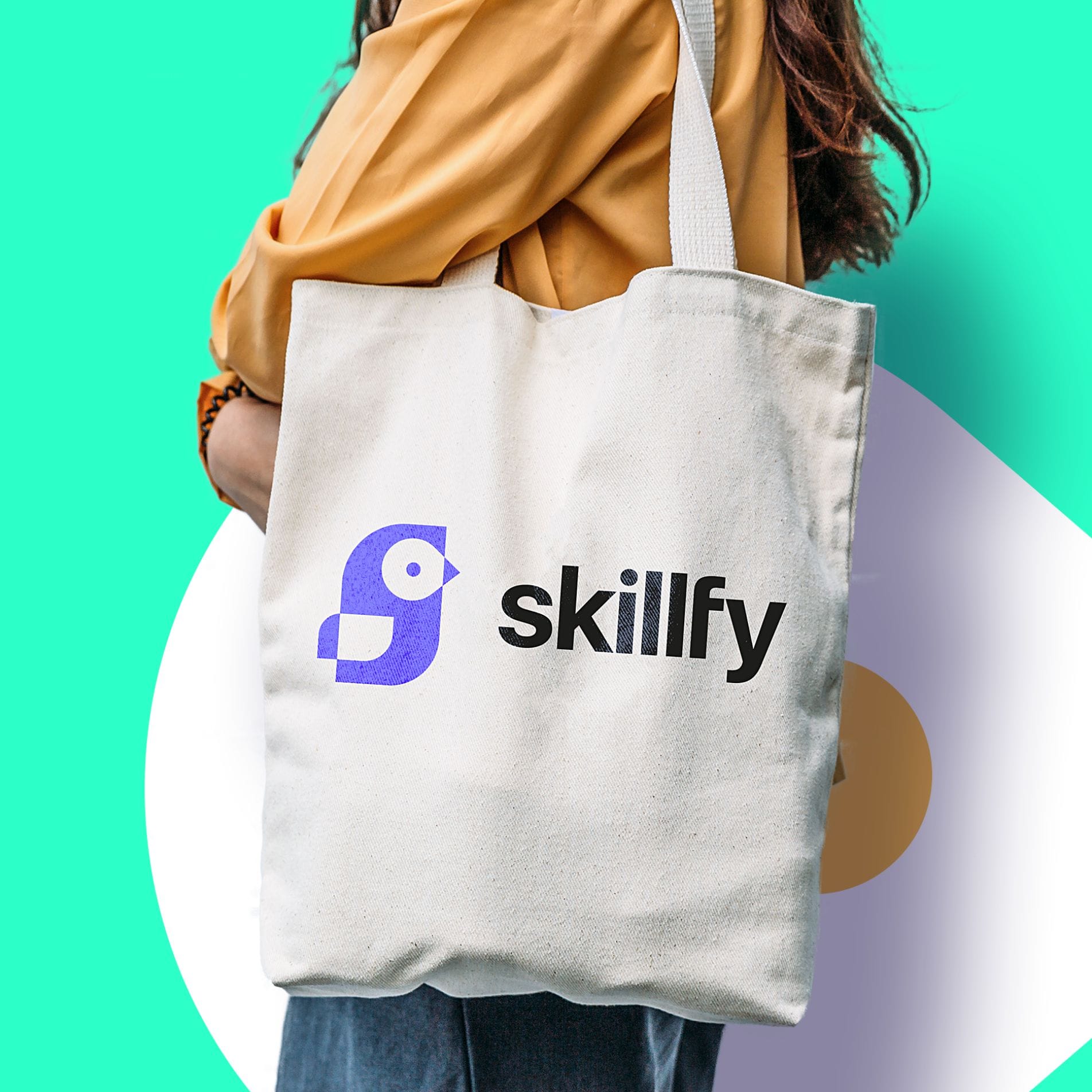
The project involved planning the colour scheme, the creation of a key visual, a logo and materials for promotional items.
How do we create a logo?
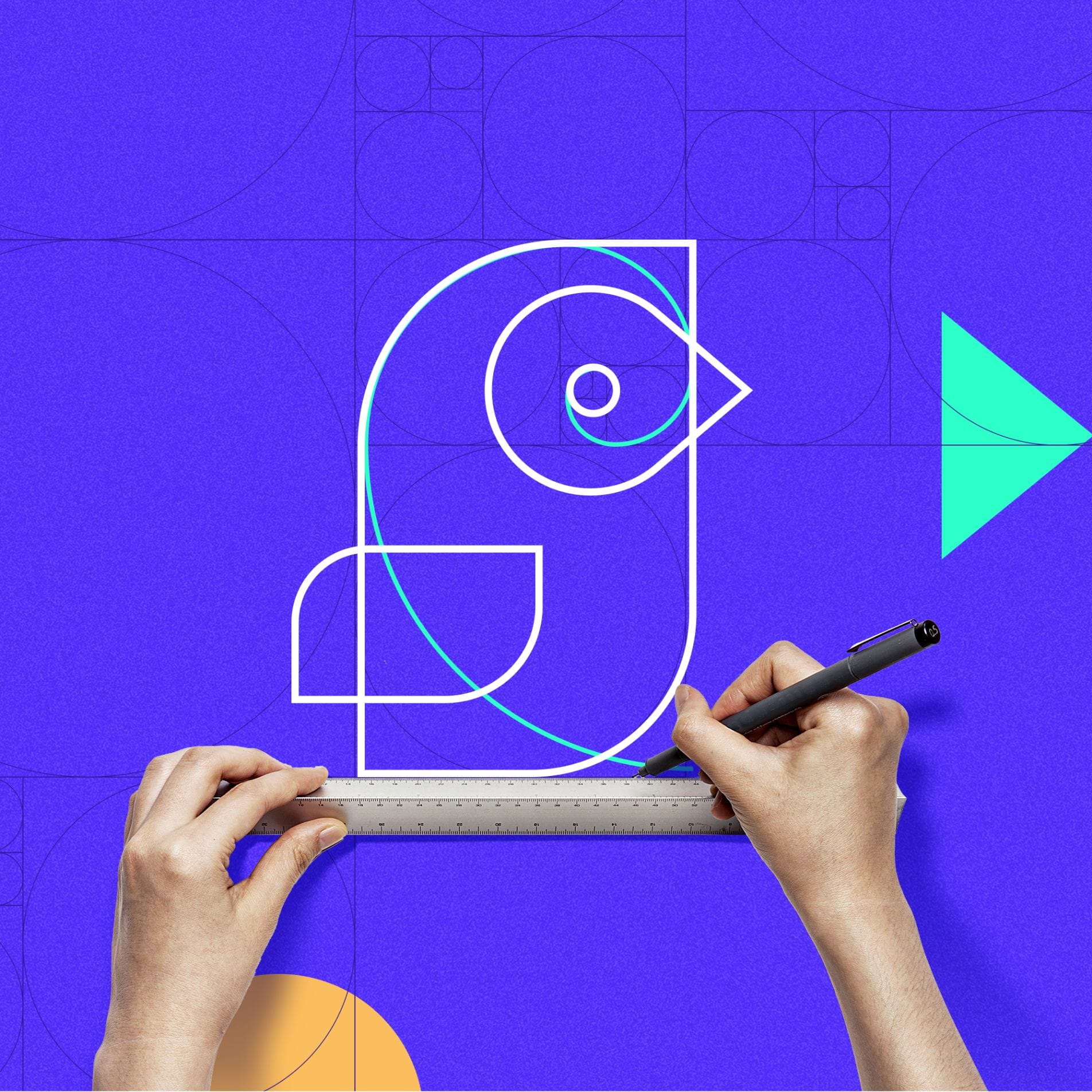
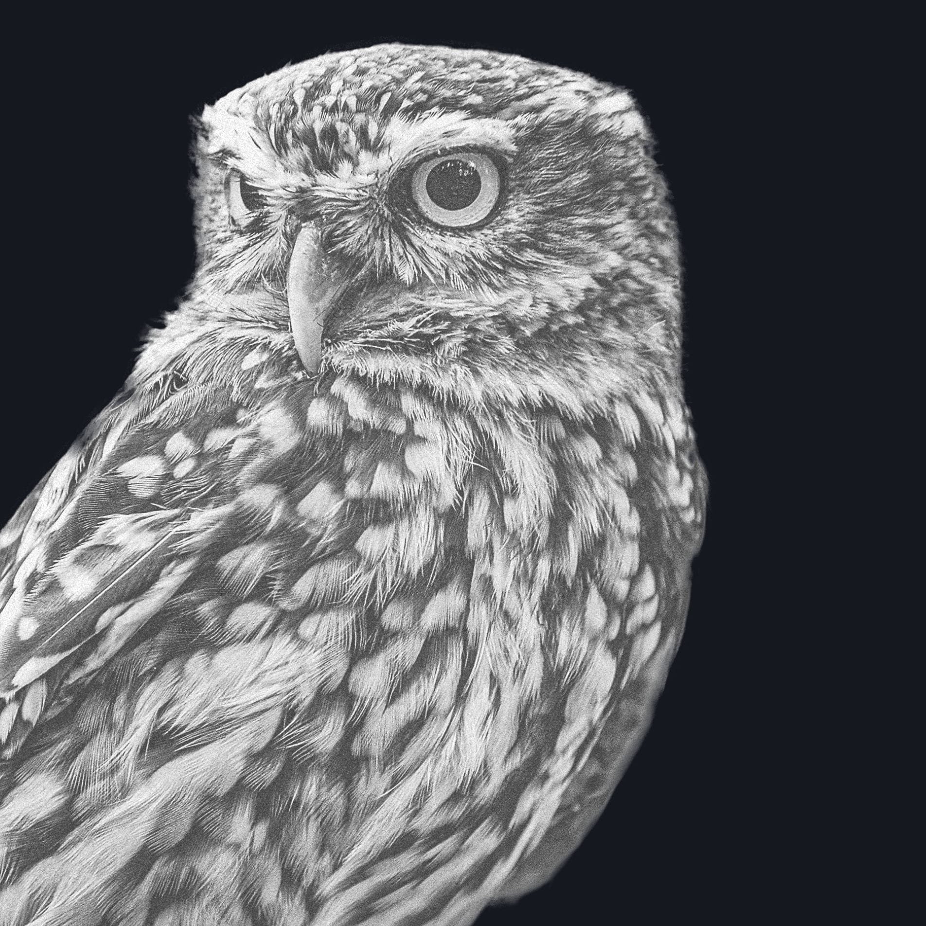
When creating a logo, we always start with a storm of ideas and developing a concept, in accordance with which we will proceed. Wisdom and the acquisition of knowledge are associated with the owl, which is why we have chosen it as the theme of the project.
We designed the logo based on the principle of the golden ratio, emphasising at the same time the simplified and geometrised physical features of the owl.
The symbolism of the logo
The nature of the app determined its visual design. Skillfy is a versatile piece of software for everyone, which is why our logo embodies the versatility the client was looking for.
A universal approach
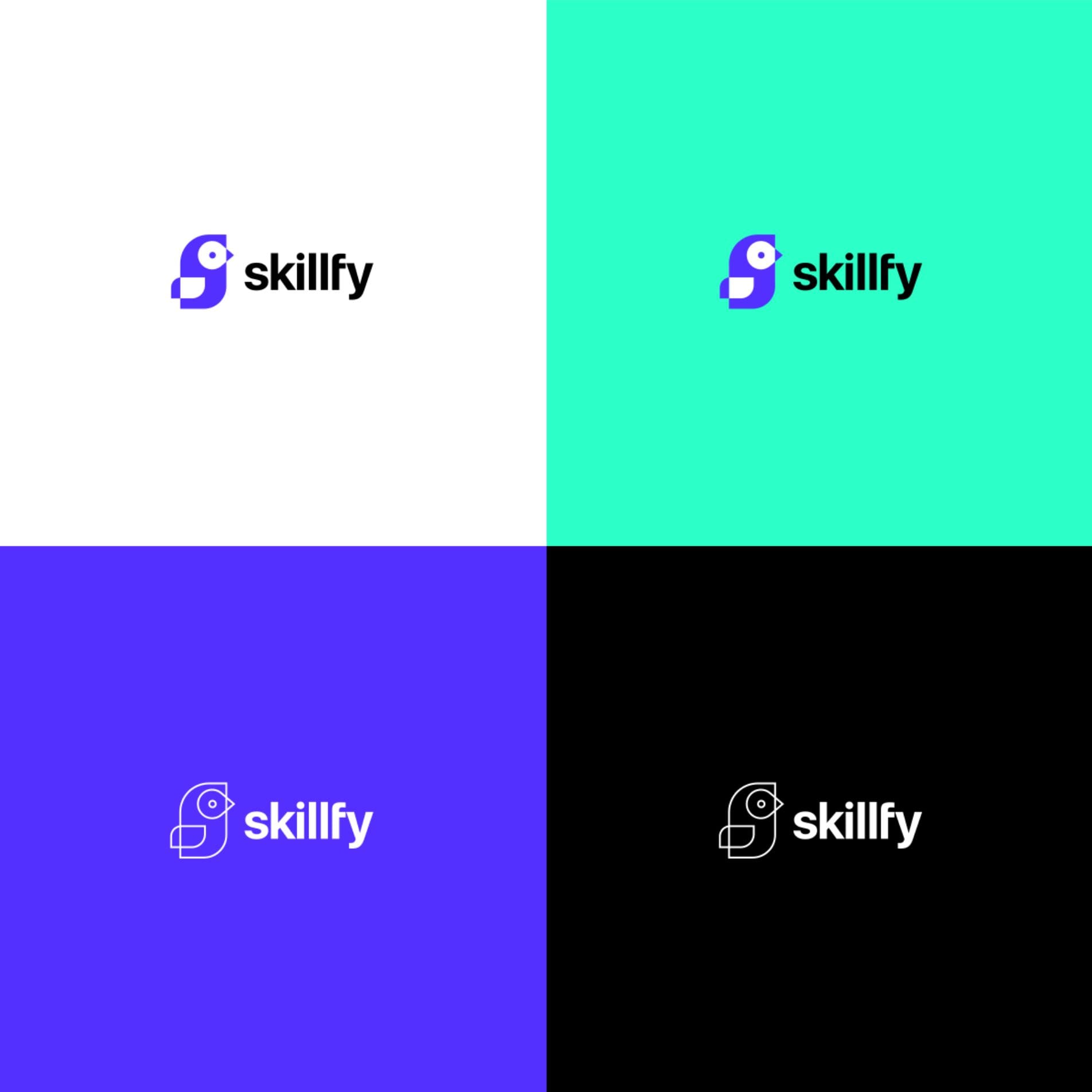
We designed the logo in such a way that the emblem itself could be used as the icon for the mobile app. Furthermore, to emphasise the logo’s connection to the brand, we arranged the animal’s silhouette to resemble the letter S, which is the initial of Skillfy.
Legibility and clear association are the most important features of a good logo. We have included a basic version with a blue graphic element and black typography, ensuring that the logo maintains a clear contrast and good legibility.
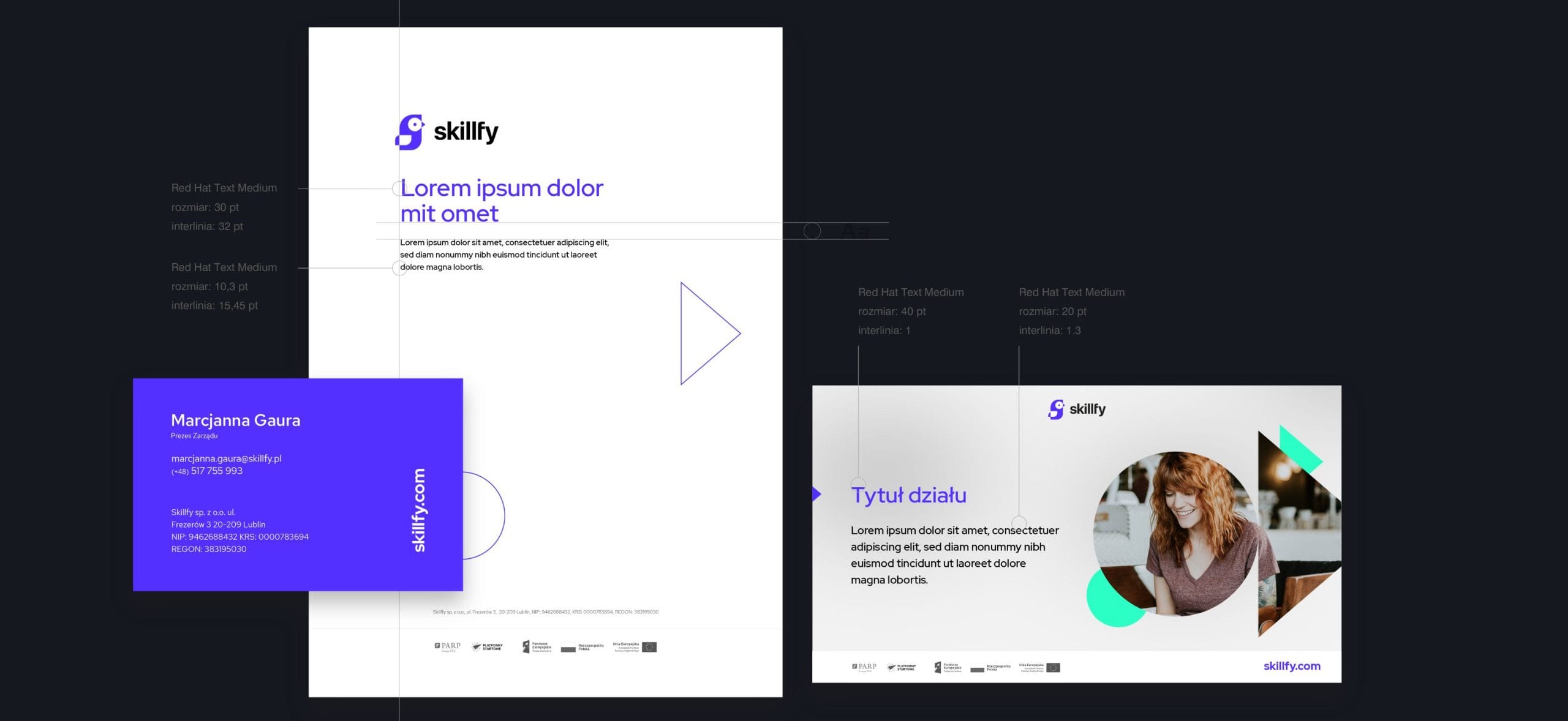
Commercial printing materials
As part of our project for Skillfy, we designed a range of corporate stationery, including a business card, letterhead and a template for a multimedia presentation. This will ensure that the company maintains a consistent visual identity.