


Telephony mobile for superheroes

Project summary:
We have created a key visual for the brand.
We have created a logo based on the name.
We have prepared some additional materials – a SIM card template.
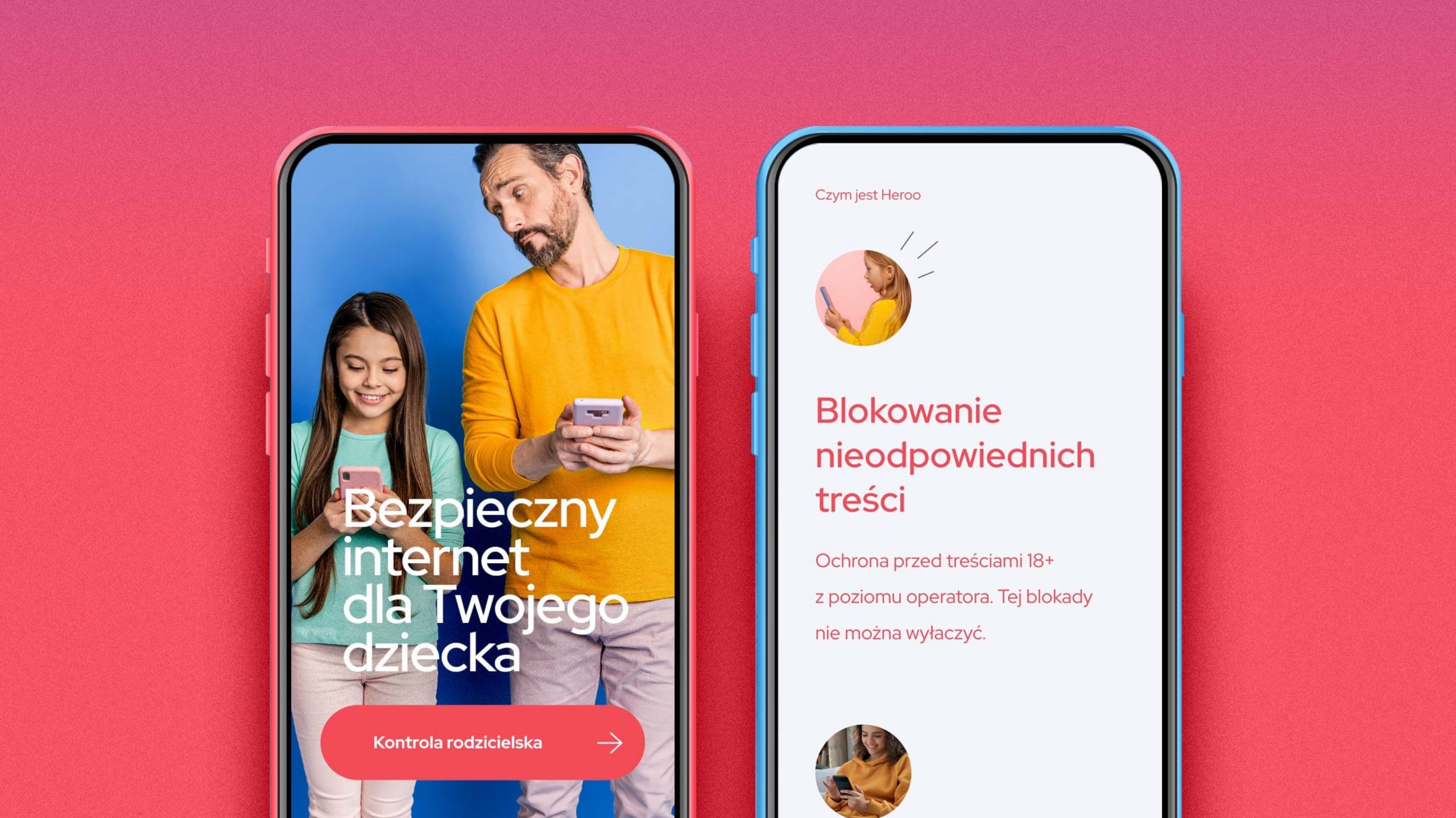
The end result was a visually appealing microsite.
Project objectives
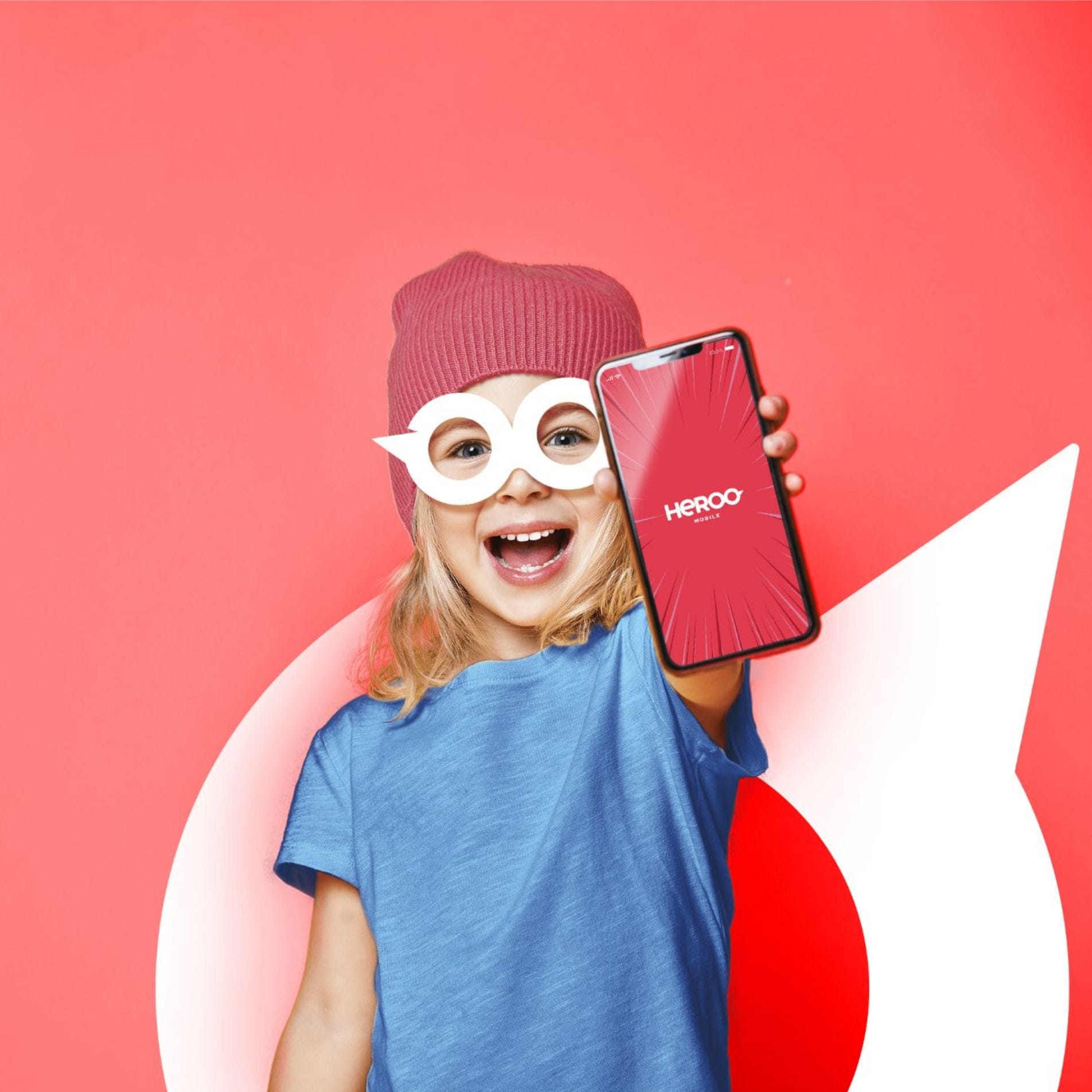
The name of the telecom network set the direction for our work. We wanted our branding to emphasise that ‘hero’ means ‘superhero’, which is why the proposed logo features a graphic reference to this.
Define a customer
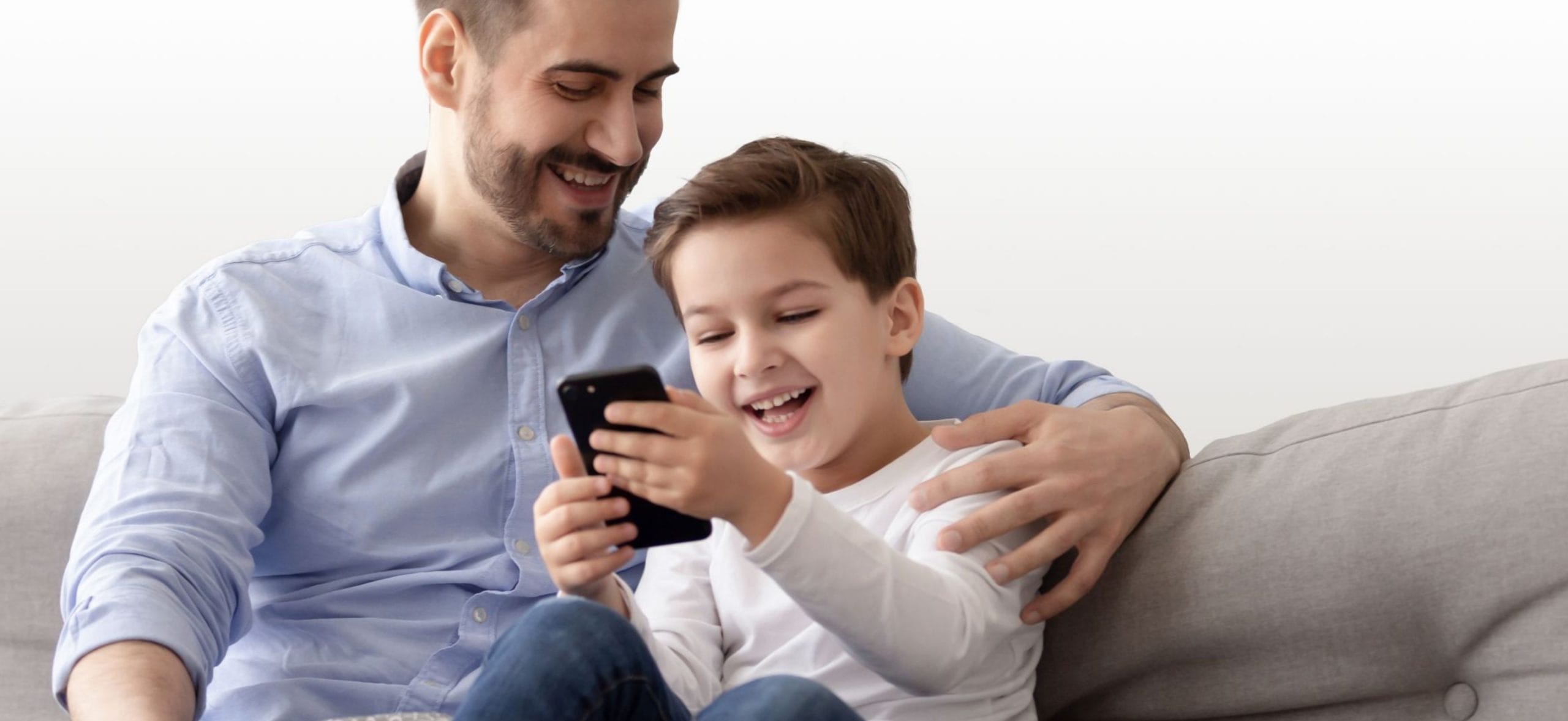
We have developed the branding for Heroo Mobile – Poland’s first mobile phone network designed specifically for children. We began the project by holding discussions with the client, during which we gained an understanding of the target audience and the brand’s strategy.
Universal key visual
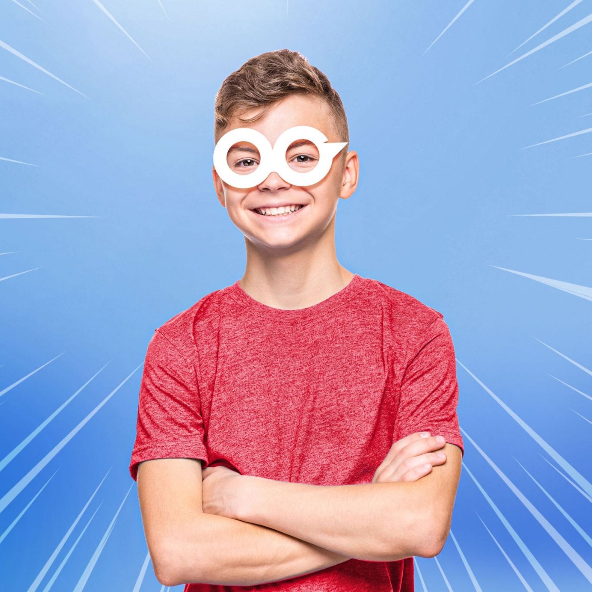
The biggest challenge was to create a visual identity that would meet the needs of both parents and children – the end users of the mobile network. Furthermore, the client wanted the Heroo Mobile brand to ‘grow’ alongside the user, so we ensured that the result of our work was a mature yet child-friendly brand identity.
An eye-catching logo
We have ensured that the logo designed for Heroo Mobile is legible and evokes clear associations. We have created two colour variants – white and red. In both cases, the logo maintains a safe contrast and is clearly visible.
When designing the logo, we opted for minimalism. This ensures that the logo is scalable and looks good even when significantly reduced or enlarged.

The hidden meaning of the logo
The letters ‘OO’ are joined together and resemble the classic masks worn by superheroes in comic books. Furthermore, shades of red dominate, which are the hallmark of many famous comic book heroes.
Consistency of identification
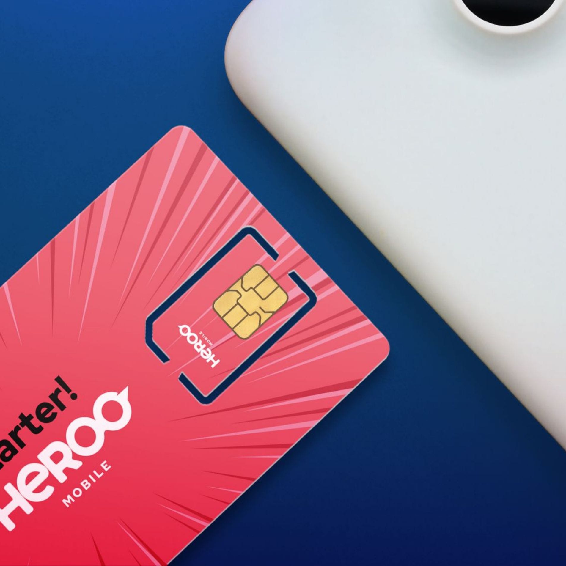
As part of our collaboration with Heroo Mobile, we also designed a range of corporate stationery, including business cards, letterhead and an email footer, as well as a SIM card design in line with the brand identity.
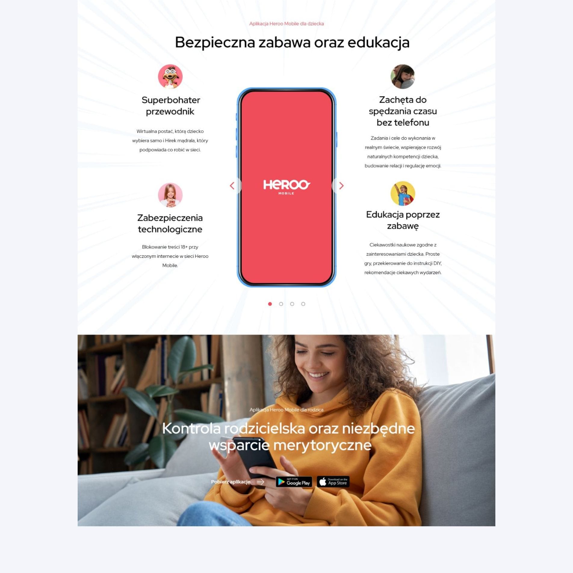
Modern microsite
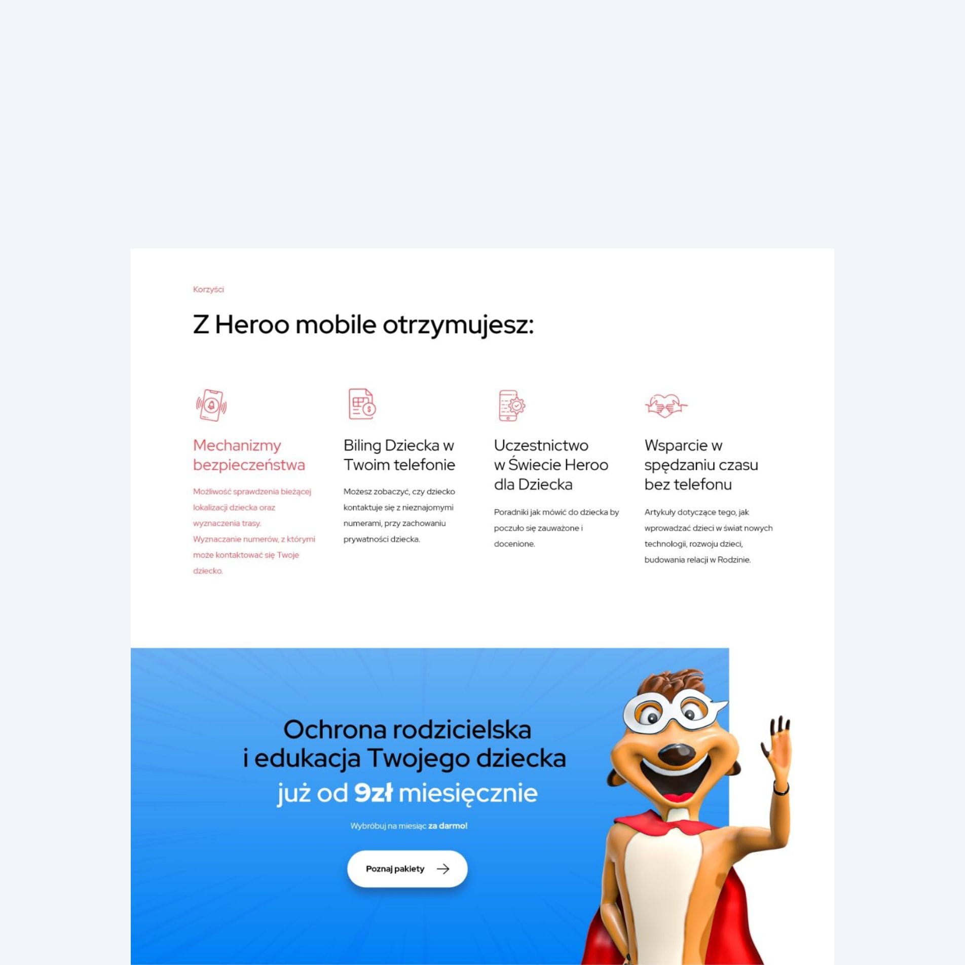
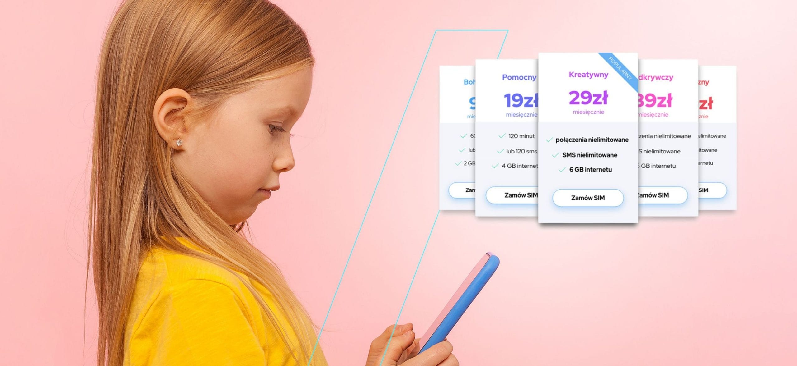
As part of the project, we designed and launched a landing page for Heroo Mobile, which fits in with the modern and vibrant key visual of the brand. The website is designed to present the offering, as well as also to build a connection with the audience through through the blog that exists within the framework of the website.