


Rebranding of a jewellery brand and catalogue of products

Project summary:
We have carried out a rebranding of thejewellery brand
We have designed a product catalogue intended for both print and online presentation
We carried out styling shoots featuring the brand’s products
Project objectives
The client approached us as Virago. They wanted to improve their image and present the brand as a Polish company with a long tradition. Thanks to our efforts, Filipowicz Jewellers can now boast a new brand identity resulting from a complete rebranding.
Solution
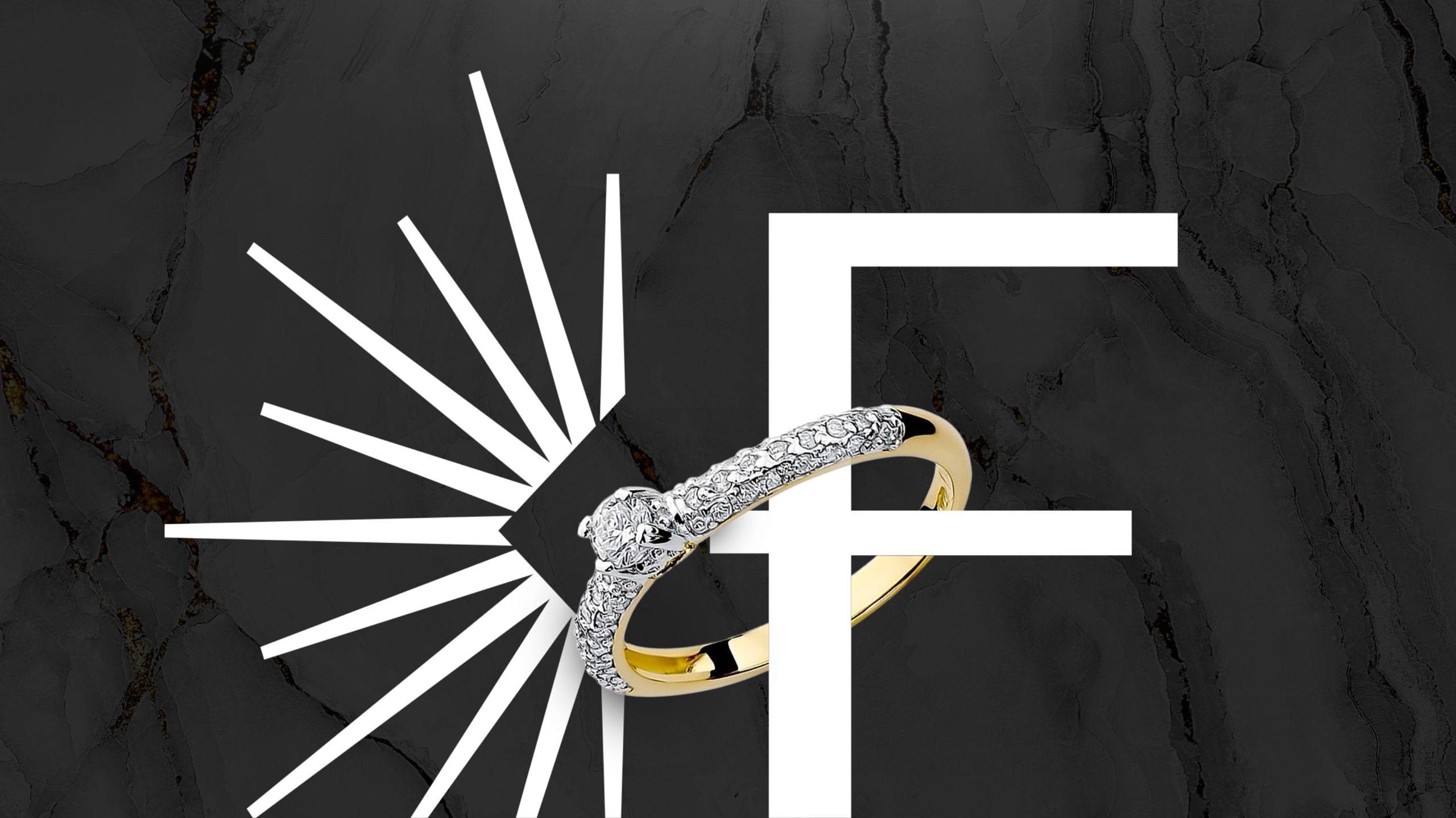
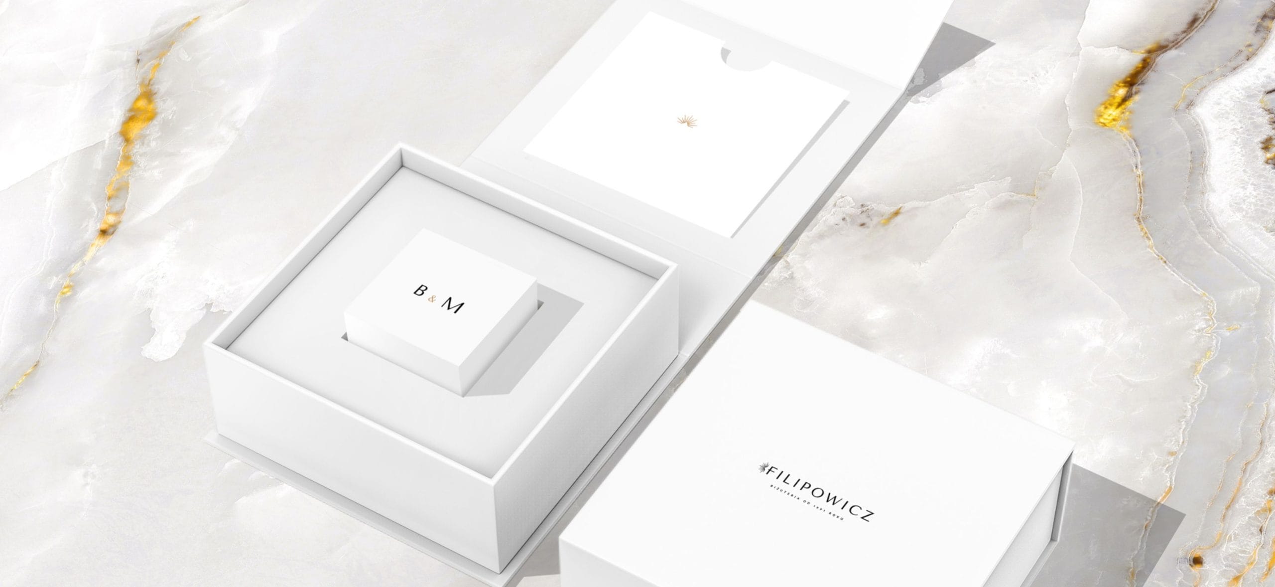
We have designed a new brand identity for a Polish jeweller. We have used white, black and gold accents. This has given the brand an elegant feel. The key visual now evokes the emotions associated with engagements and weddings.
Branding
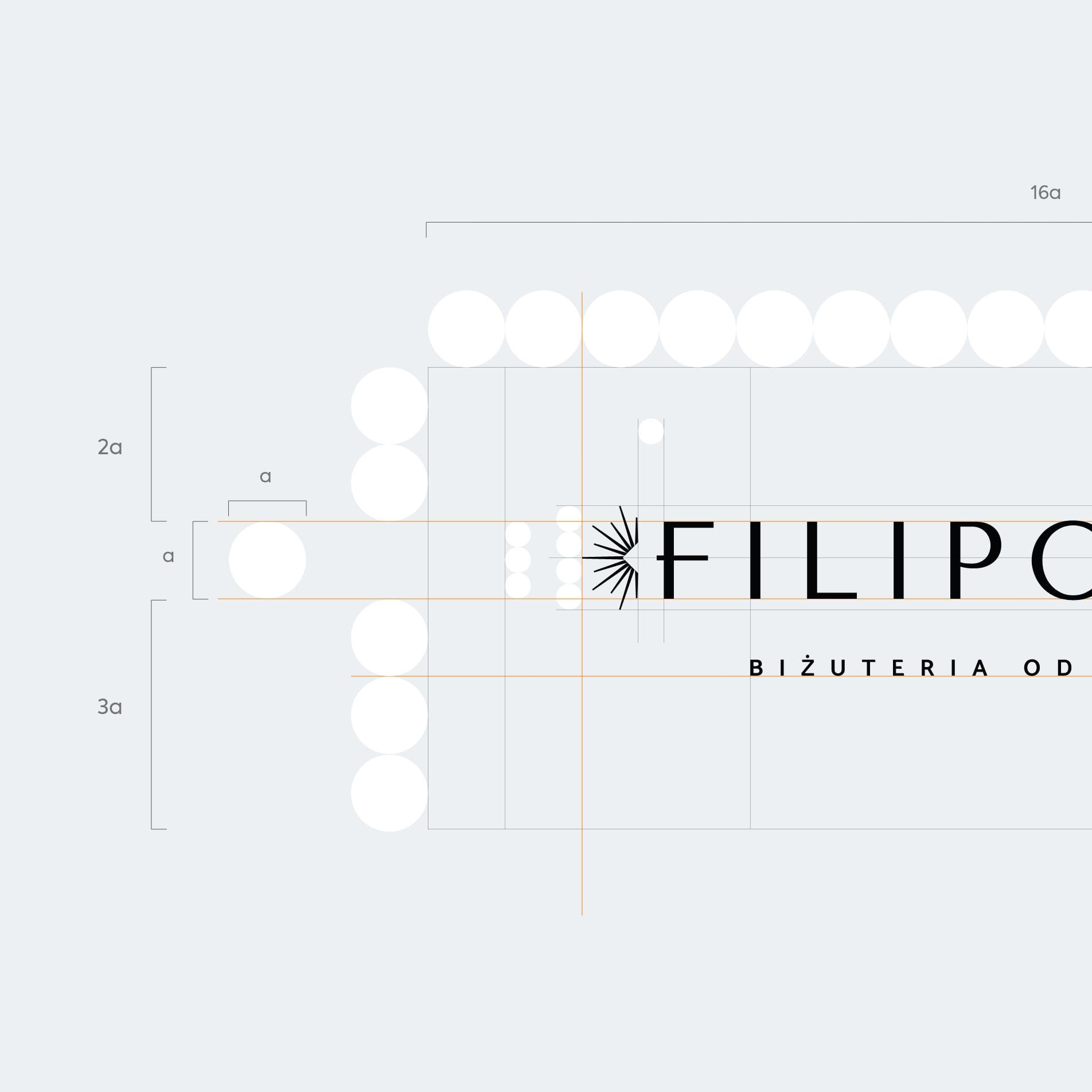
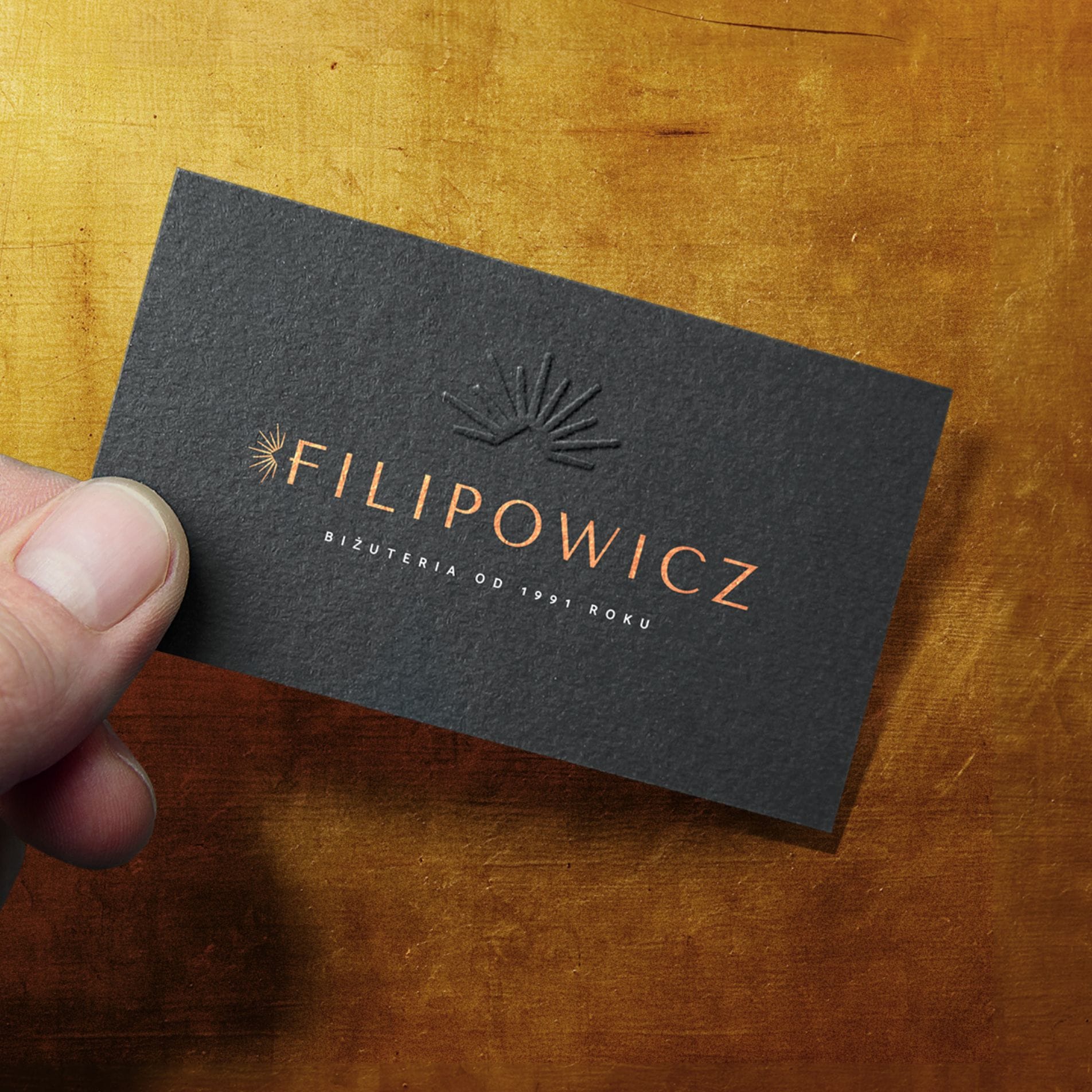
We began our work by preparing several logo designs. Ultimately, the client chose a sans-serif typeface for the logotype, accented by a symbol resembling the sparkle of a diamond. We rounded off the design with a tagline emphasising the brand’s traditions.
The new logo looks good against both a white and a black background. Its simplified version consists of the letter ‘F’ accompanied by the symbol, which can be used on its own.
Catalogue of wedding rings
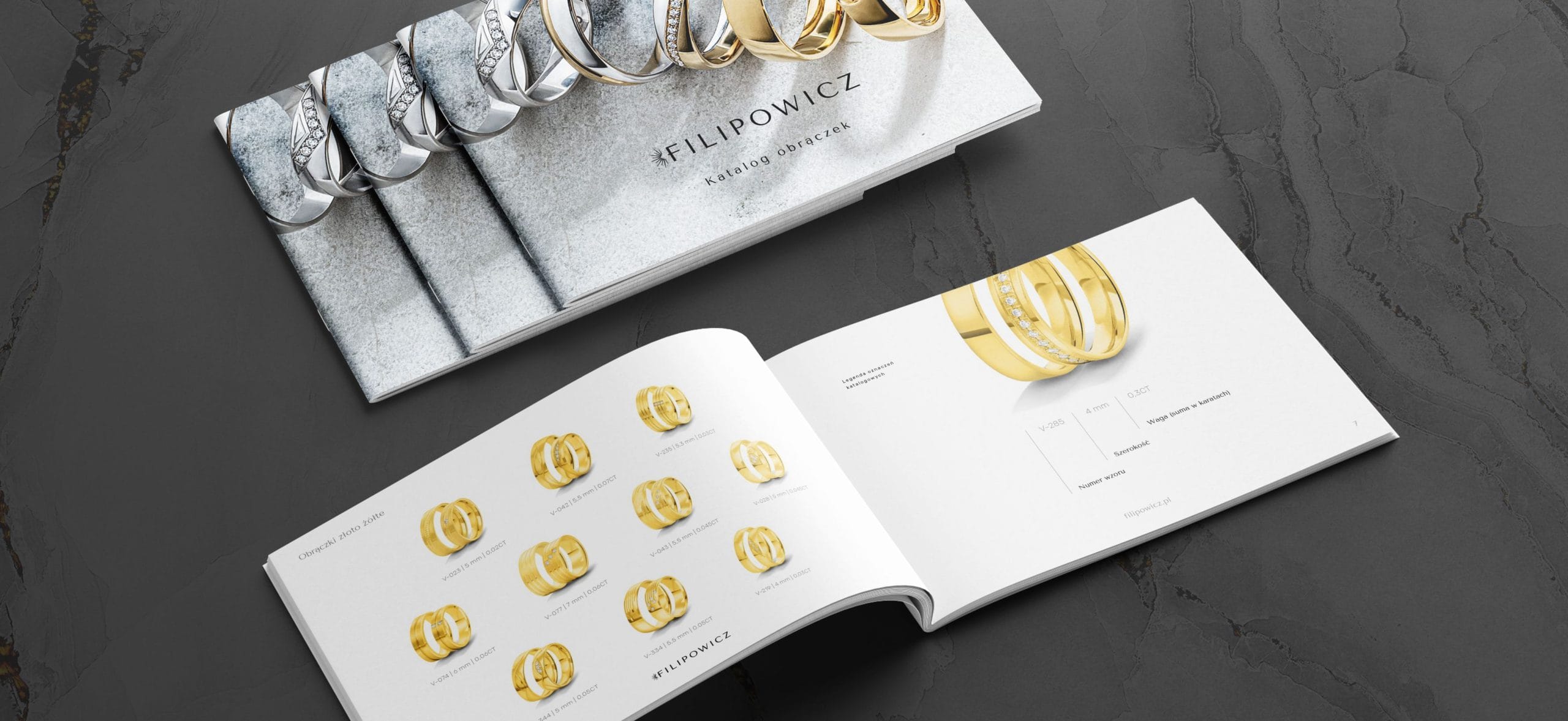
We produced a wedding ring catalogue for the Filipowicz brand. The main aim of our work was to present the jeweller’s range effectively and encourage customers to place an order. We designed the graphics and spreads, took the product photographs and edited the content. We prepared the entire catalogue for print and as a file for online presentation.
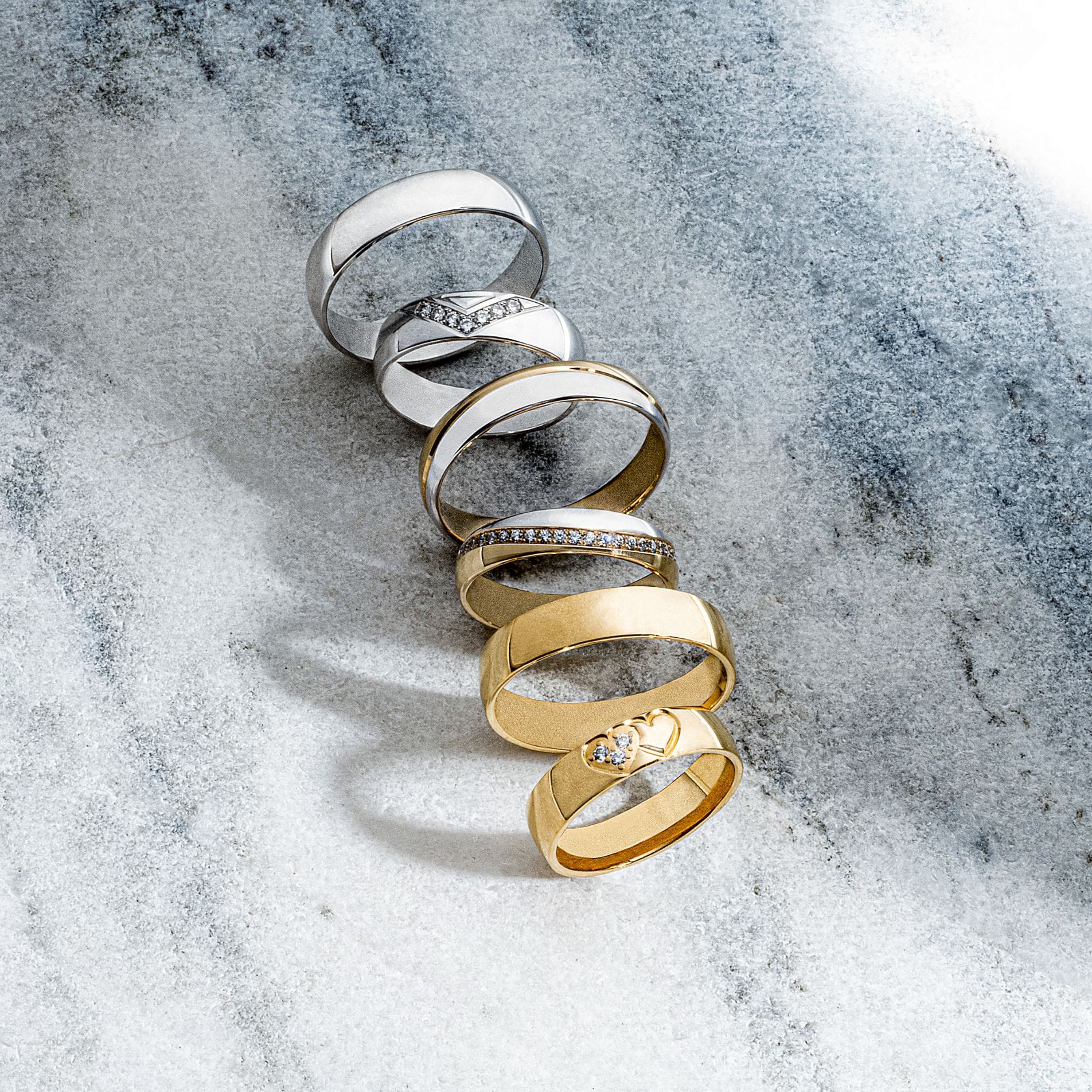
Photo shoot

We carried out styling sessions featuring the products, the results of which added variety to the catalogue. The wedding rings, presented to best effect, emphasised the exclusive nature of the premium brand. The marble background on the catalogue cover and the spreads showcasing the different categories of rings further highlights their elegance.

