Mobile-First Index vs RWD – a website optimised for mobile devices

More and more people are using the internet on mobile devices. Optimise your website for mobile users and you’ll boost your conversion rate.
We are becoming increasingly mobile
The latest Gemius/PBI research shows that in November, the total number of internet users in Poland stood at 28 million. 23.3 million people used personal computers and laptops, whilst 23.4 million used mobile devices. A comparison with the 2018 figures reveals that the popularity of smartphones and tablets is steadily increasing. The rise in mobile device usage is also confirmed by the Omnicommerce 2018 report. Forecasts suggest that as early as 2021, over half of all e-commerce sales will be generated via mobile devices.
Conclusions? Adapting websites to standards “small screens” is extremely important. Below we discuss two solutions, thanks to which you’ll increase traffic from mobile devices.
Mobile First Index
Literally: “mobile first”. The term ‘mobile-first’ refers to the website design process. It assumes that work begins with the creation of a dedicated mobile version of the site, and only later, based on this, is a simpler desktop version developed. “What are the benefits?” We get a professional website that is optimised and loads very quickly. The layout (UX), as well as the features available on the site, are precisely tailored to the needs of mobile users.
The mobile-first approach places particular emphasis on task-oriented design – the views are free of unnecessary ‘extras’ and focus on clearly defined objectives. This is intended to speed up the conversion process and make it easier for users to navigate the site (a simplified customer journey).

Website responsive (RWD)
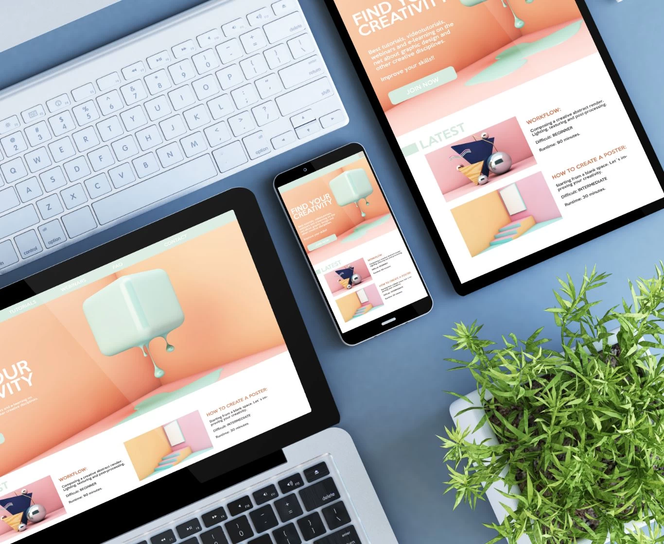
This solution is more versatile and involves designing the website in accordance with the principles of RWD (Responsive Web Design). What do you need to know? Responsive design is highly sought-after these days – because it ensures that websites automatically adapt to different screen sizes. Users can therefore use tablets, smartphones, laptops or TVs – and on every device they’ll see the content laid out exactly as you intended.
The website is responsive and automatically adapts to the standards of mobile devices. It offers the ability to manage content freely, and changes made in the CMS are visible to both desktop and mobile users. Sounds perfect, doesn’t it? Bear in mind, however, that the versatility of this solution comes with certain trade-offs, which should be discussed with the team responsible for the graphic design.

Mobile-First Index or RWD?
Are you wondering which approach is better? Well, when choosing between mobile-first and RWD, you should be guided first and foremost by the needs of your audience. A lot depends on what you’re selling and who your target audience is. Do users primarily search for the products or services you offer on mobile devices because they satisfy their ‘spontaneous’ needs? Or does placing an order require them to think it over for longer and weigh up a greater number of factors? In what context do you think your website meets your customers’ needs?
So try to determine the likelihood of mobile users purchasing your services or products. How can you do this? As an agency, we recommend using professional tools such as Google Analytics or Google AdWords. These will enable you to analyse where your website traffic comes from and find out which devices your customers use most frequently. Don’t rely solely on intuition – thoroughly analyse your customers’ behaviour and meet their expectations.
A short lesson that’s well known in the industry… By looking after your mobile users, you’re looking after your company’s growth. Are you keen to implement the best possible solution for your business? We look forward to working with you! We’ll find out what’s going on for you and suggest the best options.