Responsive websites – what do they look like and what are their advantages?

What does the mysterious abbreviation RWD stand for? What does it mean when graphics, websites and e-commerce sites are described as ‘responsive’?
You’ve no doubt come across the acronym RWD or the term ‘responsiveness’ used in relation to graphics, websites or e-commerce sites. When talking to a web designer, this phrase naturally comes up often, but what exactly does ‘responsiveness’ mean? Getting started online involves a lot of unknowns. In this article, we’ve put together a brief overview of the topic for you. What exactly does ‘responsive websites’ mean?
Responsive websites – what does that actually mean?
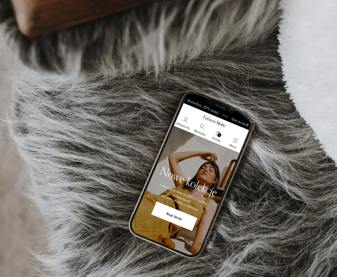
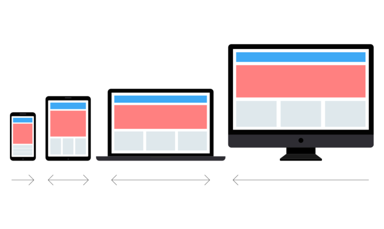
RWD, or Responsive Web Design, is a term referring to the design of online websites in accordance with the latest UI and UX standards. Responsive websites easily adapt to different screen resolutions and devices. It doesn’t matter whether someone is viewing your website on a desktop (desktop computers and laptops), a tablet or a smartphone. The content is automatically scaled each time – it’s always clearly visible!
How you can benefit from UI and UX
When reading about responsiveness, you’ll come across the terms – UI and UX. UI (user interface) and UX (user experience) measures relate to the layout of content and navigation on your website. As you might expect, they are inextricably linked to RWD. They guide users along the quickest route to the articles they’re interested in, meaning they’re less likely to click ‘back’ or ‘close’.
Brands and companies have also found their place and built up a following. The Piotr i Paweł retail chain, which has recently been very active on social media – and is doing a good job of it – joined the Snapchat community this month. We wish them the best of luck and are keeping our fingers crossed ???? It may come as no surprise, but Coca-Cola takes the top spot among brands. The top 100 includes, amongst others, shopping centres, TV and radio channels, websites, newspapers, universities, mobile phone networks, clothing shops and more. There’s a wide range of sectors represented, which proves that Snapchat isn’t just for a select few.
Higher in search engine results
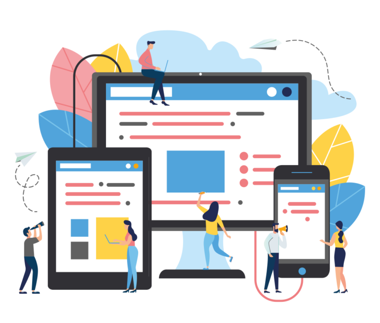
The use of UI and UX results in a lower bounce rate. You should be aware that responsive websites are ranked higher in search engine results, because they adapt to the resolution of mobile devices. Your website enjoys better search ranking results as a result. Thanks to this customers easier to find information about your offer.
Do responsive websites www contribute to an increase in conversions?
With RWD, you’ll increase the amount of time users spend on your website. By utilising UI and UX, you’ll implement measures to improve communication and create an attractive and user-friendly interface. I imagine you’re keen to attract new customers?
Remember, good navigation is key! Today’s users aren’t keen on reading long pieces of content where they might find something of interest. They quickly scan pages in search of specific information. Meet their needs, and they’re sure to come back.

Our projects
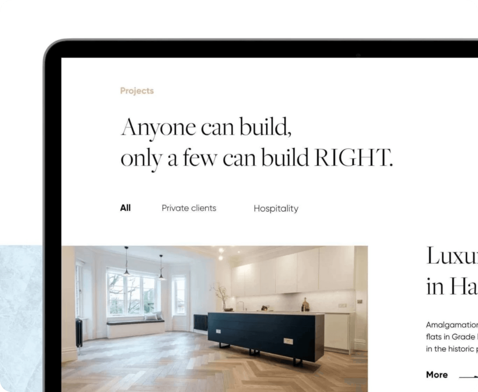
If you’re curious to see what a website designed in accordance with RWD principles looks like, be sure to check out our project for Rockfield.
RWD is now the hallmark of a professional website
Firstly, it significantly improves navigation. Secondly, it speeds up page loading times. Thirdly, it enhances users’ comfort and aesthetic experience (responsive websites are more attractive and engaging). Today, over 52% of internet traffic comes from mobile devices.
RWD is an absolute MUST-HAVE for anyone working online.