Latest developments in UI design UI

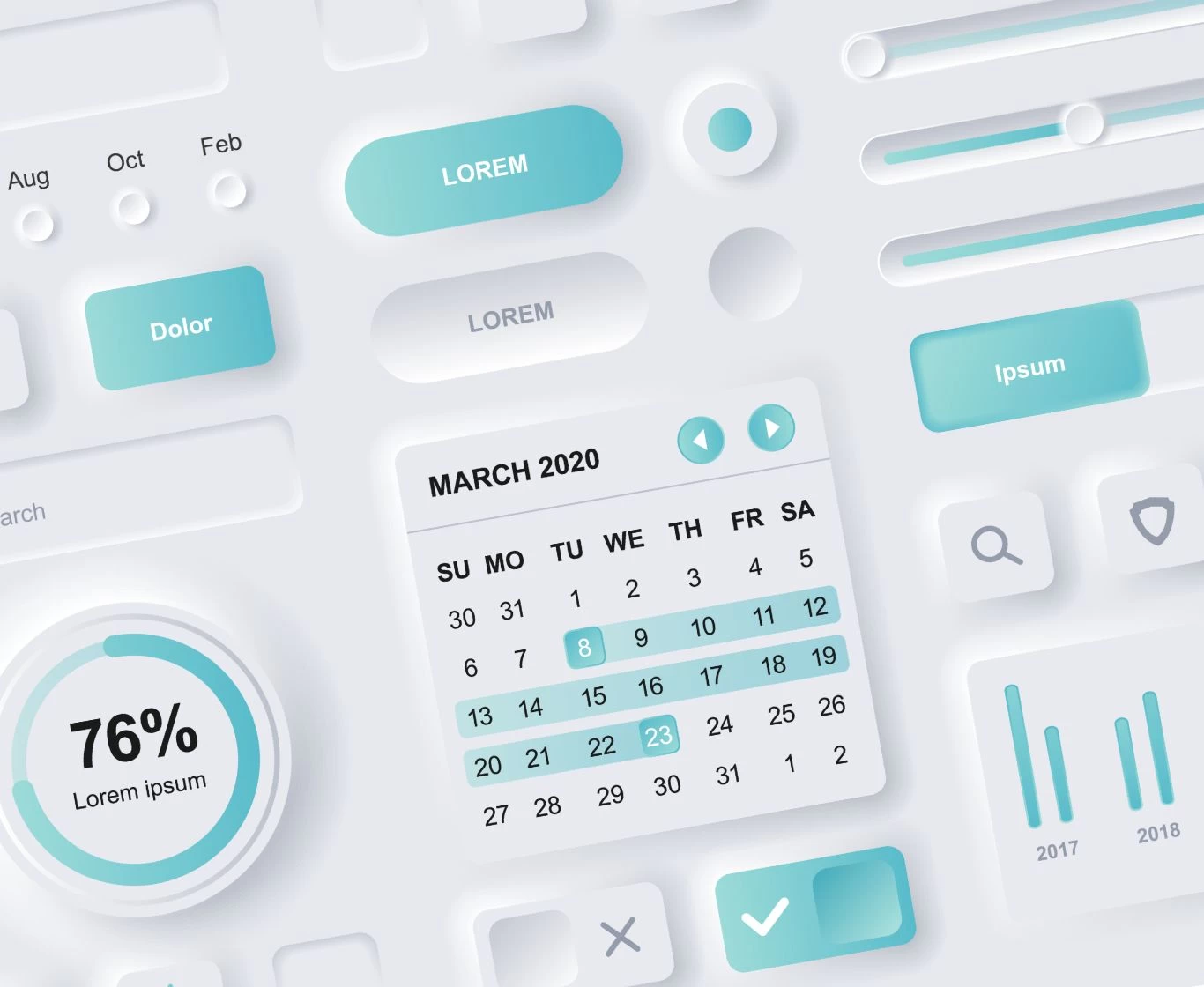
UI design standards change over the years. To meet users’ needs, a good web designer will create a website that is, above all, easy to use as well as visually appealing. Keeping up with trends gives the website a modern feel, highlights the brand’s boldness, and presents it as a dynamic organisation thriving across various areas.
The aesthetics of minimalism
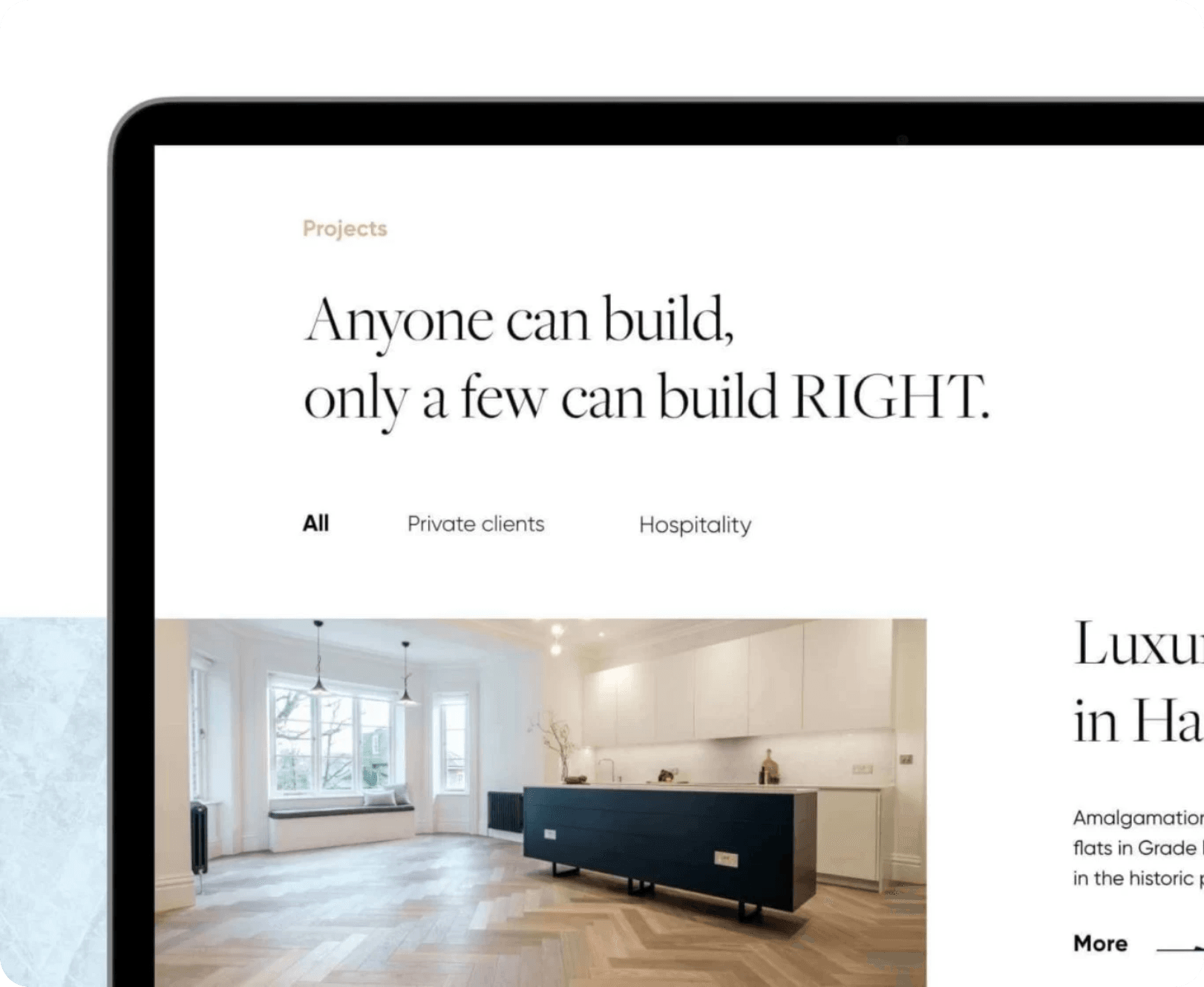
As they say, beauty lies in minimalism. A website doesn’t need to be full of gradients, colourful images or ornate typography to capture the visitor’s interest. A modest, clear, and sometimes even ‘sterile’ website can be more user-friendly, and therefore evokes positive feelings whilst using it.
Minimalism is currently the number one trend in UI design. Websites are dominated by white space and short blocks of text, whilst the use of decorative elements is kept to a minimum. At a time when the average internet user is bombarded with a multitude of stimuli every day, websites designed in this way stand out in a positive way. The user can focus on consuming content and carrying out the actions intended by the designer.
Geometry as a way of organising the layout
The perfection of Renaissance artists was based on geometry. Leonardo presented the ideal proportions of the body in the ‘Vitruvian Man’ on the basis of calculations and two-dimensional figures. These, in fact, formed the basis of every work of art.
We are currently seeing a return to conservative layouts in web design. Geometric layout elements bring order to a website’s structure. This type of layout makes it easier to navigate the site and browse its content, which is why designers are keen to use it.
The important role of typography
It is widely recognised that typography plays a vital role in communication. It forms the basis of graphic design and user interface design. It is usually the letter that takes centre stage in any project.
The composition of text, grids and typefaces are just as important as graphics and illustrations. It is also worth noting that we have recently been seeing more and more designs based entirely on typography. Large, distinctive letters form the basis of some interfaces.
The blurred background effect and glassmorphism
In many projects, illustrations and graphics feature a blurred background effect and what is known as ‘glassmorphism’. How do these two techniques differ?
The first, as the name suggests, involves blurring the elements that make up the website’s background. Glassmorphism, on the other hand, is the superimposition of two elements, in which the first is semi-transparent, creating a glass-like effect. However, this is nothing new, as certain mobile phone brands have been using it to design their main menus for several years now.
Vibrant colours
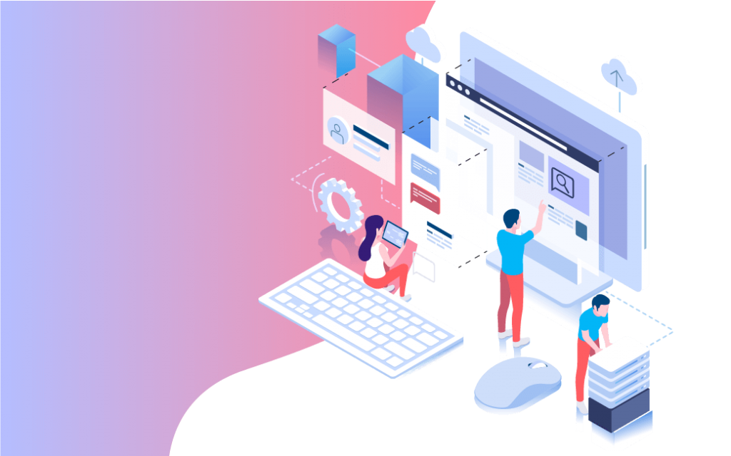
Users are better able to remember products, which are highlighted with vibrant colours. The use of blurred patches and colourful elements has a positive effect on UX. However, one should bear in mind aesthetic minimalism and not allow any clutter.
3D illustrations are still all the rage
For several years now, 3D illustrations have consistently been at the forefront of UI design. All the signs suggest that, in the near future, designers will have even greater scope to showcase their creativity when creating them. This will be made possible by 5G technology, which allows 3D illustrations to be rendered on a webpage without compromising its performance.
What to bear in mind when designing the user experience
As well as the latest developments in UI design, we must not forget about UX standards. One of the most important is accessibility. A website created on the the basis of WCAG standards has become a priority (in particular for government and public websites).
The interface must be adapted for older people and people with disabilities as well as work well in all circumstances. The website should be easy to read on screen of a smartphone as well as outdoors, on a sunny day.
Good communication is not just colours, clarity and user-friendly illustrations. Let’s not forget about UX writing and microcopy. Every piece of text on the internet must be written in an accessible manner. The content on the website should be understandable both for the general user, as well as a specialist in a given industry.
A good copywriter will edit content for CTAs, information about errors and other short messages (micro copy), based primarily on emotions.
The final, but equally important issue when creating a website on the internet are A/B tests. Web developers as well as their clients, are not the target customer of the website under development, therefore it is essential to carry out research involving the participation of users. Thanks to them it is possible to find out which of a37> what suggestions for graphics, illustrations, templates or texts to which the audience responds best.
To sum up, there are many trends in UI design. Depending on the nature of the brand, for which the website is being built, it is important to select the appropriate solutions. New features may sometimes fail to work, which is why it is so important to adopt an individual approach to every project. From this perspective an essential stage of the design process is testing. Never do skip this when working on products.