Mobile-first website for a property developer

Project summary:
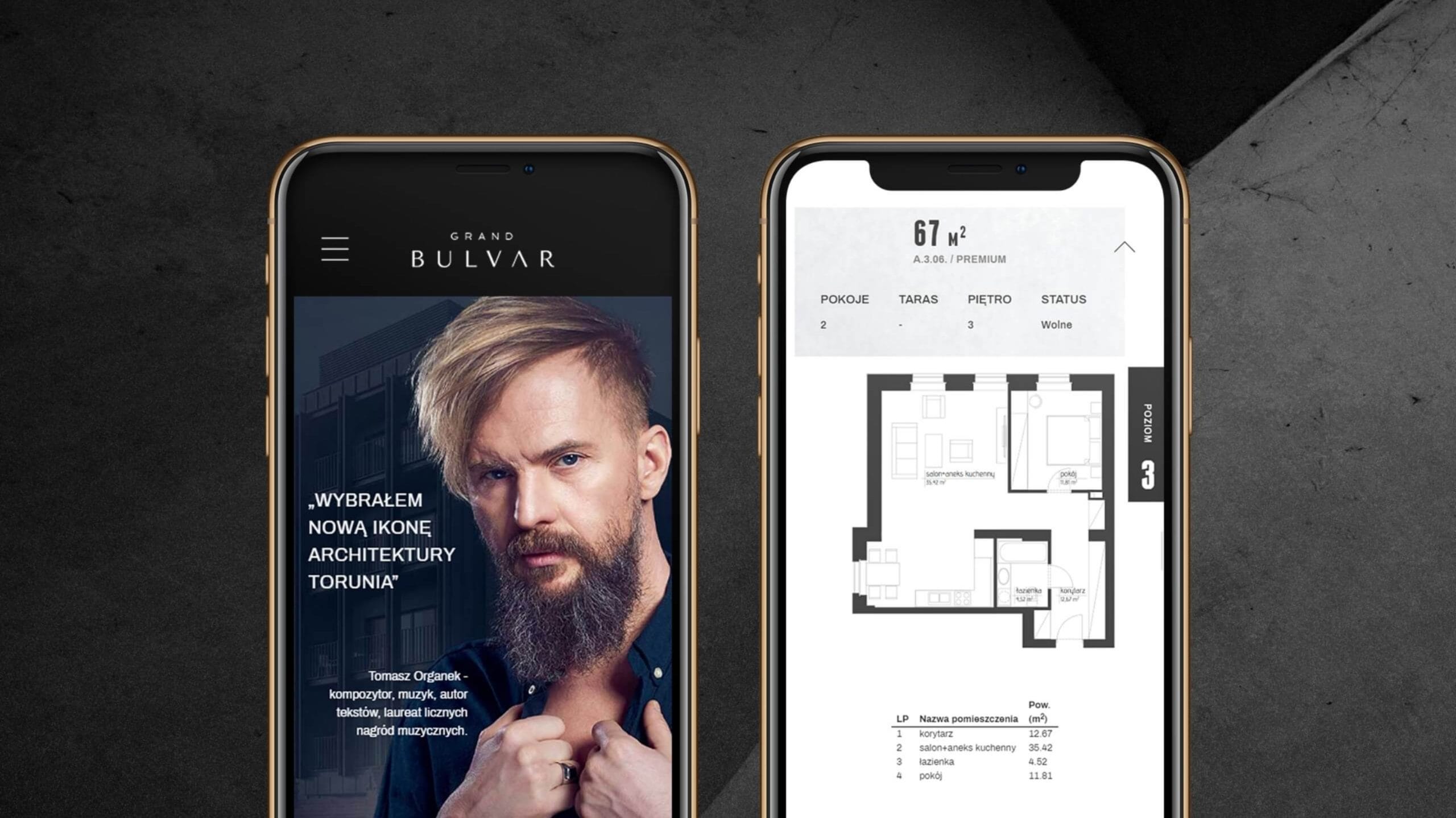
Responsive website online – designed with a mobile-first approach, featuring simplified navigation and an intuitive search function for offers.
Comprehensive branding – developed on the basis of the brand’s key visual.
A modern website – designed and developed with mobile users in mind.
A professional photo shoot – carried out with the participation of the project’s ambassadors.
Project objectives
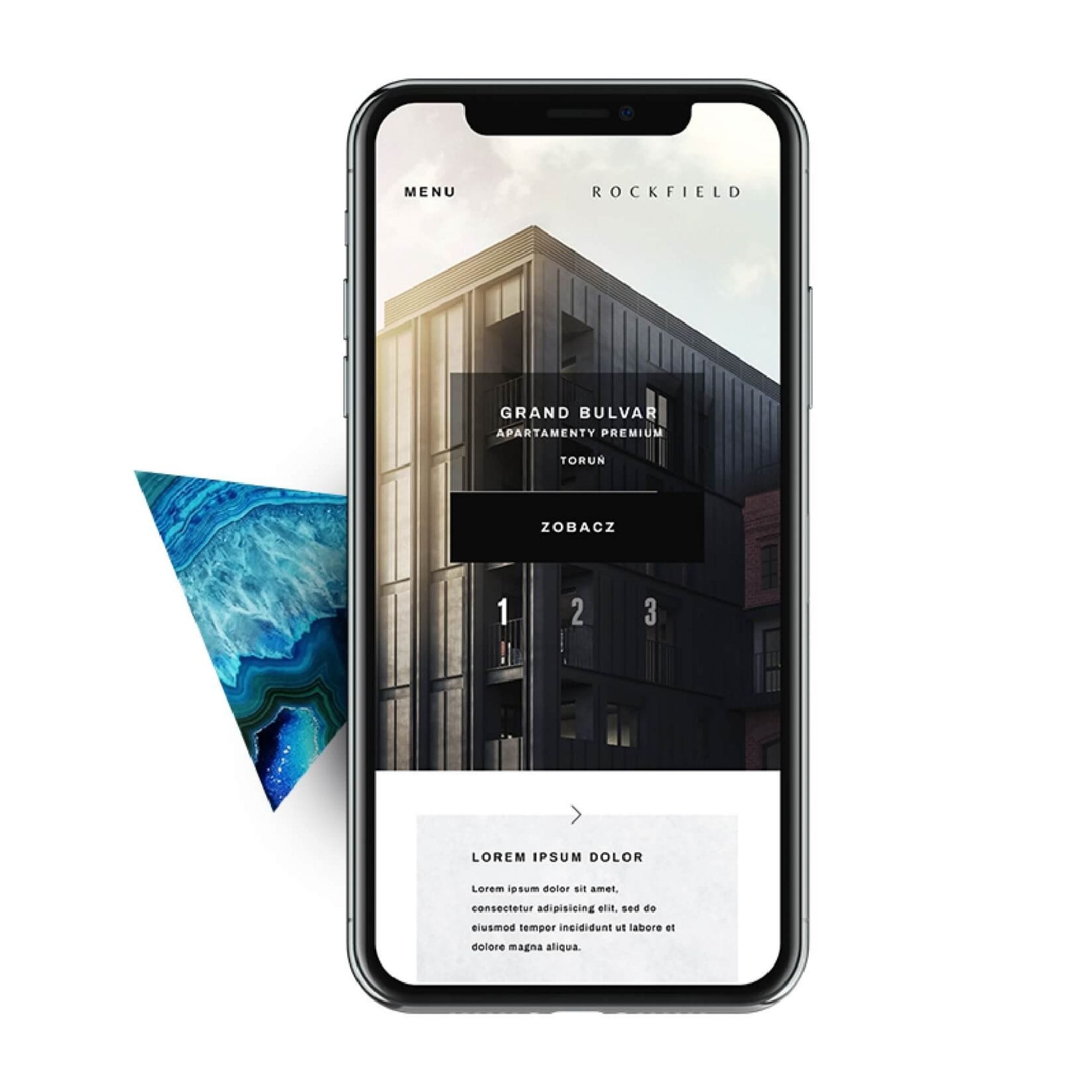
The need to create a ‘mobile-first’ website arose from the characteristics of the target audience, who most often use mobile devices such as phones or tablets to browse the internet. Designing the website starting with the mobile version made it possible to incorporate newer mobile UX standards, which had previously been dependent on the responsiveness of the desktop version.
A leader in the property development market
Rockfield Development specialises in the construction of prestigious developments in the Kujawsko-Pomorskie region. The company is committed to delivering projects on time and to a high standard.
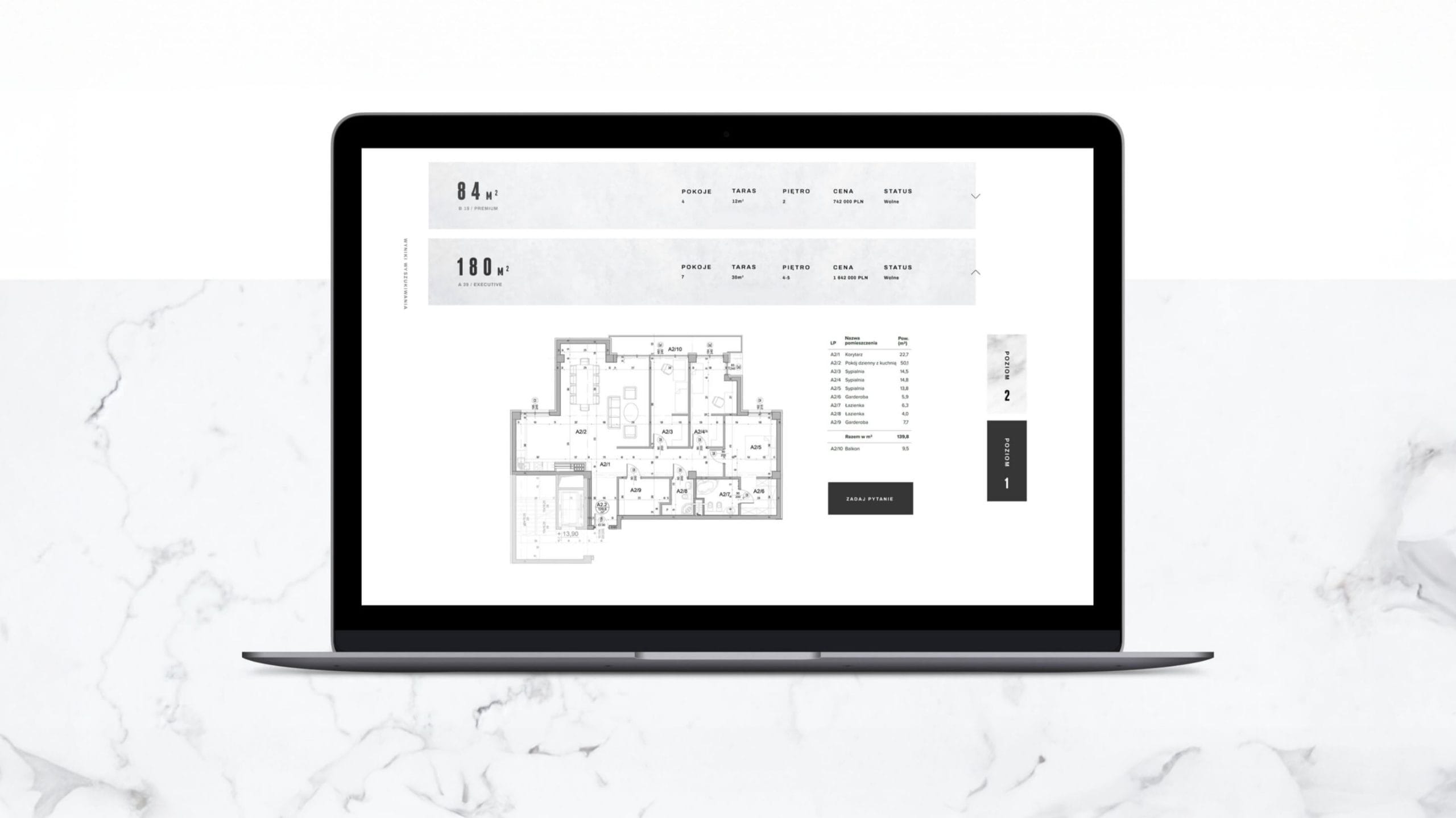
Solution
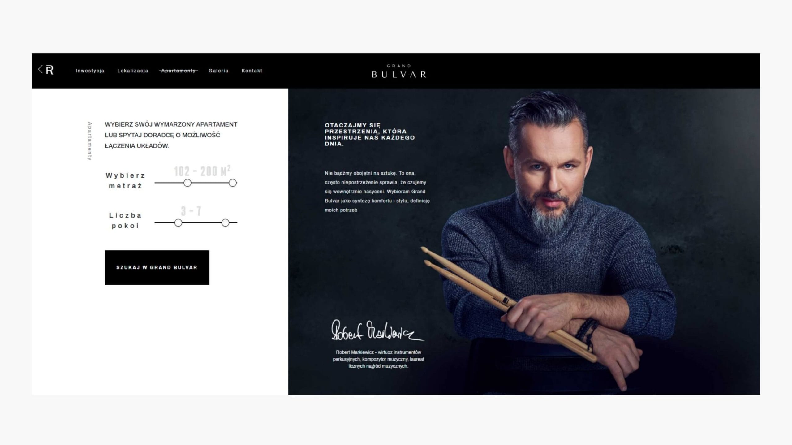
In the desktop version, the website retains all the functionality of the mobile version. Navigating the content and searching for offers remains the same, ensuring a consistent user experience when users switch between different devices.
Mobile-first optimisation
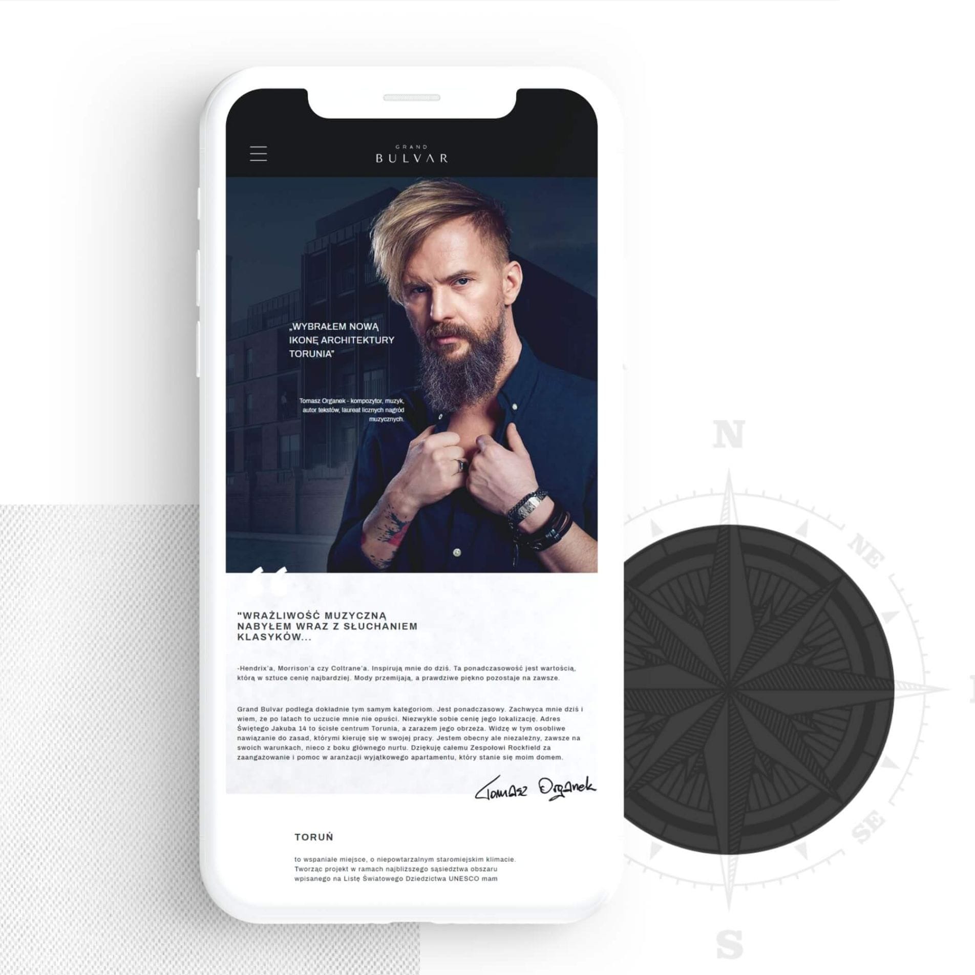
Appropriate compression of graphic elements and the avoidance of complex programming solutions have speeded up the loading of the mobile site and improved navigation. Speed is crucial for conversion rates on mobile websites.
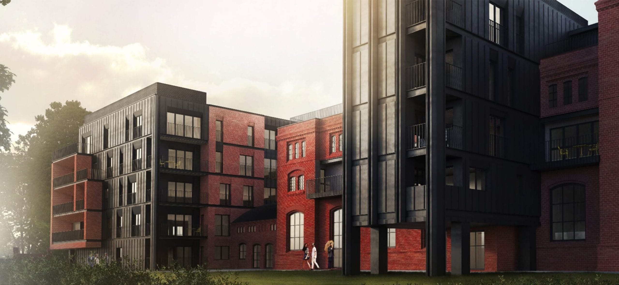
Offer search engine
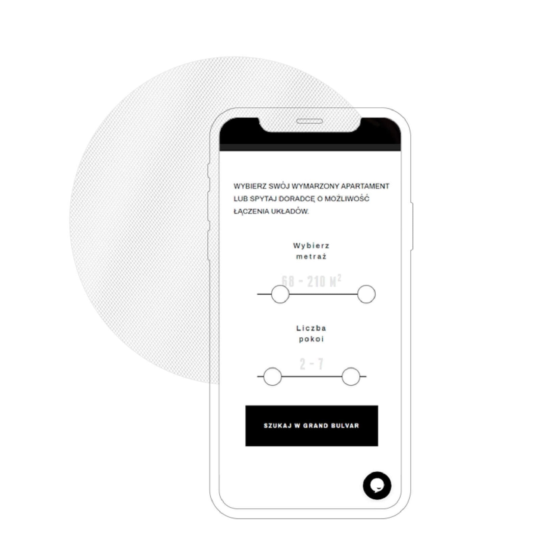
The standard flat search function has been simplified to a single parameter. The range is set using an intuitive slider, which is particularly popular on mobile devices.
UX
The standard flat search function has been simplified to a single parameter. The range is set using an intuitive slider, which is particularly popular on mobile devices.
Navigation
A common practice on the websites of property developers was the use of a dual menu (one for the developer and one for the development). This made navigation on mobile devices considerably more complicated. The use of the abbreviation made it possible to separate the brand from the investment pages whilst retaining the ability to quickly return to the developer’s homepage website.
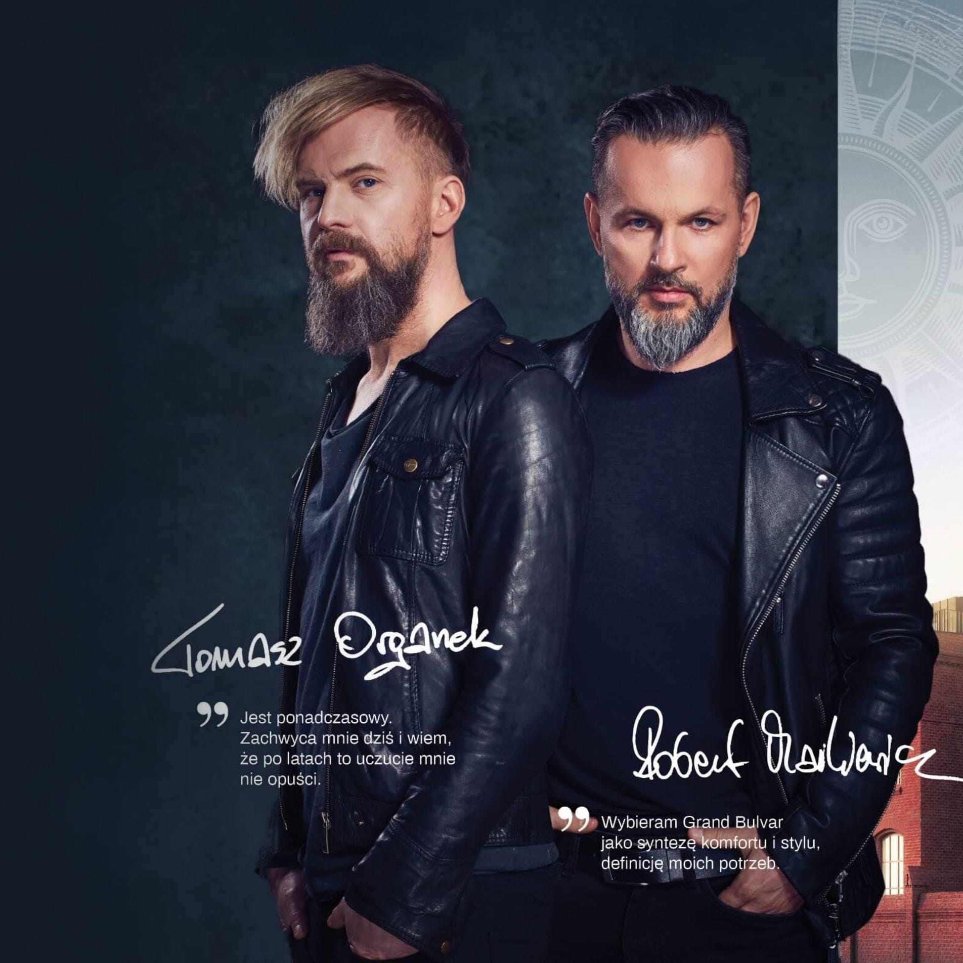
Photo shoot
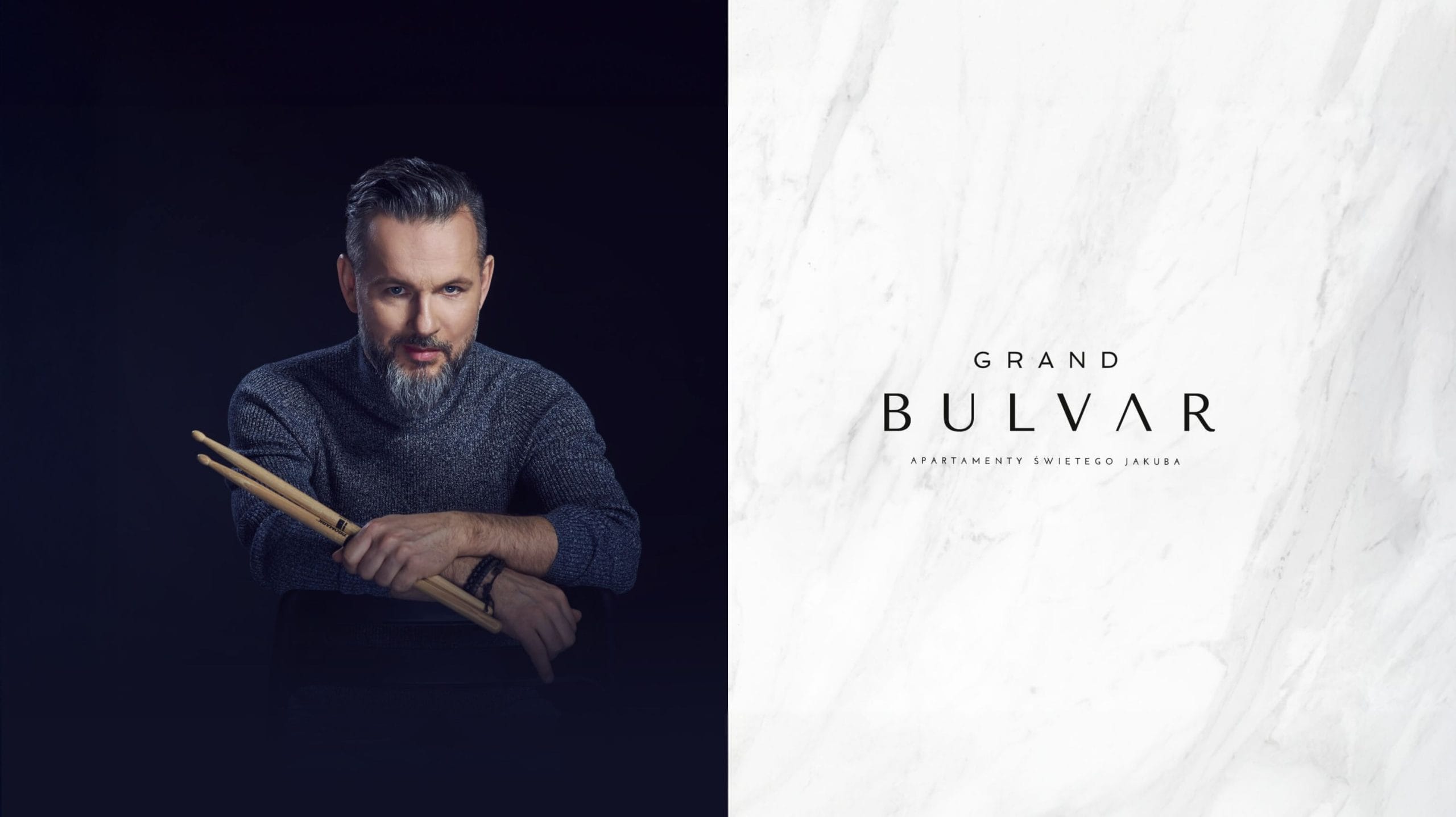
We took photos with the ambassadors of the Grand Bulvar development – Tomasz Organek and Robert Markiewicz. The image shoot took place based on a previously agreed concept, colour scheme of the website, designs visualisations of the buildings and agreed specifications regarding the appearance of the silhouettes of the models.