


Design and implementation of a website for the airport

Project summary:
We have designed a useful website with a simplified user journey.
We have simplified the contact forms.
We have introduced features to make the website easier to use for people with disabilities.
We have carried out the migration of data from the old website to the new one.
Project objectives
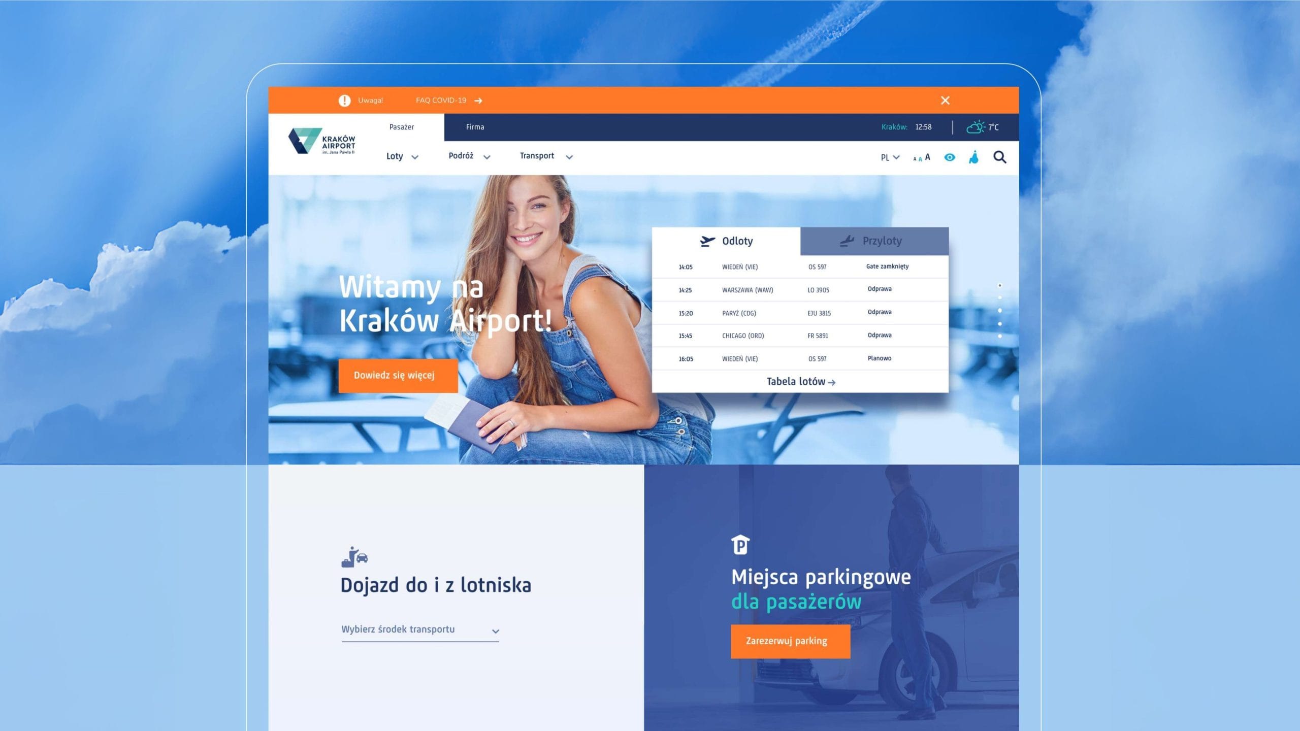
The project was created to enhance the airport’s image through a modern website, designed in line with current UX standards. In addition, our task was to simplify and shorten the user journey. In our work, we focused on creating a widely accessible and user-friendly website that would meet users’ expectations.
Kraków Airport
Kraków Airport is the largest regional airport in Poland, serving the south-eastern part of the country, which is home to around 8 million people. The company is constantly growing and is committed to modernisation. As a result of this growth, there was a need to modernise the website to make it more user-friendly for an increasingly demanding online audience.
A service tailored to the customer
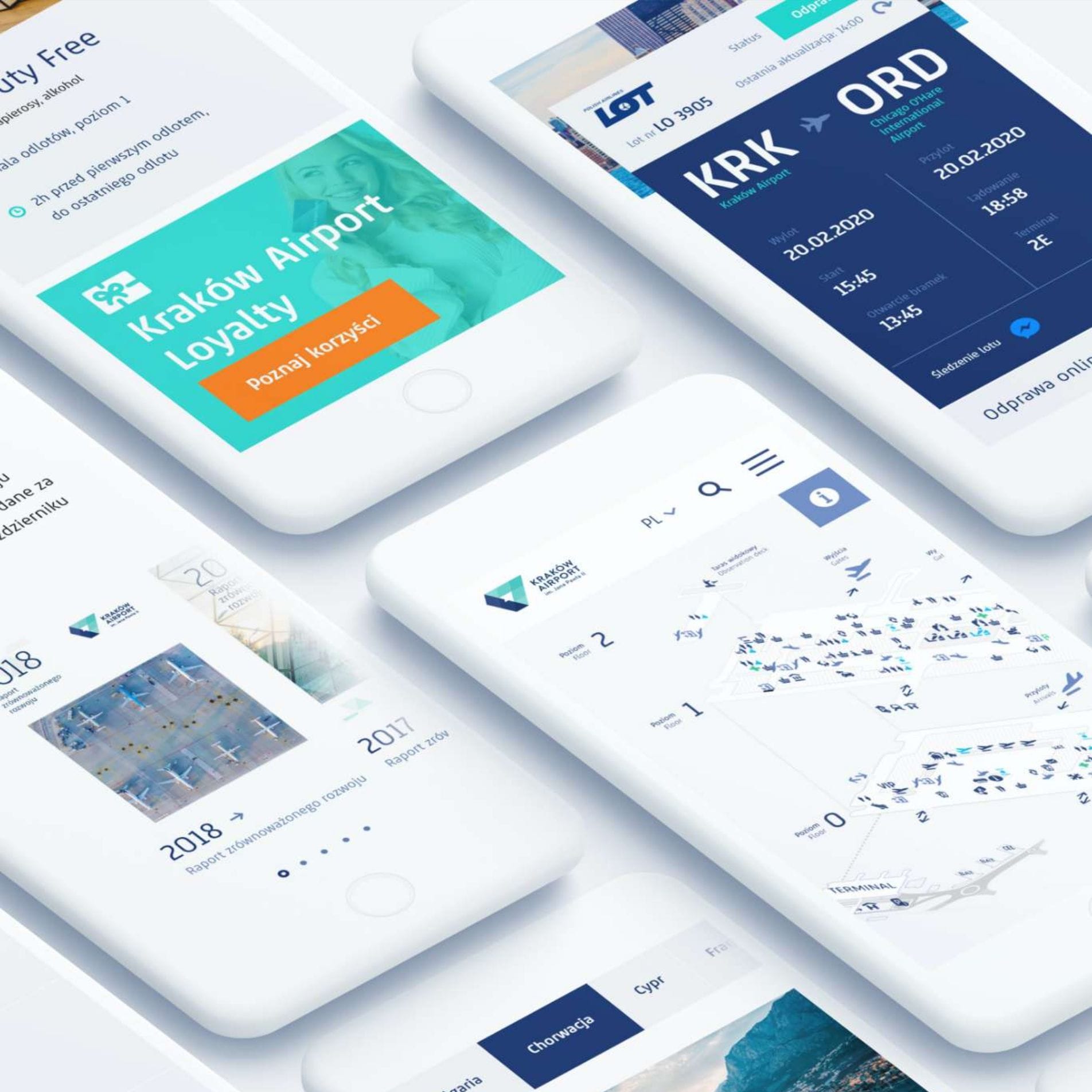
The mock-up design involved organising the website’s content and functionality in such a way as to adapt it for display on both mobile devices and higher-resolution screens.
We refreshed the airport’s visual identity and prepared a UX mock-up incorporating an extensive database of subpages, for which we developed intuitive and straightforward access.
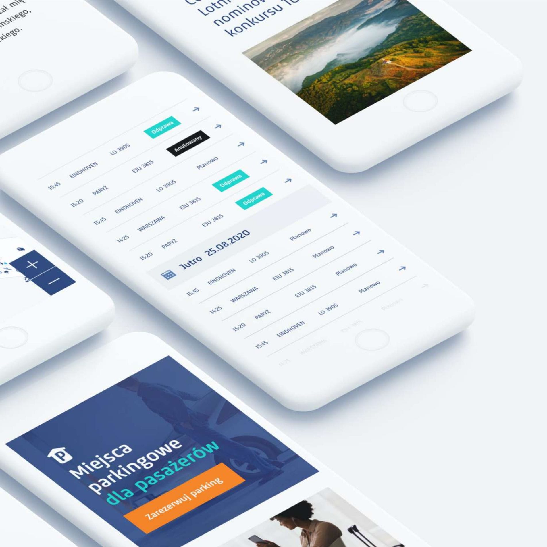
Following the client’s approval, we set about designing the graphical user interface based on the new key visual.
The result of our hard work is a fully functional and user-friendly website that adapts to the needs of every user. The KRK website can even be navigated without using a mouse – using just the keyboard and function keys.
Menu tab
We wanted the website to offer a consistent user experience across all devices. However, the main menu layout was very complex, so we had to find a suitable solution to ensure it could be displayed unchanged on both smartphones and desktops.
We have implemented a system comprising a main menu and a detailed menu, which helps to categorise the content on individual subpages. This ensures that the website remains user-friendly, even when viewed on smartphones. In future, the menu tab can be expanded as the website grows, without compromising on usability or aesthetics.
Flight ticket
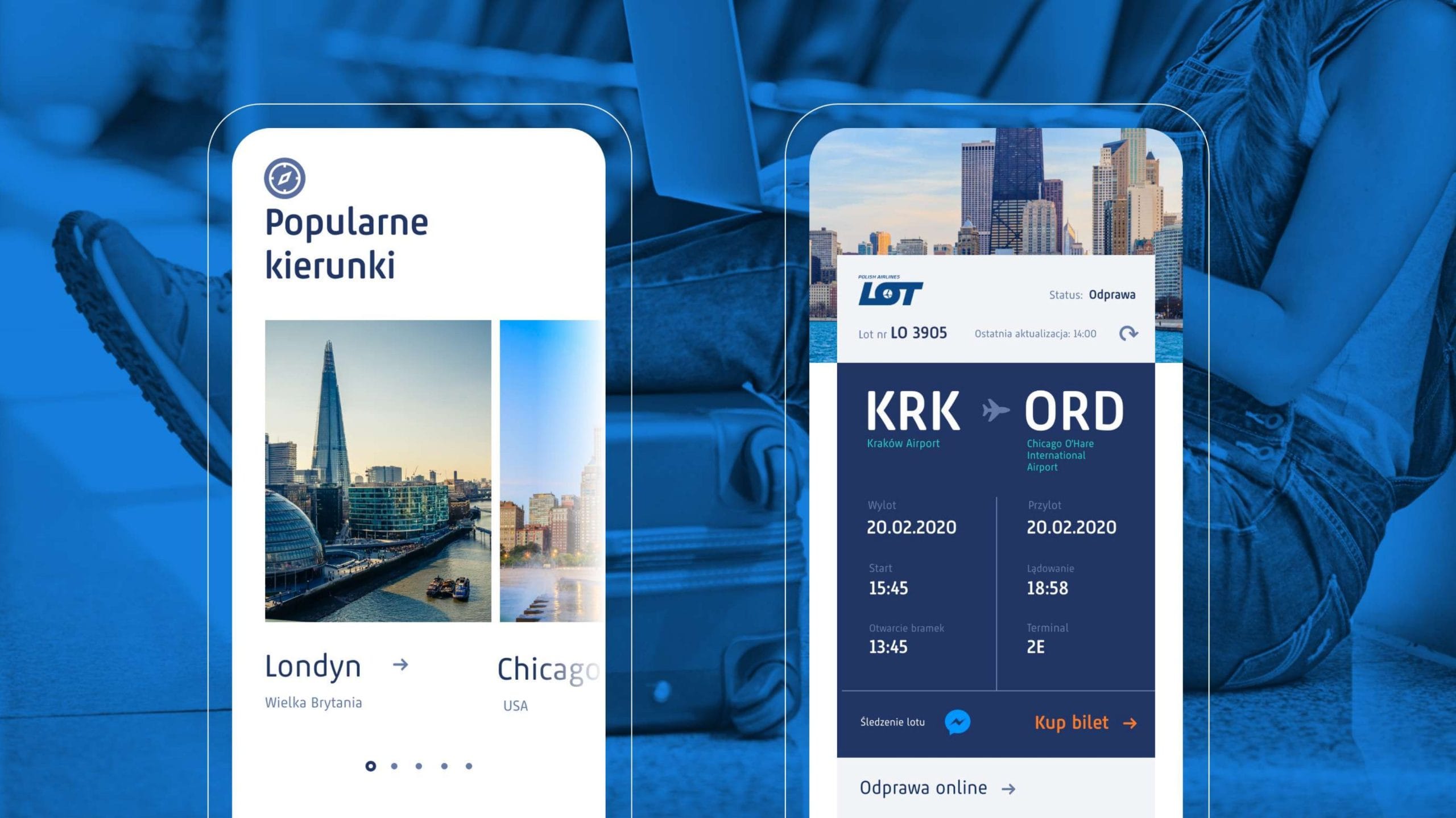
From a usability perspective, the flight details page is the most important subpage on the website. We have ensured that key features are prominently displayed so that users can find them straight away, even when they are in a hurry.
In addition, we have introduced a feature that allows passengers to monitor what is happening on the tarmac before departure via automated messages sent to their Messenger account. With just one click, passengers can receive important updates.
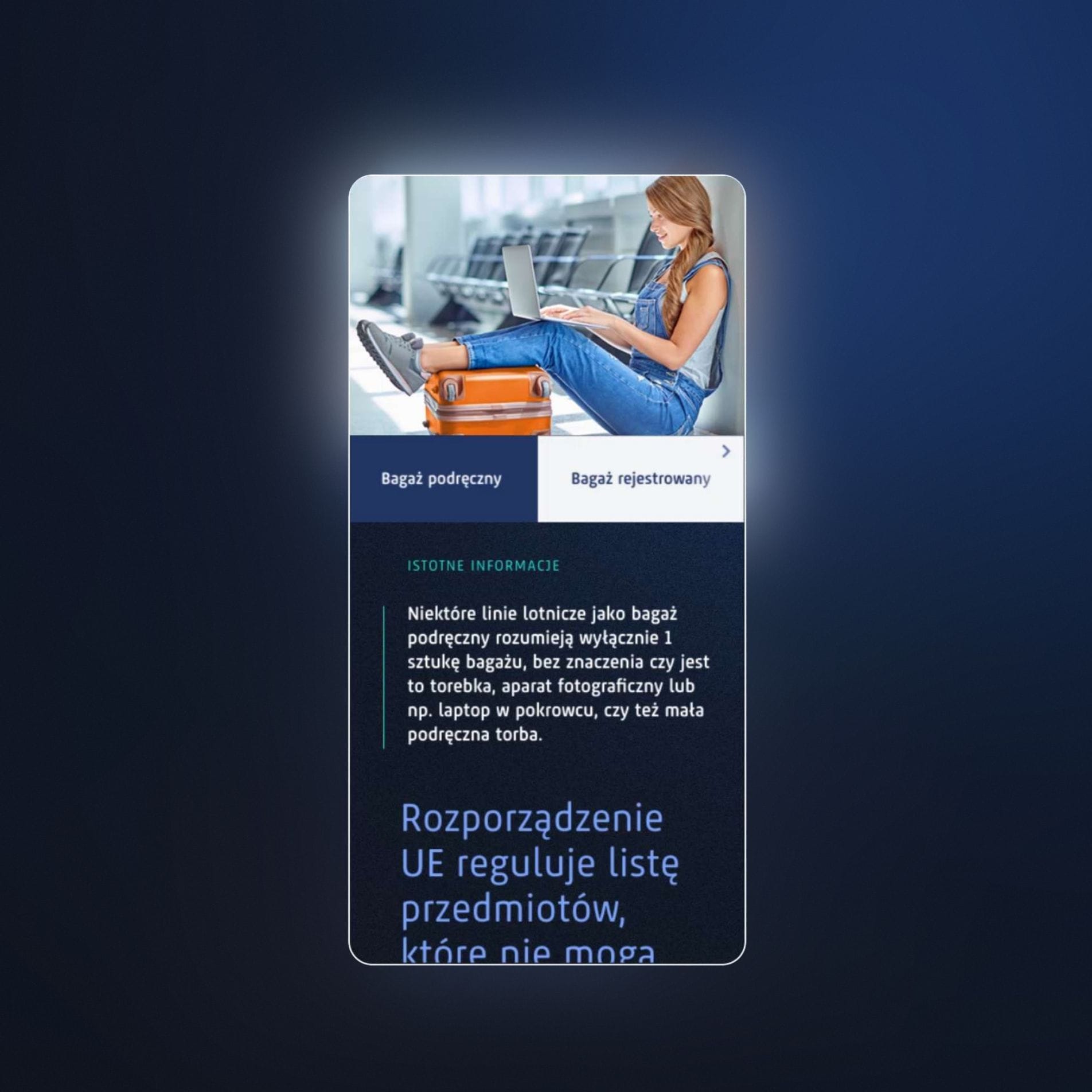
We have set aside space for a passenger guide. When designing the functionality, we assumed that the user would be flying for the first time. This ensures that the tutorial provides all the necessary information and leaves the customer with no doubts about the flight.
WCAG Standards
A project aimed at ensuring widespread access to resources could not exist without WCAG standards. People with disabilities also use the airport’s services, which is why we have adapted the layout to suit the needs of every user.

