


Identity visual and website for universities

Project summary:
We have prepared a design for the new visual identity of the university.
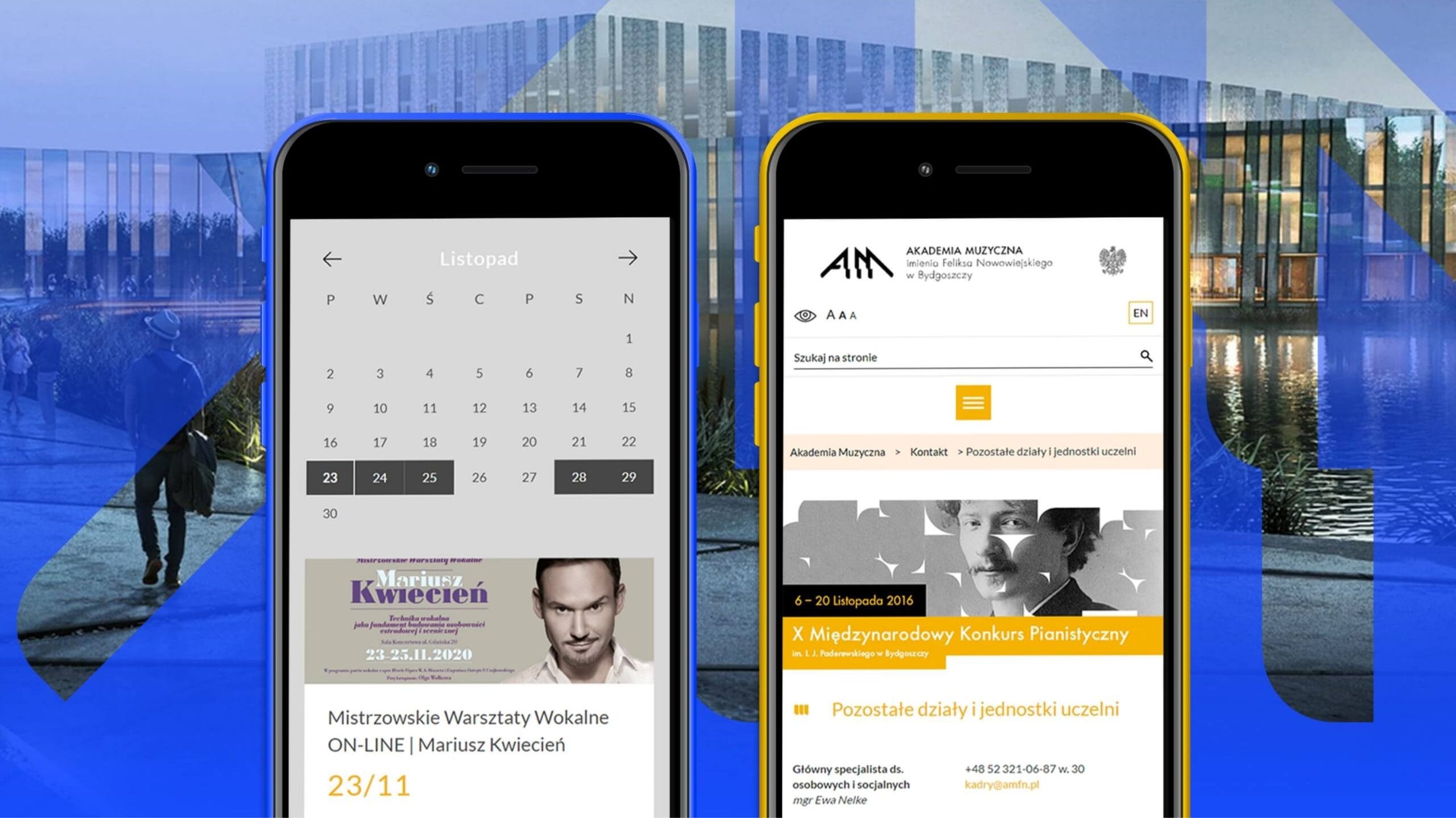
We have designed a clear website www based on the new KV.
We have developed a new colour palette that reflects the character of the university.
The issue
One of the project’s main objectives was to create a unique image for the Academy that would set it apart both nationally and internationally. Our primary aim was to boost the university’s popularity amongst young people choosing where and what to study.
Who have we worked with?
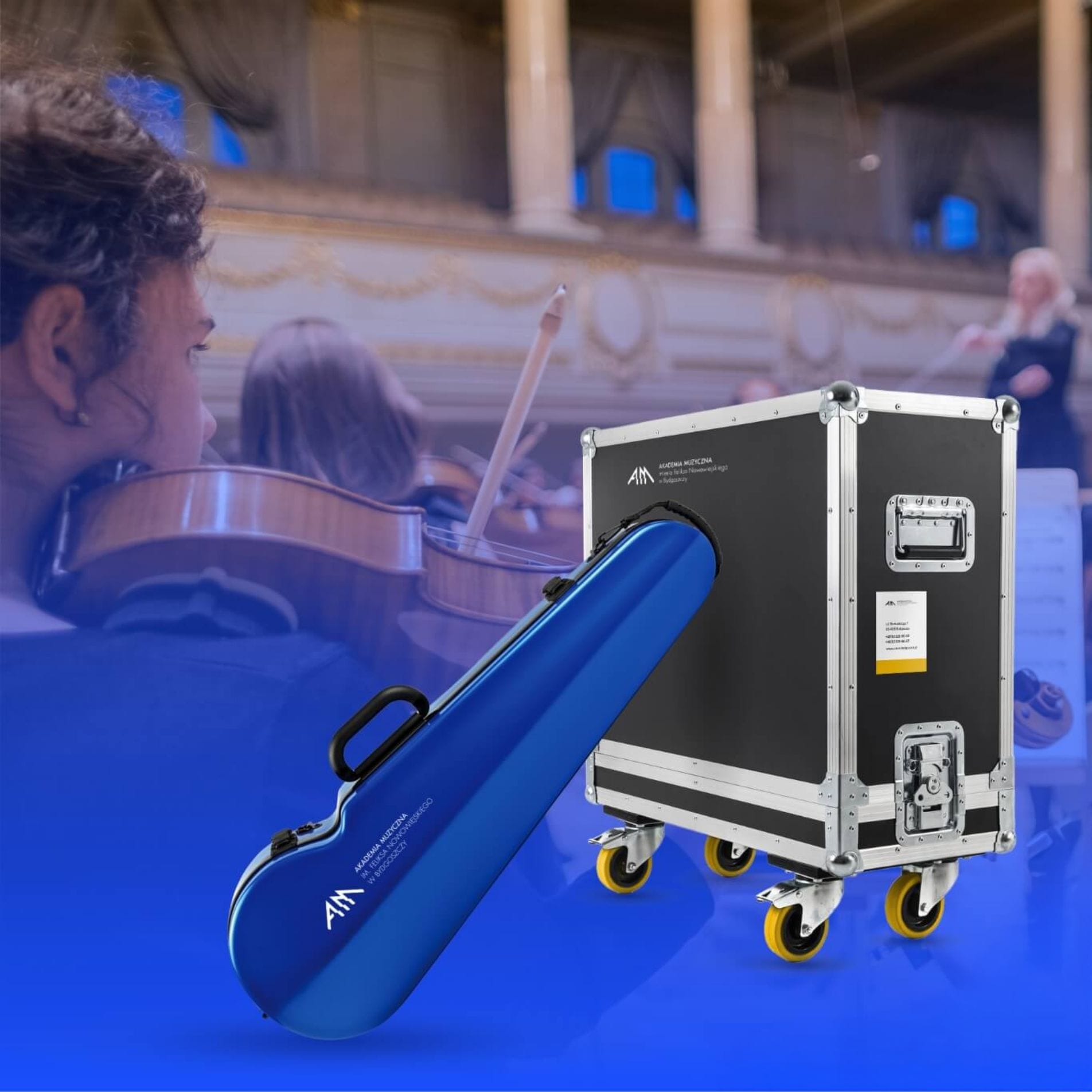
The Feliks Nowowiejski Academy of Music is a higher education institution in Bydgoszcz. The client required a new and cohesive brand identity for the institution, which had not yet established a recognisable visual identity. Until then, the only distinctive element of the brand had been its logo.
Solution
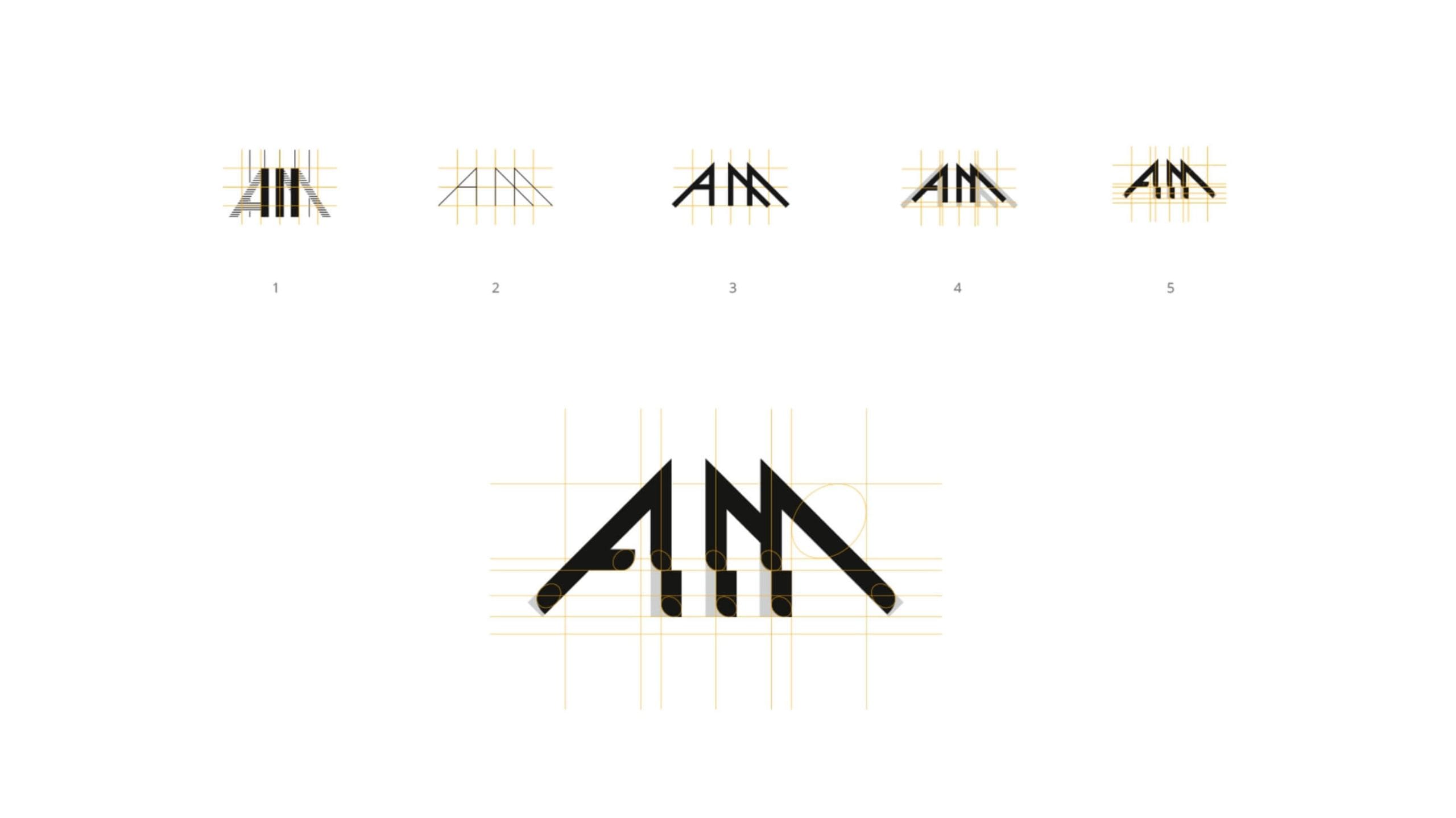
Creating a cohesive brand image required us to familiarise ourselves with the institution’s history and achievements, as well as its architecture, character and current trends in the sector it represents. Armed with this information, we were able to define the aesthetic of the new brand identity. The brand image required a redesign of the logotype to bring it into line with modern standards of graphic design.
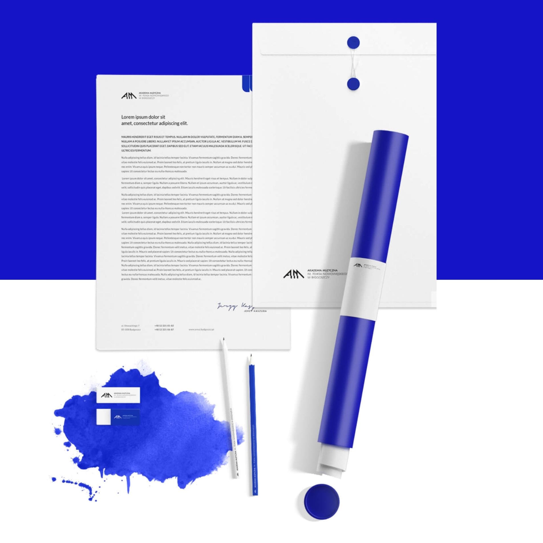
We also decided on a signature colour that would set the school in Bydgoszcz apart from other higher education institutions in the country. The next step was to apply the full brand identity to basic promotional materials and the website.www.
Color
The colour palette for the new visual identity consists of white and black, as well as colour accents that draw on the ‘language of music’. It was also inspired by the colour of the ink once used to write musical notation.

Key Visual
A music academy is naturally associated with sound. When developing the visual identity, our priority was to make the institution stand out visually on the international stage. The abundance of ‘light’ gave the design a sense of breathing space and lightness. Strong contrasts emphasised the clarity of the overall design.

Website
The structure of the Academy of Music’s website is portal-based, which means we have divided it into relevant main sections – the Academy, for students, for prospective students, and for staff. This allows every user to quickly find the content they are interested in. We have prepared a test version of the shop, which can be accessed from the main menu via the ‘Publications’ tab.
The available products are divided into categories – books, sheet music and anthologies. This approach improves navigation within the e-commerce segment. To tailor the website to potential candidates from abroad, we have implemented two language versions of the site – Polish and English. The website was built using an easy-to-use CMS, the functions of which we have customised to suit the departments and roles of individual users.
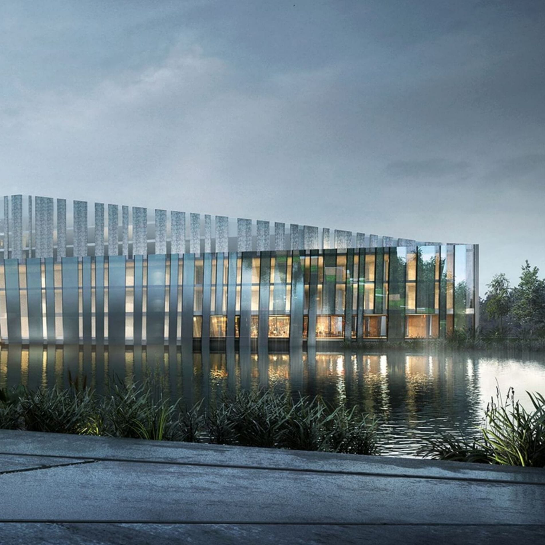
Architecture
We decided to take a forward-looking approach to the Academy’s image, bearing in mind the plans for the institution’s expansion in 2020. The new visual identity does not draw on the current architectural design of the Academy’s buildings, as that would be something of a nostalgic exercise.
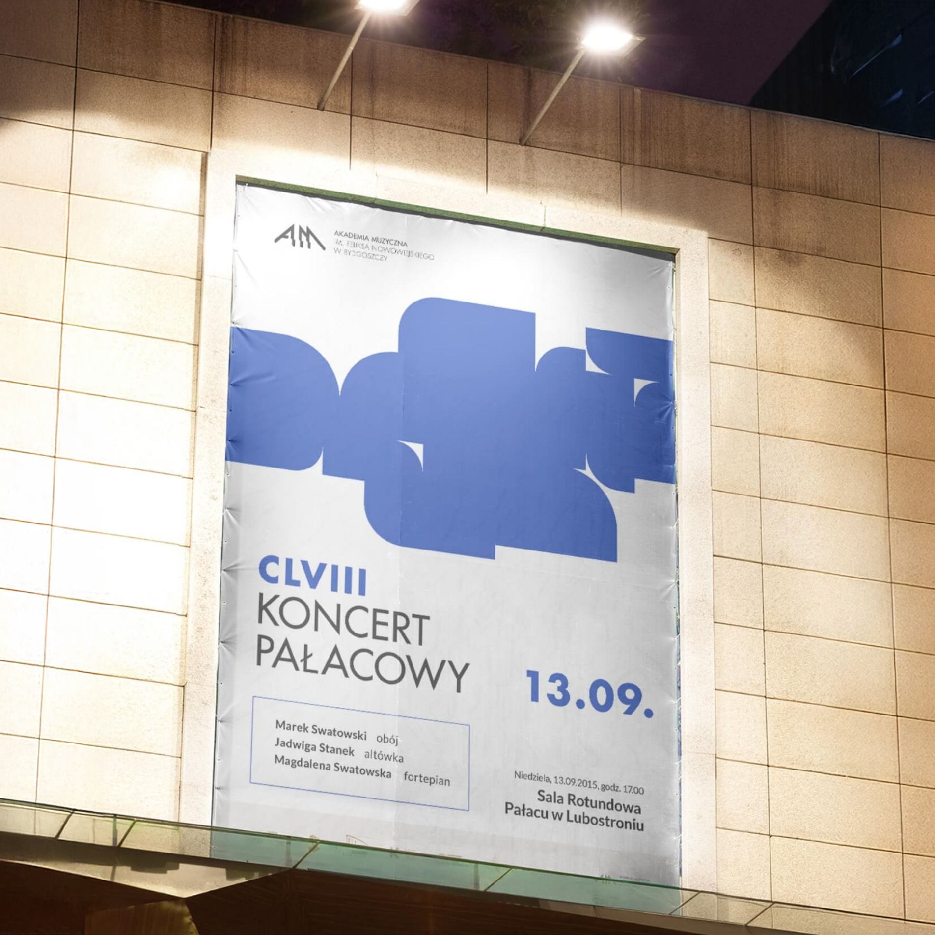
Consistency
Branding loses all meaning if it is not applied consistently across all media that contribute to the institution’s recognition. Promoting events organised by the university is one of the key areas on which we have decided to focus. Communications of this kind should be automatically associated with the Academy of Music in Bydgoszcz.

