


UX/UI design for an online shop for an exclusive jewellery brand.

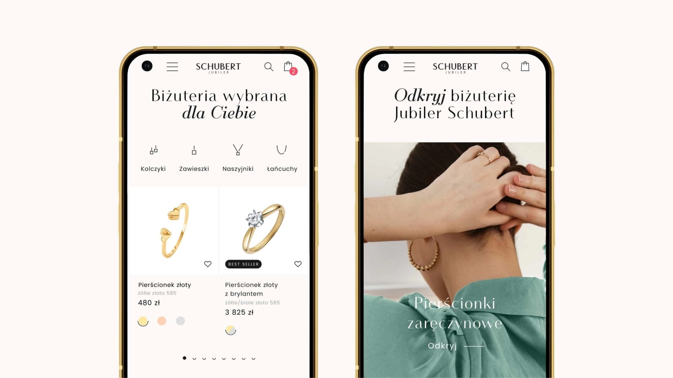
Project summary:
We designed the UX for the new online shop based on data relating to the target groups, their characteristics and habits.
Based on the completed UX mock-ups, we proposed a completely new UI based on a style guide developed specifically for the project.
We submitted the finalised project, along with comments on its operation and the materials required for its implementation.
Customer
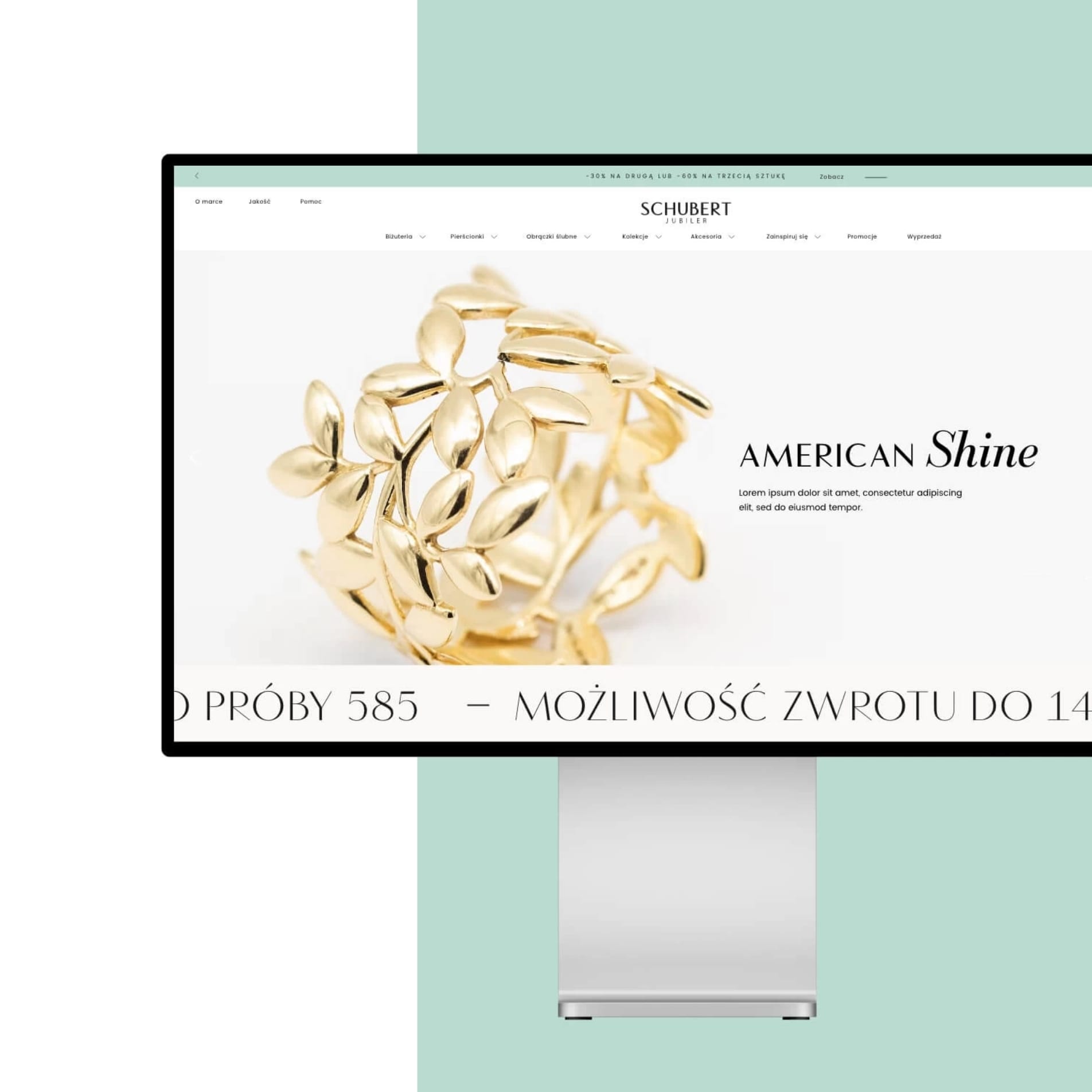
The Schubert brand offers its customers the very best quality jewellery in stylish and timeless designs. The company’s philosophy is that jewellery enhances our beauty, and the act of purchasing it should be a truly special pleasure.
Task
Our role involved analysing customer needs and tailoring the user interface to meet them. The main design objective was to create a new UI and UX for the website, offering customers convenient and visually appealing shopping tools, which in turn would enhance the brand’s image and boost sales.
The design process
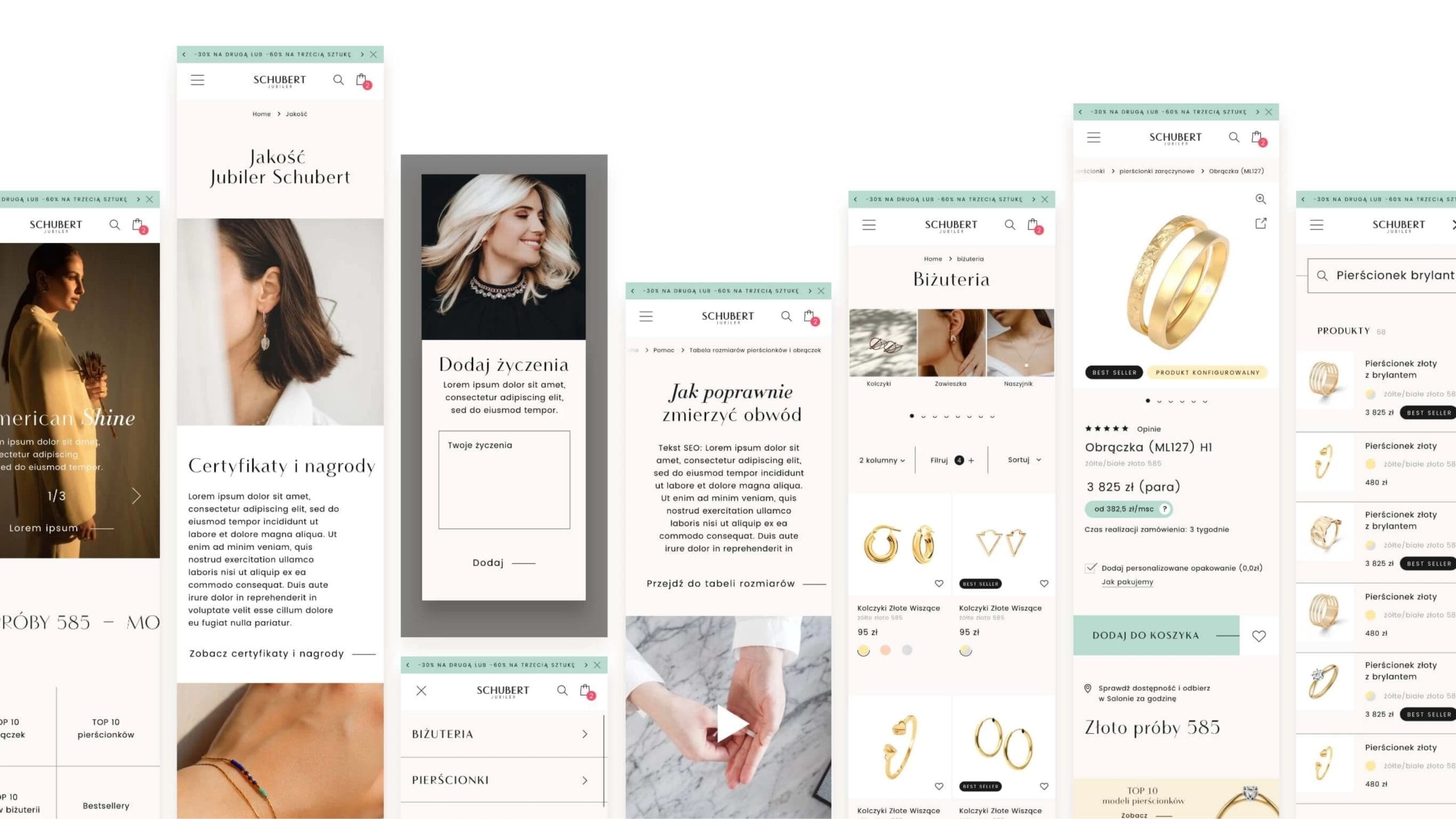
The online shop design was created using the most advanced UX/UI prototyping tools available on the market. These tools gave the client continuous insight into the process, which significantly facilitated and accelerated communication. Work on the layout covered both the mobile and desktop versions, as well as a comprehensive style guide. All of these elements are essential for the successful implementation of the shop.
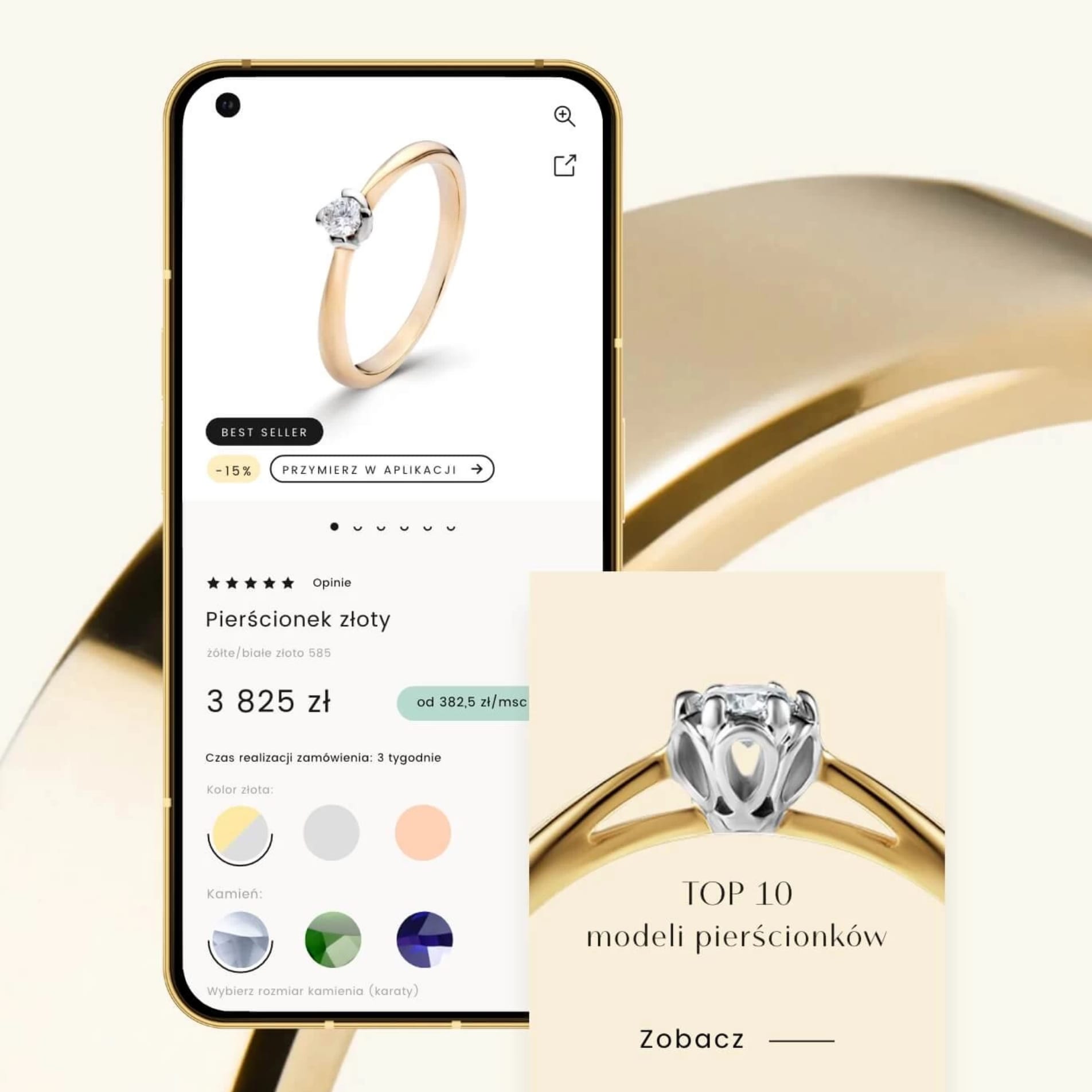
New UI
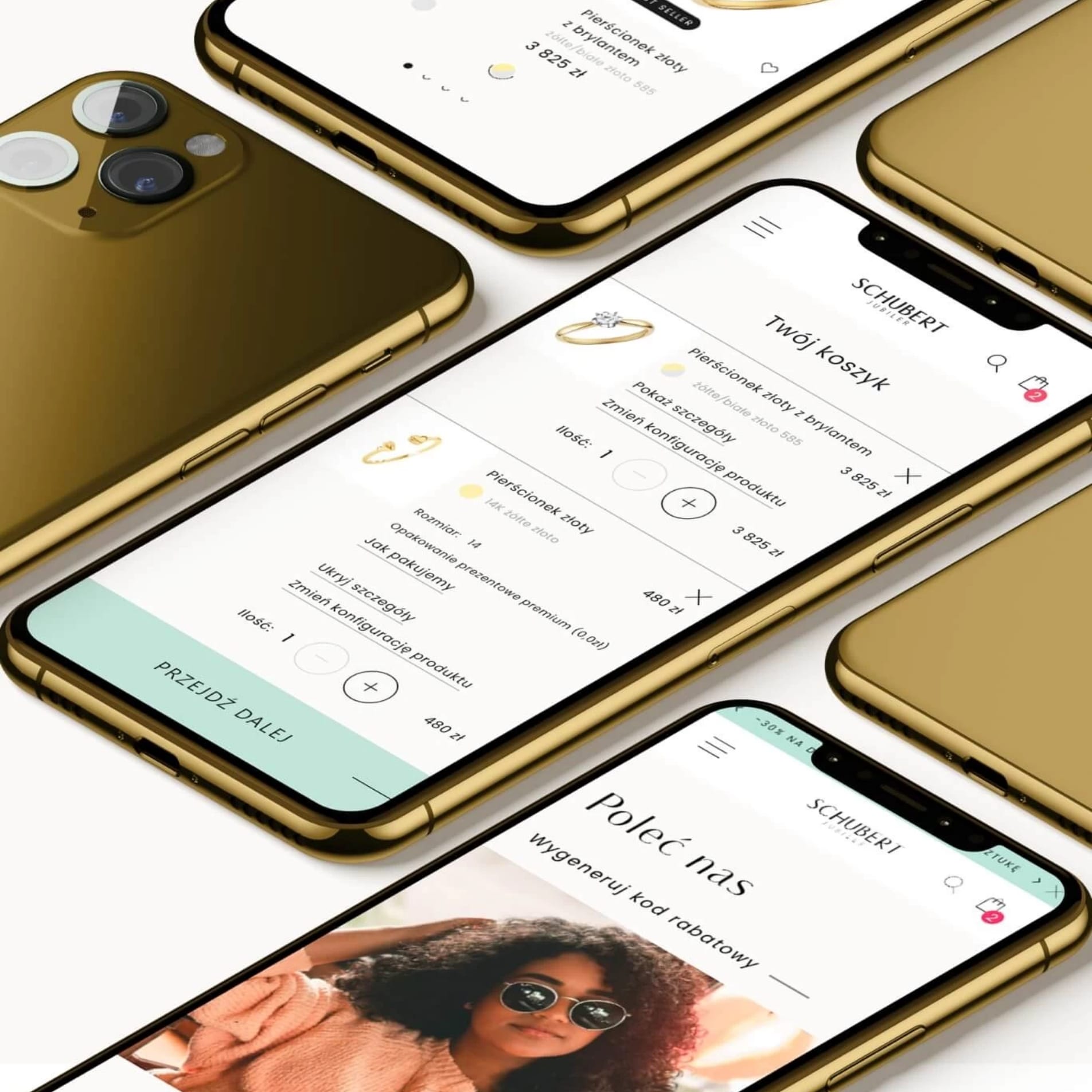
A well-designed user interface captures customers’ attention and has a positive impact on their perception of the brand. It is therefore worth ensuring that products are presented effectively, that navigation is intuitive, and that the website has an aesthetically pleasing design.
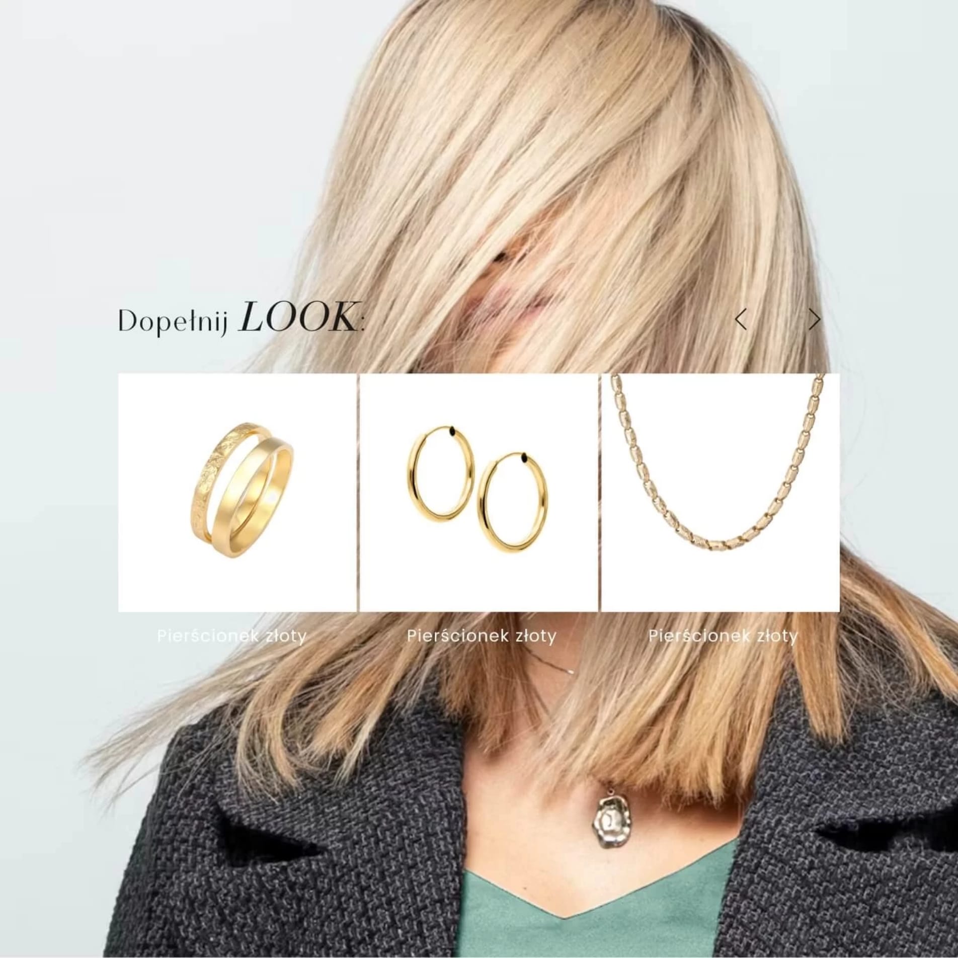
Upselling sections
The upsell and cross-sell sections are extremely important in the purchasing process at an online shop selling exclusive gold jewellery. They enable customers to discover products that will perfectly complement their purchases and ensure they are fully satisfied with their transaction.
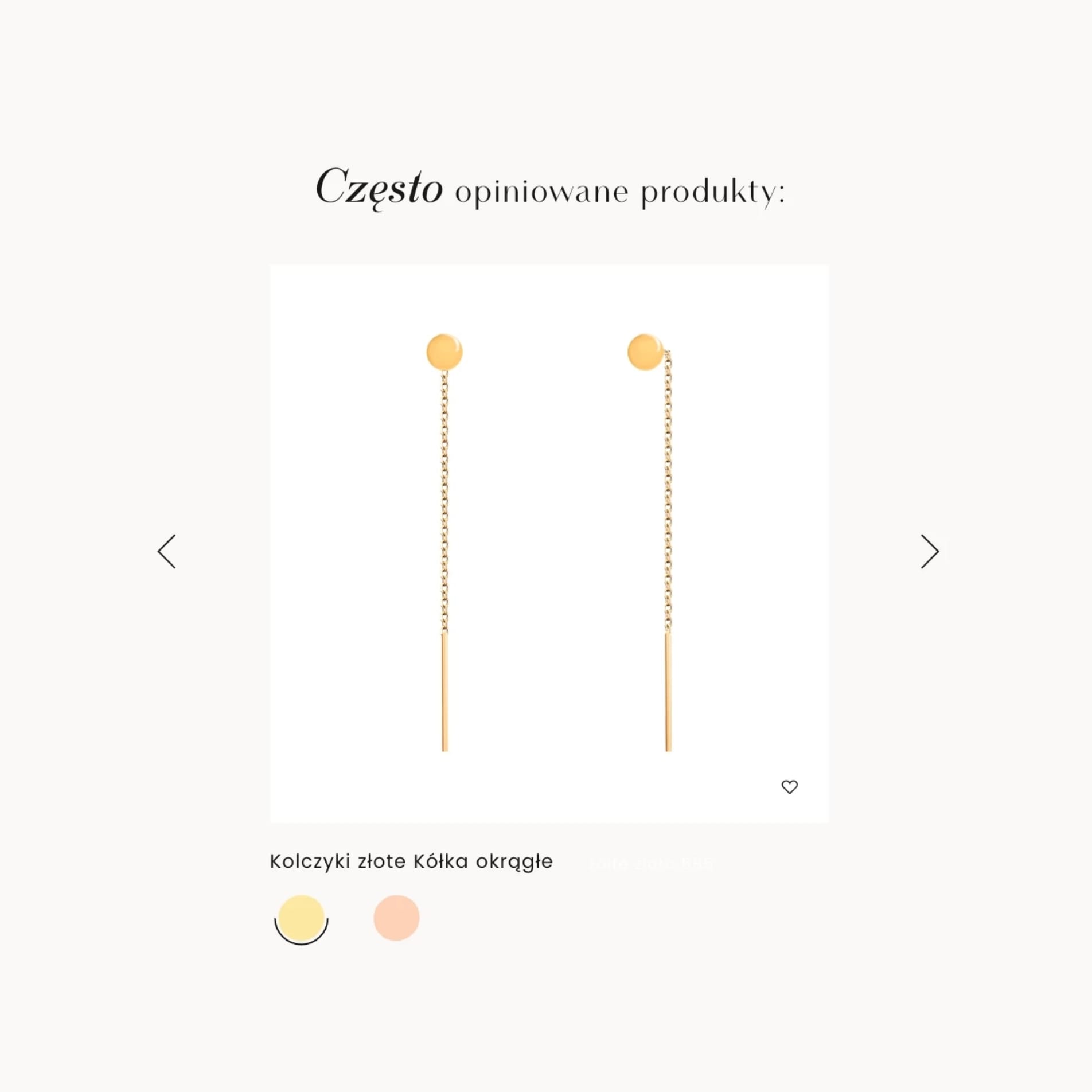
Easy to get in touch
Upselling involves offering customers more exclusive products, whilst cross-selling involves suggesting products that will complement their previous purchases well. This not only allows customers to discover new and interesting products, but also enables them to take advantage of the best offers and discounts. It is worth taking a look at these sections to ensure you have a comprehensive range of gold jewellery and can be confident that every purchase will be satisfying.
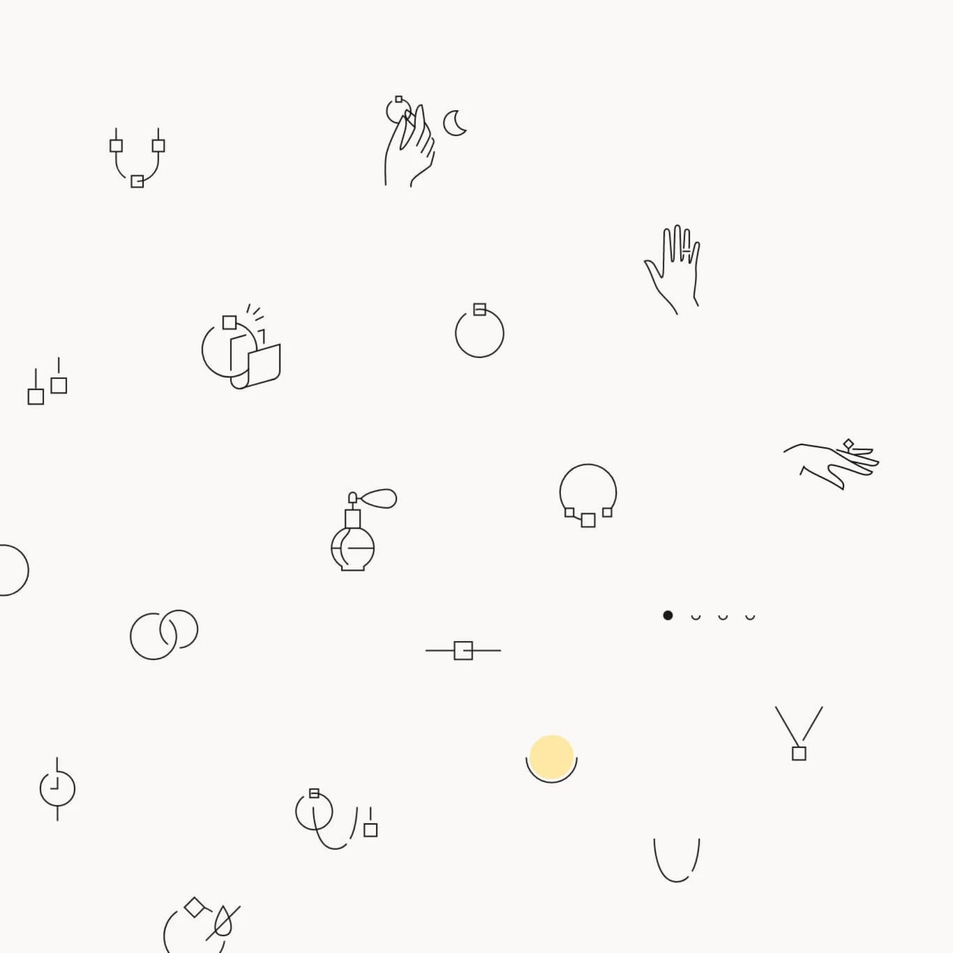
KV Marki
The brand’s visual identity has been given a new, subtle colour scheme and a set of modern, consistent icons. Changes have also been made to hover styles, pagination and functional elements such as checkboxes and radio buttons.
UX in the process of purchasing
With the right UX, customers will easily find the products they are interested in, complete their transactions quickly and feel secure when entering their personal and financial details. UX also ensures a positive user experience and increases the likelihood of repeat business from customers who value the accuracy and aesthetics of the products on offer and expect a high standard of service.
A well-designed online shop that is easy to use and provides customers with a positive experience boosts sales and builds lasting relationships with customers. For this reason, online shop owners should pay close attention to UX to ensure customers have the best possible shopping experience and to build a positive brand image.
The complexity of the project
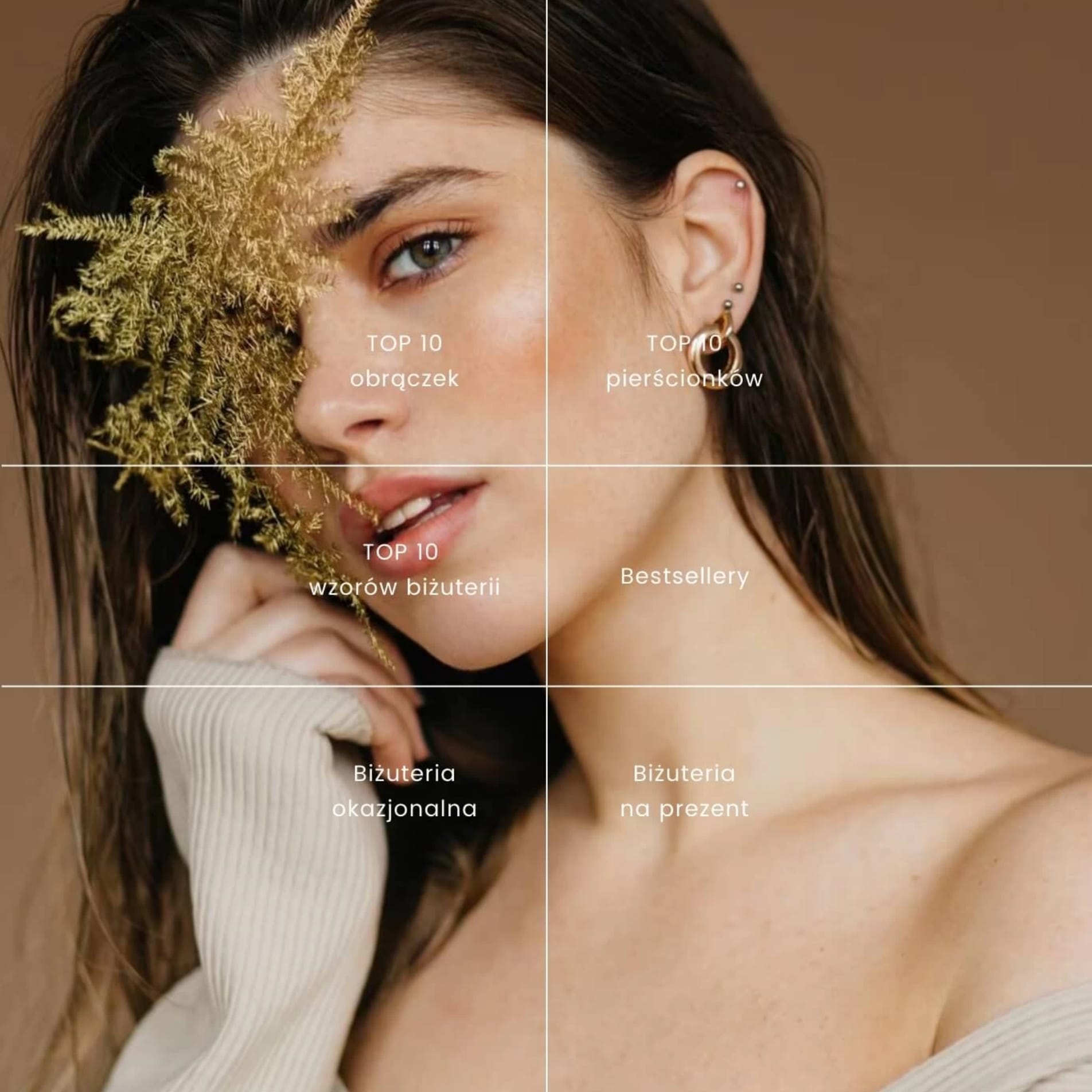
The nature of this environment influenced design decisions not only in visual terms but also from a strategic perspective. When designing all 170 views, particular attention had to be paid to the structure of the mobile and desktop functionalities, as modifications to these in Magento 2 have a significant impact on the implementation timeframe.
Integration with external tools
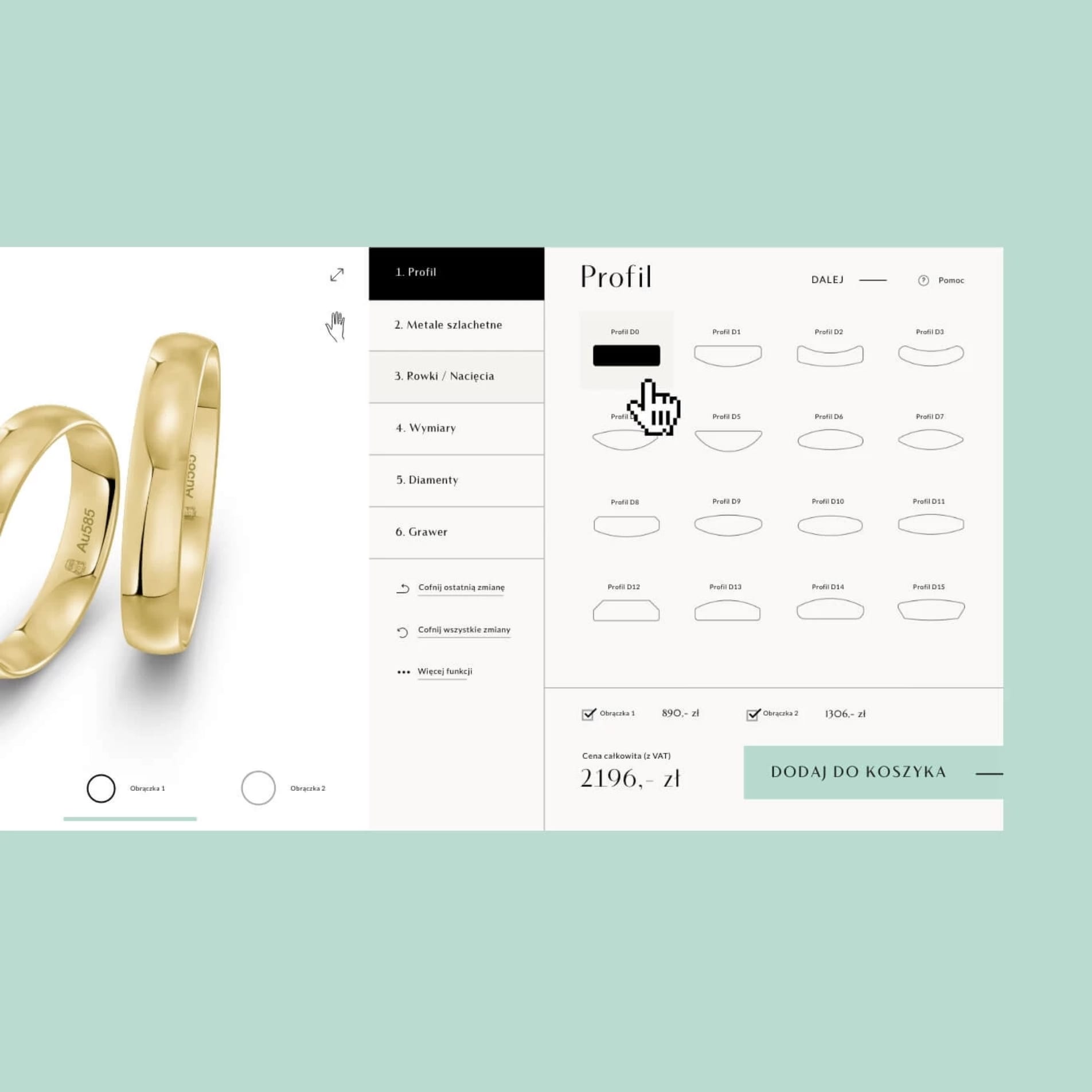
As part of the project, our task was also to ensure that the new visual identity was consistently applied in external tools, such as the wedding ring configurator and the ring size measurement app. Visual consistency reinforces the quality of the services on offer and enhances the user experience.
Product page
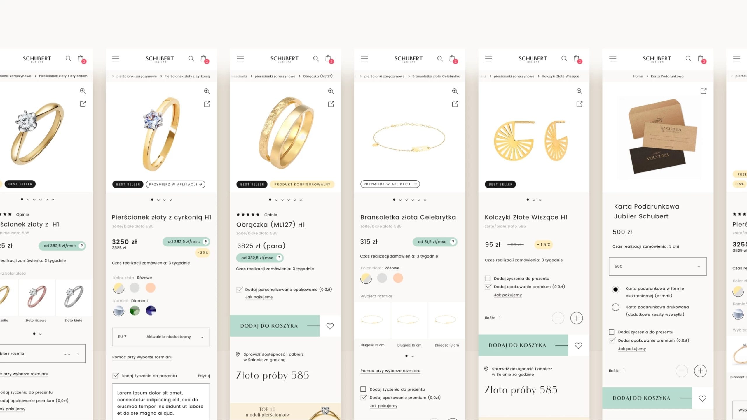
The design of the purchasing process took into account the variety of product types and characteristics. This resulted in a modular design for the product subpage, which accounts for all possible variables. The number and type of modules are selected on a case-by-case basis, and this does not affect the clarity of the offer.
For prototyping purposes, the following views have been prepared: product with a configurator, standard product, standard product with variants, product with a configurator and variants, pre-order product, promotional product, gift card with variants, etc. Additional upselling modules (complete your look), which can be added individually or in bulk, along with the ability to check availability in-store or try on jewellery within the app (AR), have a significant influence on the user’s purchasing decisions.
Order and collect in-store
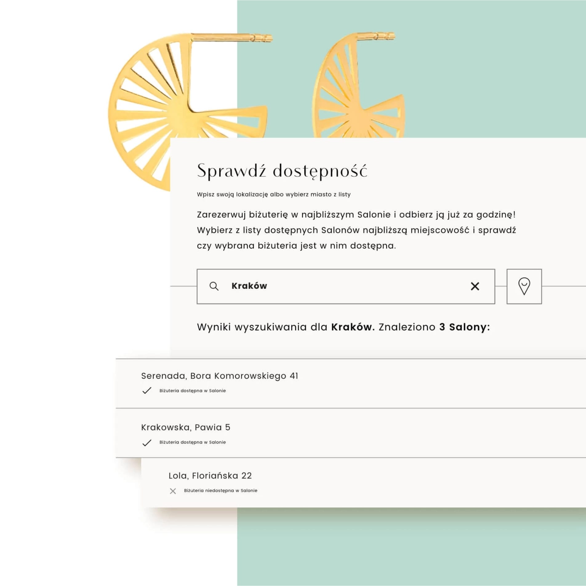
Our task was to design the functionality so that, firstly, users could easily find their nearest stores and view the search results in the same window without having to reload the page (the user remains on the product page). Secondly, to ensure that any time constraints relating to the shop’s logistics were as clear as possible to the user before they even set off to the shop to collect their order.
User account
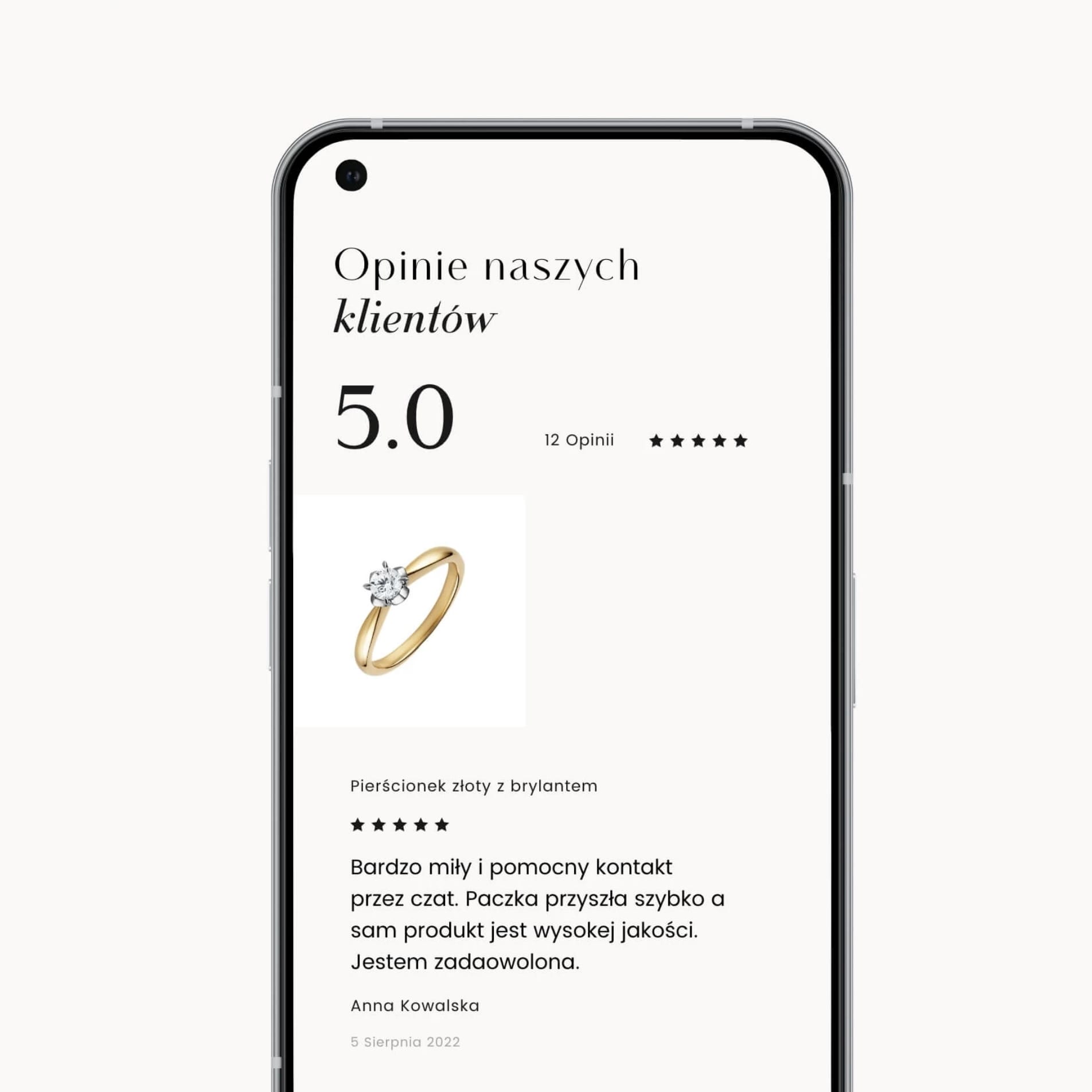
Before and whilst shopping, we encourage you to create a free account, which allows you to build a library of your favourite products, enable notifications about their availability, view your purchase history and make quick returns. Only logged-in users can submit reviews, and only for products they have purchased themselves, which significantly enhances their credibility.
Return of an order
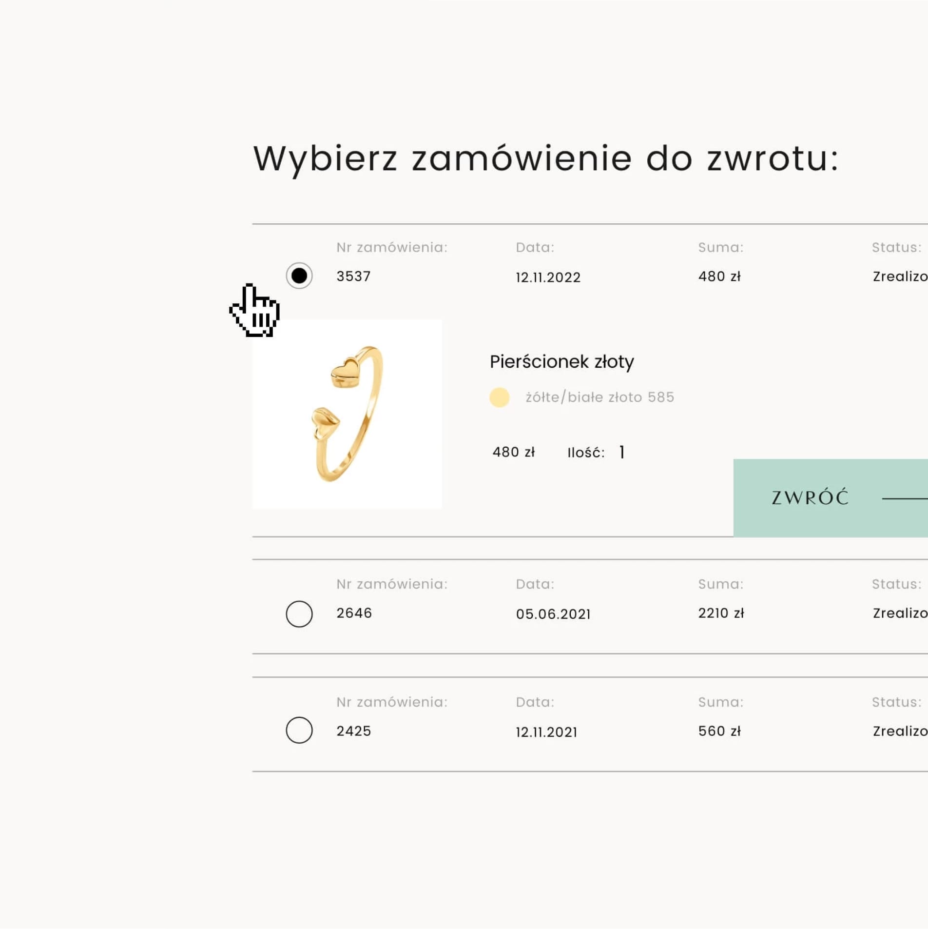
The order returns system was based on a special Magento module, which required stylistic adjustments to ensure consistency with the rest of the shop. As the proposed changes could not affect the underlying functionality, we had to be flexible in our design approach.
Banners advertising
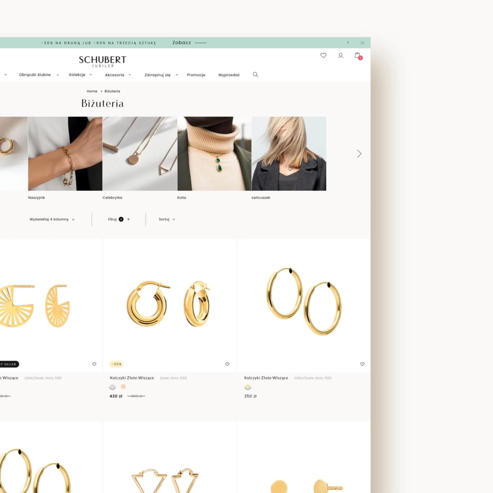
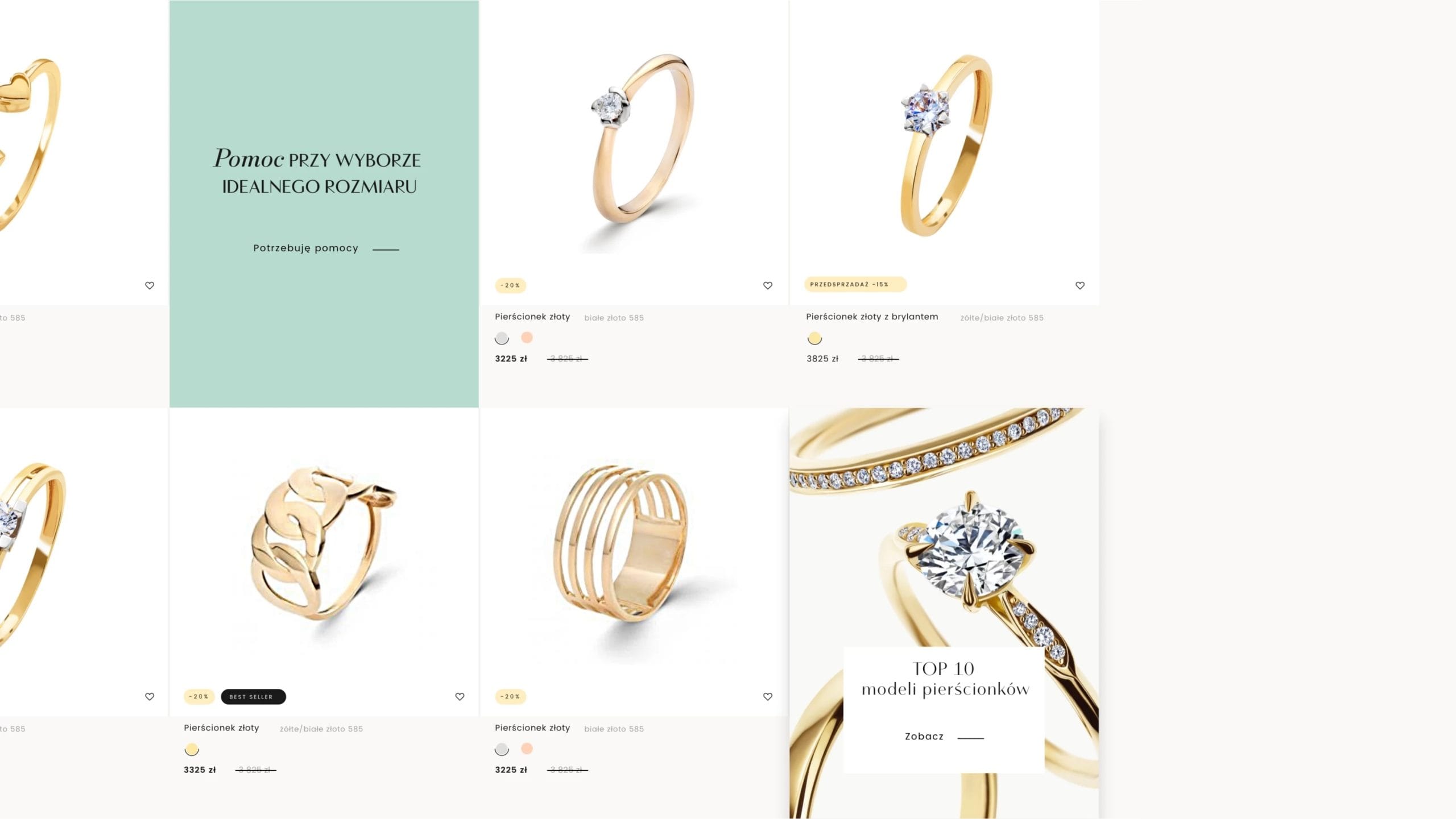
The product listings are by far the most frequently visited section of the shop. The high footfall creates ideal conditions for sales-promoting communication, which is why we have decided to use banners within the product fields. Their placement in the listings is not random, and the message itself is tailored to each product category.
Paths user
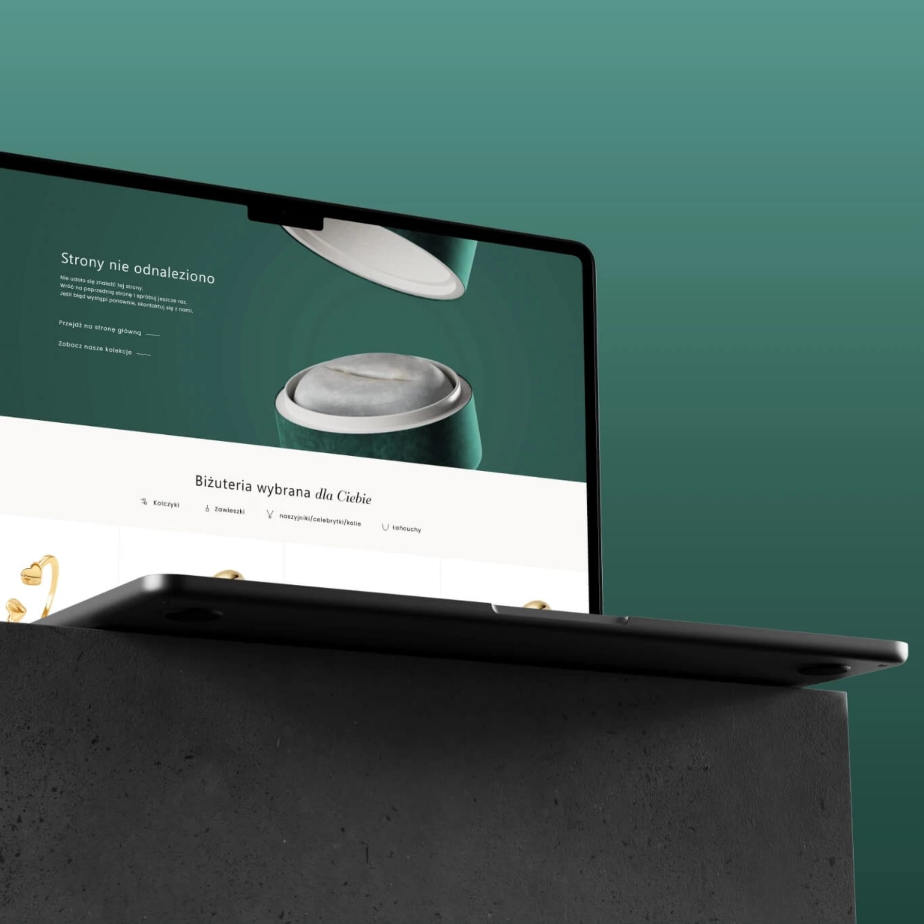
We have ensured that the user’s journey – from their first visit to the site, through the visual content and product range – flows smoothly and without interruption right through to the purchasing process. This is achieved through the appropriate use of CTAs, banners and links. Even if a user lands on a subpage that no longer exists, they can easily return to the designated path, from where they can continue making purchasing decisions.

